Alternatives to “guys”


2015-06-19 05:30:36 -08:00

When you’re addressing a mixed-gender or unknown-gender group, you should not use the word “guys”.

(Everything in this post also applies to “dudes” and “fellows”, and the singulars of all three. For example, “the IT guy”.)

The word refers to people who are male. It doesn’t matter what you meant by it in a particular instance, or how you as an individual tend to use it: That is what it means. That is what it conveys. That is what people hear when you say it.

As Julia Evans found, different usages vary in how they’re received, and there’s almost always a difference by gender. You’re more likely to think “guys” is gender-neutral if you’re a guy.

When you use it to address people of mixed or unknown gender, you reinforce the idea of male-as-default: This masculine word can refer to anybody! Funny how that doesn’t work for feminine words.

When you use it to address people of mixed or unknown gender, you erase the non-male people in the audience: Everybody here is guys! There’s nobody else here, no non-guys at all, no, sir.

So stop it. Stop saying “guys”.

(Except, of course, when you really do mean a group entirely of guys, like a men’s sport team.)

You may think it’s perfectly normal. It’s common, and that’s different. “Normal” implies healthy, and this isn’t healthy.

If you start paying attention, it won’t sound so “normal” after all, once you start noticing every time somebody refers to people who aren’t all guys as guys.

You might think “OK, I’ll say ‘guys and girls’ or ‘ladies and gentlemen’ instead.” Don’t do that. That does not include everybody: There are more than two genders, and not everybody inhabits any of them.

We can do better than that. We can include everybody.

So, what should you say instead?

These are words and phrases that include rather than exclude. That acknowledge rather than erase.

If you have other alternatives to suggest, please do suggest them in the comments.

My 3D printing setup


2015-01-10 12:03:29 -08:00

Here’s what I have today:

Hardware

Photo of my 3D printer (1), with a glass plate (2) and small piece of blue painter's tape (3) on the print bed, an SD card (4) in its slot, a USB fan (5) outside, a USB strip light (6) inside, and a cuticle nipper (7) outside.

  1. The 3D printer is a PowerSpec 3D Pro from Micro Center. I believe it’s a rebrand of the FlashForge Creator Pro. For $800 (that was on Black Friday sale; it’s normally a kilobuck), you get a decent printer with two extruders and a heated bed. It fared average in Make magazine’s 2014 comparison, and I agreed with their assessment on the whole.

    So far, I’ve only printed PLA, and I’m happy with that. I have no reason at present to switch to ABS.

  2. The glass plate is from a dollar store picture frame. I had a choice between 5×7″ (smaller than the build platform) and 8×10″ (larger); I went smaller, which worked out well. A simple 1 mm shim was all I needed to adjust the platform height to offset the thickness of the plate.

    The printer comes with Kapton tape applied to the print bed, and I have a roll of it from which I’ve replaced the tape once, but now that I’m printing on glass, I don’t think I’ll go back to Kapton. I may change my mind if I start printing ABS.

  3. This is blue painter’s tape, on a corner of the print bed. Overrated, in my experience, but its terribleness at PLA adhesion is what makes it great for this specific purpose: prints I export with Simplify3D (more on that below) start with a glob of plastic in this corner, and having that land on painter’s tape makes it easy to remove whenever I want.

  4. The SD card came with the printer. I’ve never connected the printer to my computer; I always run it autonomously, using the controls on the front.

  5. I turn on this USB fan (Walgreens seasonal item) after a print to cool off the print and print bed. Once they’ve cooled enough, the part stops sticking to the glass and I can just pick it up—no pulling or prying required. This is the major advantage of glass.

  6. Hanging down into the printer is a wonderful little USB gooseneck strip light. The printer has its own lighting, but it’s top down, so the area under the extruders is in shadow. Lighting from the side gives me a better view of the print action.

  7. The cuticle nipper is among the tools I use to refine finished prints. They’re great for clipping off tiny burrs on edges and corners. I also have a nail file (they come in four-packs at the dollar store, and I don’t need that many nail files for my hands) that I use for similar purposes, including cleaning up where the cuticle nipper left off. Filing/sanding is one area where I feel my toolset is incomplete.

Not shown:

  • Two rolls of PLA. On the spindles are one “clear” (more like translucent) and one white. The white currently isn’t even loaded into the printer; I could swap in another spool at any time.
  • Other rolls of PLA. I have more white, some “natural” that I suspect may be equivalent to the “clear”, at least one spool of black, and half a kg of red (I want to make a pommel for Ikea’s red wind-up flashlight, and I want the colors to match).
  • A roll of PVA. I haven’t used it yet, but its use in 3D printing is as a support material in PLA parts. You can use PVA to support bridges and overhangs, then dunk the part in water to dissolve the PLA away.
  • The remaining Kapton tape.
  • Two spatulas. One is just a normal metal spatula from Daiso. The other is an extra-wide “fish” spatula from Target’s summer section, bought on clearance after summer ended. I’ve only used that a couple of times, and I basically haven’t touched either since switching from Kapton to glass.
  • Long cross tweezers, for extracting the odd bit of scrap plastic from the printer while the part is printing, or from the hot end while it’s still hot.
  • 15 cm ruler, and a digital caliper from Harbor Freight
  • Duster, for sweeping dust and bits of plastic off the print bed.
  • The USB charger that the USB hub is plugged into. (The fan and strip light are both plugged into the hub.) The charger is the one that came with the fan.

Several of the things I’m making are meant to be stuck to a magnetic whiteboard, so I’ve got stuff for that:

  • Magnets, obviously. I have strong permanent magnets—strong enough that the protective packaging is more protecting everyone and everything outside the package than protecting the magnets. A millimeter of plastic and a layer of silicone is enough distance to water them down to fridge-magnet pull.
  • Super Glue, of the brush-on type.
  • Disposable gloves, for handling the glue (“WARNING: BONDS SKIN INSTANTLY”) safely.
  • GE “100% silicone”, for added grip. (I’ve had mixed success with this so far. I may need to lay it on thicker than I’ve been doing.)
  • Plastic putty knives for applying the silicone to the parts.
  • Metal putty knives for removing the silicone from the plastic putty knives.

Software I use

I use OpenSCAD to design models—programmers will love it—and Simplify3D to slice and export the model for the printer. (Simplify3D exports G-Code; for a printer like mine, you’ll need GPX to convert it to an x3g file.)

UPDATE 2016-09-09: The version of Simplify3D I have now successfully exports x3g files on its own.

OpenSCAD is different from most 3D modeling software: It’s text-based. You describe your model in code, mainly using shape primitives and set operations (intersection, difference, and union), and then hit render to see what it looks like. When you’re done iterating, you do a final (longer-running) render, then export STL.

Simplify3D is a $140 slicing and printer control program. It’s both the best one out currently and ugly in a lot of places (especially the installer, which is a Windows-style “setup wizard”). It offers you a lot of control, which is both a blessing and a curse—but it means I can do certain things that I want that MakerWare wouldn’t let me, like crank the printer’s base print speed up to 125 mm/s (the default is 90).

So I write a model in OpenSCAD, export it to STL, bring that STL file into Simplify3D, export G-Code, and use gpx to convert the G-Code to x3g. I then put that x3g file onto the SD card to put into the printer.

Software I’ve tried and abandoned, or not tried at all

I’ve tried Cheetah3D, 123D Design, and Inventor Fusion. I found them all limiting in various ways; I frequently run into “I know what I want but either don’t have a tool that does that or the tool doesn’t want to let me do that” situations. OpenSCAD is bare-bones, but expressive.

I have not tried the successor to Inventor Fusion (which requires an internet connection, which makes no fucking sense for 3D modeling software), nor have I tried Blender.

I originally used MakerWare, and it was OK, but I find it hard to give up some of S3D’s more advanced features, like the speed control. I did have to export one part from MakerWare because Simplify3D seemed not to notice a long, very thin cylinder that was part of the model—but that’s the only problem I’ve had with S3D so far.

I’ll likely go back to MakerWare, at least initially, when I do my first dual-material (PLA+PVA) print. Simplify3D’s UI does not give me lots of confidence that it will handle that correctly without my needing to explain it some things.

I have tried Slic3r. Here’s a picture of me using it:

I have no idea what I'm doing.

I haven’t tried the newer “MakerBot Desktop” (successor to MakerWare), nor ReplicatorG, nor any of the other, older slicers.

I really want someone to come out with the iWork of slicers. Or modelers, but I’m happy enough with OpenSCAD that I’m likely not to want to put in the time to learn another GUI modeler, unless it’s a graphical editor for OpenSCAD files. But a truly nice slicer, with Simplify3D’s capabilities but much more refined and easy-to-use UI, would be great.

The to-do graph


2014-12-21 15:35:00 -08:00

Earlier this year, I started practicing GTD.

I’m not very good at it yet. But I’ve learned some things.

And I’ve proven that lists suck.

A list is a single, flat, ordered collection of items. In GTD, you’ll have one list per project, and each item is an action.

This makes sense if you consider the list to be a record of everything you did toward that project, in order, written before instead of after.

But who does that?

Who micromanages the order of things they’re going to do before they do it?

Who has such perfect foresight?

Who has that kind of time?

Moreover, the order of a list is implicitly transitive: Every item in the list must come after every item before it and before every item after it.

That isn’t true: Some things can be done at the same time, or in either order. For example, you can work on assets while you install Xcode, and then you can work on assets before code or code before assets.

A list is a serial queue. No work can proceed until the work before it is finished.

The alternative to that is to throw out the ordering altogether: Put items in in the order you think of/receive them, and then every time you want to start one, scan through the whole list until you find something that you haven’t done and can do.

It’s a choice between false information—order relationships that don’t really exist—and no information.

The latter seems worse: Some of the orders are true, and therefore valuable, so why throw them all out?

How can we avoid that?

What makes the true orders true? Why do those actions have to be done before those other actions?

Dependencies.

This action must be done before that other action because the other action depends on it.

Some actions depend on other actions. Some actions depend on multiple other actions.

This is a graph.

That’s what I’ve switched to. I still use OmniFocus (version 1), but only as an inbox; I migrate those items to my to-do graph, which I keep in OmniGraffle.

Example graph of two projects, “Build new app” and “Work on existing app”, with actions such as “Create Xcode project”, “Fix bug in frobulator”, and “Add BSP reticulation”.
You can tell this is a made-up example because some of these actions are not concrete enough to be proper GTD.

The graph enables me to express dependencies without making up false orderings. Items that can be done in parallel are in parallel.

I mainly edit the outline, rather than the boxes on the graph directly. You could use something like OmniOutliner or TaskPaper, but those can’t visualize the graph. OmniGraffle has an “auto layout” (no relation to the Cocoa feature) option that automatically creates and arranges boxes in the graph corresponding to items in the outline.

The top-level items in the outline, the roots of the graph, are goals. I typically write these as high-level imperative sentences such as “build initial version of app”.

All, or occasionally nearly all, of the other nodes are indivisible actions. Each is a single concrete step toward the goal.

The leaf nodes are “next actions”: At any time, I should be able to pick a next action as the next thing I’m going to do.

I also create nodes for other people’s actions that I’m waiting on. These nodes look like “So-and-so: Do such-and-such”. When that happens, I take it off; its parent—if it has no other dependencies—then becomes a next action.

I set OmniGraffle to lay the graph out as an upward tree, so that each project actually does look tree-like, with the “root” at the bottom.

To mark an action as done, I have two choices: I can set the node’s font to strike-through, or just delete it. I typically strike through my own completed actions, and delete obviated actions, completed actions by others, and completed goals.

You’ve gathered by now that OmniGraffle lacks some things for this.

  • It wasn’t designed to be used as a to-do list, so it lacks a concept of “done”. Instead of a checkbox, I have the Font Panel.
  • Similarly, there are no priority or due-date options. I generally don’t use these, but some projects do, in fact, have a due date, or greater or lesser priority than other projects, and it’d be helpful to track that.
  • The outline editor, which superficially looks like a mini OmniOutliner, lacks or changes about half of OmniOutliner’s keyboard commands. I really wish that if the keyboard focus is on the outline, that it would just respond exactly as OmniOutliner would to every possible keypress.
  • The option to have a node pinned to the far (top) row of the tree is a per-node option, so I can’t have it automatically lay out all next actions in the same row.
  • The outline structure, like OmniOutliner’s, means I cannot have multiple nodes depend on the same action—which they very well could in reality.

I have two points:

  • A graph is a much better way to express to-dos than a flat list.
  • There currently isn’t a Mac app ideally suited to this. OmniGraffle is a great graph editor, but I’m using it for a purpose it wasn’t designed for. I’d pay good money for an app of OmniGraffle’s quality and basic nature, but optimized for to-do keeping.

G4 Cube mods


2014-11-02 20:17:43 -08:00

As some of you are aware, I own a Power Mac G4 Cube.

The G4 Cube was an impressive little machine from 2001. It was a Power Mac G4, minus any PCI slots, packed into an 8-inch by 8-inch by 8-inch (plus a few inches’ clearance underneath) cube. And it had no fan—it was cooled entirely by convection through the mostly-empty center column.

It’s also really fun to upgrade.

I’ve upgraded my Cube in three ways:

RAM

One of the old stand-bys, along with upgrading the processor and video card (both of which remain stock in my Cube).

RAM for a Cube is dirt cheap now, so I bought 1 GB. The theoretical maximum is 1.5 GB, but I’m only running Mac OS 9 on my Cube (all my personal OS X usage happens on my MacBook Air), so 1 GB should already be overkill.

SSD

The Cube, of course, came with a spinning-disk drive (a.k.a. “hard disk drive” or HDD), connected via ATA.

Replacing an HDD with an SSD is straightforward in most newer computers, but the Cube presents special challenges.

For one thing, it’s a desktop computer with a 3.5-inch drive bay, and SSDs are typically 2.5-inch (the “laptop” form factor). This would not be a problem if it were the only one, because adapter brackets exist, but it’s not the only problem.

Problem #2 is that the Cube uses ATA (now known as “parallel ATA” or PATA), whereas SSDs use serial ATA (a.k.a. SATA). Again, adapters exist, but that brings us to problem #3:

Space.

Not disk space, but physical space.

As I mentioned, the Cube is a lot of electronics packed into a small volume. The drive bay does not have free space on any side of it; it is exactly as big as needed to fit a 3.5-inch ATA hard disk drive.

This makes it difficult to impossible to fit a 2.5-inch drive, a PATA-to-SATA adapter, and an adapter bracket.

OWC sells SSDs with integrated adapters for pretty much exactly this purpose, but I cheaped out and went the DIY route.

  • I bought an 80 GB SSD off Woot.
  • I bought an adapter board at Fry’s. I think it was this one, but it was months ago and I’m not about to open up my Cube again to find out.
  • I bought an adapter bracket, I think from Amazon, but didn’t end up using it because of the aforementioned space constraints.

With a HDD, leaving everything flopping around inside the computer would be just asking for a problem, because the HDD has a motor, which will cause it and everything connected to it to vibrate. Sooner or later, the HDD could come unplugged (especially if it’s a 2.5-inch HDD), and then you just have bits pouring out all over whatever the Cube is sitting on.

But this isn’t an HDD; it’s an SSD. A Solid-State Drive.

It has no moving parts.

That’s what’s cool about having an SSD in a Cube:

No moving parts at all.

The Cube has no fan. The video card has no fan. The SSD has no motor. Thus, the entire set-up is completely silent.

The one downside is that since this drive is so large (by 2001 standards), the Mac takes awhile to validate that it is actually properly formatted. It actually shows the blinking question mark for a minute or two before it finally boots.

HDMI

The stock video card in my Cube is a Rage 128 with ADC and VGA outputs.

I used to use my Cube on a contemporary Apple Studio Display that I could plug into the ADC port, but I don’t want to set up a second monitor specifically for that computer.

For sound, the Cube didn’t have a built-in speaker (no space) or audio jacks (presumably no space even for that). Instead, it came with a custom Apple speaker set-up consisting of a central DAC box with hard-wired USB and speaker connections on one side and a headphone jack on the other.

Mine’s in somewhat shabby shape, and I don’t want to use it anyway.

I have a Yamaha AV receiver, Monoprice 5.1 speakers, and an Optoma 1080p projector. The receiver and the projector both support HDMI. What I really want is to be able to route the Cube’s audio and video together into one of the receiver’s HDMI ports, so that the Cube can be alongside my PS3, my iPad, and my MacBook Air as possible external sources to be presented through the receiver’s speakers and the projector.

And that’s what I have.

This adapter takes video input over VGA and audio input over USB, and outputs HDMI.

It’s an HDMI port for the G4 Cube.

Yes, the ideal solution would use digital video from the ADC port, but nobody’s going to make such an adapter for ADC today. A DVI one could exist, but would probably be way more expensive, and require also purchasing an ADC-to-DVI adapter cable.

The VGA output looks fine. The Cube can output up to 1600×1200, and it looks great on my wall.

The only real drawback is that Mac OS 9 (or maybe the video card) never heard of 1920×1080, so I can’t actually output the native resolution of my projector.

My wonderful Cube

My G4 Cube has 1 GB of RAM, an SSD with more free space than I know what to do with, and an HDMI port, to which I’ve connected a 1080p projector and 5.1 speakers.

And it’s completely silent. (Although admittedly the projector ruins that.)

It’s a cool little machine.

Updates


2014-10-25 09:50:47 -08:00

The blog’s back up. It’s been down most of the year, as rather a lot of you noticed.

Thank you, everyone who told me. Every time you told me my blog was down, you were also telling me that you missed it, or at least you needed it for something. You’re part of why I kept meaning to bring it back, and why I eventually did.

I work for Apple now.

I’m on the Foundation and Core Foundation team, which is part of Cocoa. Part of my job is reading the Radars you file about those two frameworks and making sure they go to the right people.

I live in San Francisco now.

I moved early in the year, not long after I had to change hosting providers after TextDrive breathed its last (that was why the blog went down in the first place) and shortly before I started at my job.

I moved for the job; I work in Infinite Loop.

(I also moved because I love San Francisco. I’ve been here a couple of times before, and fell in love with it when I first stepped out of Civic Center BART onto Market Street.)

I probably won’t write as much here anymore.

A big part of that is time constraints: Subtract the job, the commute, three square meals, and sleep, and I don’t have a lot of time in a day to pound out a blog post.

Then, of course, there’s the nature of the job: Being at Apple means I know some things that aren’t public. Not a lot, but enough. Better to be careful than accidentally say something here that I’m not supposed to.

The same goes for my being active on Stack Overflow.

You’re welcome to ask a question and send me the link, but somebody else will probably get to it before I will.

And, of course, MacTech. See above. (If you have a subscription, you might have noticed this already—my last article ran in August, I think.)

I won’t be at MacTech Conference this year, either. This is the first time in the conference’s history that I won’t be at it. But plenty of other fine folks will who are worth listening to and who are good company.

That’s all I have to say for now. For those of you who use Twitter, I’m still there.

Until next time.

Simple starter Cocoa app ideas


2013-12-11 13:46:20 -08:00

Inspired partly by tonight’s Hour of Code, here are some index-card-sized outlines of some simple app projects you can make as someone new to Cocoa.

Text editor/word processor

  • Document-based Mac app
  • In document window: NSTextView
  • Use NSAttributedString to read/write document data
  • Document types:
    • public.plain-text
    • public.rtf
    • com.apple.rtfd
    • com.microsoft.word.doc
  • Extra credit:
    • Add a ruler (NSRulerView)

Picture viewer

  • Document-based Mac app
  • In document window: IKImageView
  • Use CGImageSource to read image (picture) & its properties
  • Document types:
    • public.png
    • public.jpeg
  • Extra credit:
    • Floating inspector panel showing the properties in an NSTableView
    • Color-correction panel (IKImageEditPanel)
    • Support folders (public.folder): display images from folder in IKImageBrowserView

PDF viewer

  • Document-based Mac app
  • In document window: PDFView
  • Use PDFDocument to read from .pdf file
  • Document types:
    • com.adobe.pdf
  • Extra credit:
    • Toolbar with zoom in/out buttons, zoom % field, page number field

Requirements for a true Mac keyboard


2013-09-06 21:09:47 -08:00

With the Mac undergoing a resurgence in popularity, keyboard manufacturers have started to release Mac versions of their hitherto Windows-only products.

Of course, USB helps; it’s been possible for 15 years to use Windows keyboards on a Mac. But I don’t think any Mac user wants the reminder of looking down and seeing that logo staring back up at you.

Moreover, just as certain things—including that key—make a Windows keyboard a Windows keyboard, there are certain things that make a Mac keyboard a Mac keyboard.

Unfortunately, the Windows keyboard manufacturers tend to forget most of them and screw up others.

My bias: The keyboard I hold up as the standard


The Apple Extended Keyboard II.
(This is John Gruber’s; his photo was better than any of mine.)

When I evaluate how much of a Mac keyboard a keyboard is, I compare it to this.

The most obvious sign of a Windows keyboard

… is, of course, the plus key on the numeric keypad.

Here’s the Das Keyboard Model S for Mac:

Das Keyboard for Mac keypad
Doubleplus ungood

Compare to the keypad from the Apple Extended Keyboard II above.

To enumerate the differences:

  • Where a Windows keypad has NumLock, a Mac keypad has Clear. (Das Keyboard’s Mac model gets this much right.) Extended keyboards often have the Clear key bear both labels (as on the AEK2), since it may be used as NumLock in a PC emulator or virtualizer.
  • The Mac keypad inserts an equals key immediately to the right of the Clear key. The operator keys remain in the same order (/ * – +), but are shifted over to the right and down.
  • To make room for the equals key, the Mac keypad’s plus key takes up only a single row.

Oh yeah, and the modifiers

PC keyboard manufacturers tend to only do this halfway.

The modifier keys in the bottom-left corner are:

  • On a Mac keyboard: ctrl, option, ⌘
  • On a Windows keyboard: ctrl, Windows, alt

Plug either one into the wrong kind of computer, and the Option key is Alt (or vice versa) and the ⌘ key is the Windows key (or vice versa). Thus, Option/Alt and ⌘/Windows will be backwards.

There are two differences that PC keyboard manufacturers almost always miss:

  • On a Mac keyboard, the option key is slightly smaller than its two neighbors. The ctrl key should be the same size as ⌘.
  • A Windows keyboard may have four keys in the lower-right corner: between alt and ctrl, a key to right-click the mouse. (Apparently there are Windows users with one-button mice?!) A Mac keyboard has exactly three modifier keys on the bottom row in each corner.

All too many Mac versions of Windows keyboards have all three modifiers the same size, as the original Windows models do, and some even still have four keys in the lower-right corner (with the fn key in the place of the right-click key).

It’s also unfortunately common for the ⌘ key to be labeled “Command” rather than with the ⌘ symbol. (Both the Das Keyboard and Unicomp’s SpaceSaver M are guilty of this.) If you can put a Windows logo on your Windows key, you can put a ⌘ symbol on your ⌘ key.

The fn key and media keys

I’m of two minds about this.

On the one hand, you saw my standard up there. Ain’t no fn key on that. I’ll be happy to never see one on a desktop keyboard.

On the other hand, we do live in the Mac OS X era, with NeXT-inherited (and other) media keys on our keyboards, generally placed on the function keys. A keyboard so equipped needs a fn key to distinguish between media-key presses and function-key presses.

I’ve seen several variations of fn key placement:

  • Apple, as we all know, puts it in the lower-left corner on their laptops and wireless keyboards. Most Bluetooth keyboards that advertise Mac compatibility (as opposed to Windows or iOS) do likewise. Since this is where Apple puts theirs, if you’re making a Mac keyboard with an fn key, this is where you should put yours.
  • NeXT’s keyboards didn’t have function keys, but they did have four of the media keys: volume up and down, and brightness up and down. They had a power key, too, in between the pairs of volume and brightness keys. All five were in place of the navigation block (home, page up/down, etc.). The end key was gone entirely. (We won’t get into NeXT keypad layouts.)
  • The Das Keyboard replaces the right-click key with this. Having it in between two modifier keys is supremely weird—even just putting it in the lower-right corner would have been better.
  • Unicomp’s Spacesaver M does the same as the Das Keyboard.
  • Older versions of Matias’s Tactile Pro (which is billed as a successor to the AEK2) do not have an fn key. They put the volume keys and Eject key at the top-right, and have no other dedicated Dashboard, Spaces, Exposé, etc. keys.
  • Apple’s current wired keyboard and Matias’s Tactile Pro 4 (the current version as I write this) replace the Help key with an fn key.
  • The Mini Tactile Pro puts it immediately above the right arrow key/to the right of the up arrow key. Downside: Very easy to enter dictation mode when up- or right-arrowing repeatedly.

(Incidentally, I think the Mini Tactile Pro makes some very clever choices overall. I still won’t give up my keypad, though.)

Make sure you implement your fn key correctly, lest your users suffer the consequences. (The keyboard that Nicholas Riley was referring to in that tweet was the Logitech K760.)

The return key

Should always be labeled “return” (or “⏎”), never “enter”. Enter is on the keypad; Return is in the main keyboard.

If you have a fn key, fn-return should be Enter, exactly as on Apple’s laptops. I don’t care about this for extended keyboards, but for a compact keyboard, it’s a requirement, and if you have an fn key anyway, better to support it than not. If nothing else, it’s an affordance to heavy laptop users, who’ll be used to fn-return as a habit.

The power key

My standard keyboard, of course, has a power key, so, on a learned-behavior level, I still expect it from a true Mac keyboard.

On the other hand, it doesn’t actually power the machine on anymore (USB ports are dead on a turned-off Mac), and the Eject key can sub for it in all the old n-finger salutes, so it really is disposable.

Perhaps the power key’s remaining value is sentimental. It’s a testament. It says “this is a Mac keyboard, dammit—we didn’t just reskin our Windows board; we made one for you”.

Or: Perhaps the Eject key should replace the power key, exactly where it is. It does all of the power key’s surviving functions, and is likewise characteristic of (modern) Mac keyboards; therefore, it should be in the same place. (The Tactile Pro 4 does this, not surprisingly.)

The help key

Kill it with fire. I’ve never seen a real application make any use of it; all it does is enter a mode of unhelpfulness.

Possible alternatives:

  • Make it unconditionally an Insert key (assuming this is possible at the hardware/HID level).
  • Replace it with Eject. (Potentially problematic, considering what unmodified Eject does.)
  • Replace it with fn.
  • Replace it with the world’s smallest ashtray.

The baselines

Most character-generating keys—the letter, punctuation, and number keys—have two baselines. Punctuation keys use both of them, and, on most keyboards, keys marked with only a single character use only one of them.

On older Mac keyboards, single-character keys use the lower baseline. This includes the letter keys, the operator and number keys on the keypad, and the return and enter keys. Indeed, virtually all keys on a previous-generation Mac keyboard are labeled on the lower baseline, except for the punctuation keys. Also, on all Mac keyboards, all keys are the same color.

On a PC keyboard, things are a little more complex.

Annotated cropped photo of the Unicomp SpaceSaver M's letter board, showing the baselines of white keys (such as letter, punctuation, and number keys) and gray keys (such as delete/backspace, return, and shift).

Unicomp’s visual design is consistent with that of the classic IBM keyboards, which is much of Unicomp’s appeal (particularly among PC users). There is clearly a system there:

  • Keys are divided into white keys and gray keys. White keys all generate characters. Most gray keys do not; most of them are modifiers (like shift), and the others include backspace, enter, and the right-click (fn on the SpaceSaver M) key. Curiously, the keypad operator keys (which all insert characters) are also gray keys.
  • Single-character white keys use the higher baseline, not the lower, whereas gray keys are vertically centered.

Apple’s newer keyboards are in the middle. All keys are still the same color, but there’s a typographical division between “white keys” and “gray keys”. Most of the keys that generate most of the characters are biaxially centered, whereas “gray keys” are aligned to a bottom corner. Keys labeled with only a symbol have it in the center, whereas most of the word-labeled keys are labeled in a corner, except for esc and the navigation keys.

So, if I had my way, keyboards would have lowercase letters on the lower baseline. The numbers on the keypad should be the same (as they are on older Mac keyboards).

As it is, any keyboard that has letters (and keypad numbers) on the upper baseline sticks out as a PC keyboard in Mac keyboard’s clothing.

And then we come to the SpaceSaver M’s keypad:

Baselines on the SpaceSaver M's keypad. All of the white (number and period) keys are consistent with the other white keys, and *most* of the gray keys are vertically centered—but not all.

Most of the gray keys are consistent with gray keys everywhere else on this board (and on PC keyboards in general). But what happened with the minus and plus keys? The minus sign is on the upper baseline, consistent with the white keys to the left of it, and the plus sign is on the lower baseline!

(The minus sign is doubly weird when you consider that their PC keyboards have a single-height minus sign that is consistent with the other gray keys. Again, what happened?)

I suppose I should not be surprised that the odd keys out are the ones that replace the double-height plus key on a PC keypad. Although, in Unicomp’s defense: At least they bothered to have a Mac-layout keypad at all, unlike most PC keyboards for the Mac.

The visual design

Most keyboards look about as decent as any other, but the SpaceSaver M and Das Keyboard both stumble here.

Das Keyboard’s failing is just the ugly, low-legibility font used for the keys. Check out the apostrophe/quote key:

Das Keyboard for Mac apostrophe/quote key. The quotation mark looks more like a single short horizontal line.
This is cropped from a 3000-pixel-wide photo.
Yes, that really is the quote mark up top—this is not the accent/tilde key.

Then there’s Unicomp’s SpaceSaver M. Check out its media keys:

Media keys (most of the function keys) on the SpaceSaver M. F1 and F2 are brightness; F3 is Exposé (seemingly labeled “Expose´” with the accent mark after the e); F4 is Dashboard; F7 through 9 are playback controls; F10 through 12 are volume controls.

The brightness symbols are decent enough, I guess. Nothing wrong with the playback keys, except that that pause symbol needs to eat a sandwich.

But look at “Expose´” and “Dashbrd”. Those two keys in particular strike me as lazy—like, you couldn’t plot some rectangles? If nothing else, you couldn’t type a proper é? And why “Dashbrd” and not, if you’re going to abbreviate, simply “Dash”?

And those speakers! Those are not speakers. Those are funnels. Sideways funnels with dots and waves rising out of the intake for some reason.

Also:

The lights section in the upper-right corner of the SpaceSaver M. It has two lights: One for caps lock (labeled “A🔒”), and the other labeled “Fcn”.

“Fcn”?

Visual design is a low priority in keyboards in general, but needs to be a high priority in a high-end keyboard. The keyboard may not be a part of my system that I regularly look at, but if your keyboard is a high-end product, then it ought to look high-end. It ought to look badass and/or pretty. I ought to be able to brag about it and show pictures and have people be suitably impressed.

And remember: The first test of your keyboard is when I look at it on the web. I can’t type on it yet, so the only test I can apply is whether it looks good. Don’t fail that early.

(Incidentally, this blog post from last month shows a SpaceSaver M that looks quite different from the picture on Unicomp’s website: The left option and right “Function” keys are way smaller (too small, I say); “Expose” loses its fakey accent mark, “Dashboard” is fully spelled out, and both of them are set in a condensed font; etc.)

So what does a modern Mac keyboard look like?

If you make keyboards, this is the keyboard I want to buy from you.

A mockup of my dream keyboard's layout, made by modifying a screenshot of the OS X Keyboard Viewer window.

  • Mechanical key switches or GTFO. Ideally, somehow license Unicomp’s buckling-spring switches (or be Unicomp). Second-ideally, perfectly mimic the AEK2 keyswitches (like the Tactile Pro purportedly does). But, at the very least, your key switches need to have non-linear, tactile response. My keyboard should be loud.
  • It must be an extended keyboard. I will do without a keypad when I’m on a laptop, but when I’m sitting at my desk, I make full use of the ten-key.
  • Ctrl and ⌘ should be the same size as the tab and backslash keys. Option should be slightly smaller.
  • You should have at least a Caps Lock light, and ideally should have all three lights (they can be controlled by software).
  • Kill off the Help key. This is the one bad thing about the AEK2. Any of the alternatives mentioned above would be a welcome improvement. I nominate the fn key.
  • The Power key’s rightful successor is the Eject key; therefore, it should be in that place, in the top-right corner.
  • The media keys get to live. I, for one, do use the volume keys on my laptop, and I’m sure some folks use the Exposé keys (and I have been known to use Exposé-current-app sometimes). Ideally, I’d like to see these be separate keys, above the function keys, like on certain Windows keyboards. (But not mushy rubber buttons. All keys should be real keys.) But I wouldn’t dismiss a keyboard that satisfied all of the other requirements just because it required fn+function keys to access the media keys.
  • It must implement the fn key properly (unlike the Logitech keyboard mentioned above). Double-fn for dictation should work, and the setting to switch function keys and media keys should be respected.
  • Ideally, the keyboard should look good, too (more Tactile Pro, less SpaceSaver M).

Updated 2013-09-07 to cover a couple of aspects of newer Apple keyboards that I missed. Thanks to Jason Clark and Jens Ayton for pointing out my omissions.

How to read what I’ve been writing


2013-08-11 19:04:07 -08:00

You might have noticed that this blog of mine has gotten mighty quiet on the sort of programming-related (especially Cocoa-related) topics I historically have written about here.

There have been, and will continue to be, occasional exceptions, but, for the most part, this will remain the case for the foreseeable future.

So, where do I write about programming nowadays?

MacTech magazine.

Cover of the August 2011 issue of MacTech magazine.
The first issue with an article of mine in it.

Here’s some of what I’ve written about:

  • C and Objective-C basics
  • Introduction to NSOperationQueue
  • Uses of GCD besides dispatch_async (this one was split over two issues)
  • How Cocoa and Cocoa Touch use blocks
  • A sampling of available developer tools, both Apple and third-party (co-written with Boisy Pitre)
  • Reviews of developer documentation viewers
  • Using Quick Look
  • Practical applications of Core Image

If you want to read my previous articles, they sell old print issues for $10 each, and they sell old issues from January 2012 onward in their iPad app for $5 each.

If you want to read future articles, it’s cheaper to subscribe: iPad subscriptions are $11 (in-app) for three months, and print subscriptions are $47 for a year (or cheaper with certain coupons).

I’ve got some good stuff coming up. The immediate next thing is a two-parter on essential tools and best practices for developers. Part 1 should be in the August issue.

  1. If the object may come in a mutable variant (like NSString has NSMutableString), use copy, so that you don’t end up holding a mutable object that somebody mutates while you’re holding it.

  2. If you will own the object, use strong. (Optionally, leave it out, because strong is the default for objects.)

  3. If the object will own you, use weak. For example, a table view weakly references its data source and delegate, because they are very often the VC or WC that indirectly owns the table view.

  4. If the object cannot be referenced with a true weak reference, use unsafe_unretained. A select few classes*, such as NSTextView, do not support weak references. You will get an exception at run time if you try to establish a weak reference to such an object. You will have to use unsafe_unretained instead.

    The reason weak is preferable is because, if the object dies while being weakly referenced, the weak references automatically get changed to nil. That’s also the part that certain classes are allergic to. unsafe_unretained doesn’t have this feature, which is why the classes that don’t support weak can still be referenced with unsafe_unretained—but, the caveat is that if you use unsafe_unretained, you must ensure that the object will never get deallocated while you are weakly holding it—i.e., that you let go of your unsafe unretained reference before the last owner of the object lets go of that ownership.

  5. Never use assign. For objects, unsafe_unretained is synonymous and clearer (it explicitly says that it is unsafe, which it is). For non-objects (such as NSUInteger and CGFloat, leave it out—assign is the default for such values.

* The Transitioning to ARC FAQ includes a complete list of classes that do not support weak references.

(This is an expanded version of a comment I posted on Stack Overflow.)

How trigonometry works


2013-06-10 15:48:12 -08:00

I’ve never been a very mathy person, and I came to trigonometry particularly late in life—surprisingly so, considering I’m a programmer who has to draw graphics from time to time. (Guess why I started learning it.)

So, for folks like me who can’t read Greek, here’s an introduction to trigonometry.


Trigonometry largely revolves around three basic functions:

  • Cosine
  • Sine
  • Tangent

You know these from the famous mnemonic acronym “SOHCAHTOA”, which is where I’ll start from.

The acronym summarizes the three functions thusly:

  • sine = opposite / hypotenuse
  • cosine = adjacent / hypotenuse
  • tangent = opposite / adjacent

Very buzzwordy, and nonsensical when every time you use them, you pass in an angle. And yet, 100% correct.

The cosine, sine, and tangent functions work by creating an imaginary triangle whose hypotenuse has the given angle, and returning the ratio of two of that triangle’s sides.

Given the angle of 30° (or π × 30180 radians, or τ × 30360 radians):

Diagram of a right triangle of 30° within a circle

All three functions create this triangle, and then return the ratio of two of its sides.

Note the proximity of the three sides to the origin.

  • The opposite side is the vertical side, literally on the opposite side of the triangle from the origin.
  • The adjacent side is the horizontal side, extending from the origin to the opposite side. It’s the adjacent side because it touches (is adjacent to) the origin.
  • The hypotenuse is the (usually) diagonal side that extends from one end of the adjacent side (namely, from the origin) to one end of the opposite side (namely, the end that isn’t touching the other end of the adjacent side).

Let’s consider a different case for each function—namely, for each function, the case in which it returns 1.

Cosine

Definition: adjacent / hypotenuse

Circle with a 0° triangle from its center

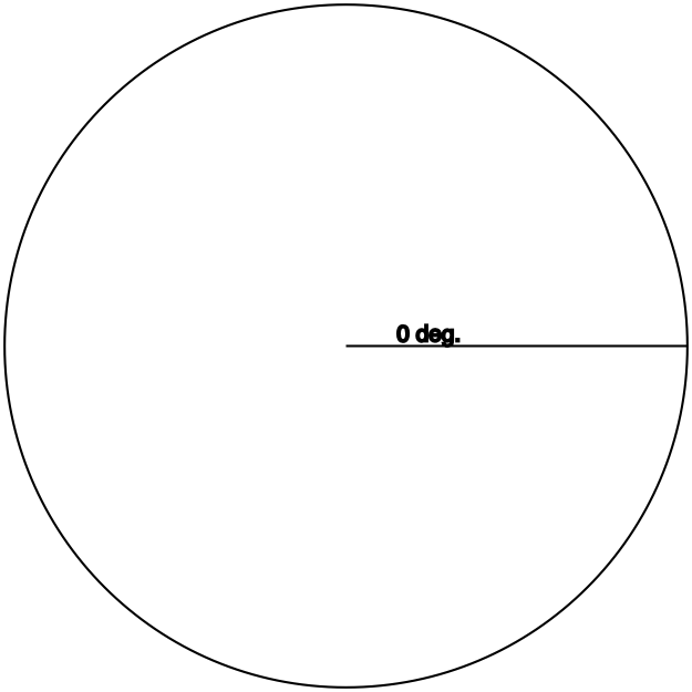
With the hypotenuse at 0°, there basically is no opposite side: The hypotenuse is in exactly the same space as the adjacent side, from the origin to the lines’ ends. Thus, they are equal, so the ratio is 1.

Sine

Definition: opposite / hypotenuse

Circle with a 90° triangle from its center

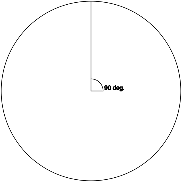
With the hypotenuse at 90° (or τ/4), there basically is no adjacent side: The hypotenuse is in exactly the same space as the opposite side, from the origin to the lines’ ends. Thus, they are equal, so the ratio is 1.

Cosine and sine: What if we swap them?

Try sin 0 or cos τ/4. What do you get?

Zero, of course. The 0° triangle has effectively no opposite side, so the sine of that (tri)angle is 01, which is zero.

Likewise, the 90° triangle has effectively no adjacent side, so the cosine (adjacent/hypotenuse) of that (tri)angle is 01.

Tangent

Definition: opposite / adjacent

You should be able to guess what the triangle for which tangent returns 1 looks like. Go on, take a guess before you scroll down.


Circle with a 45° triangle from its center

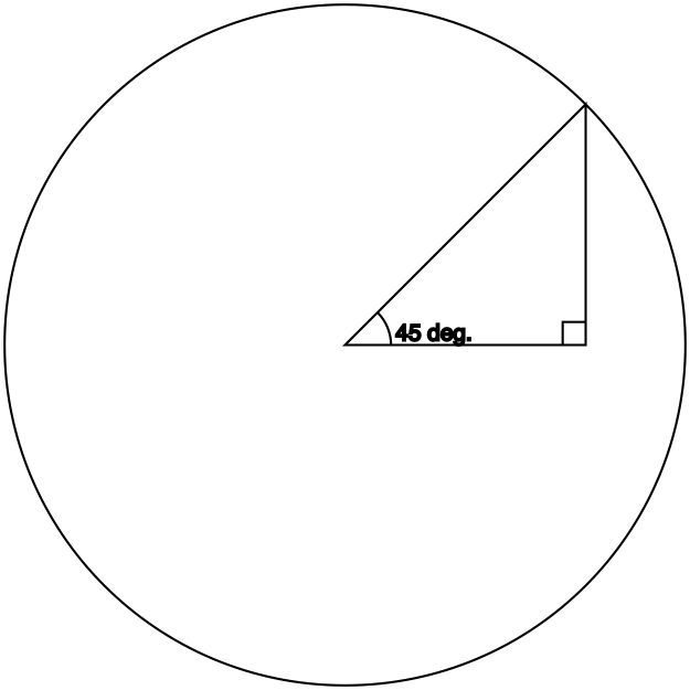
A 45° (tri)angle’s adjacent and opposite sides are equal, which is what makes the tangent function return 1.

Cosine and sine: The unit circle

Cosine and sine return the ratio of one side or the other to the hypotenuse.

Accordingly, the length of the hypotenuse affects the result. But, again, these functions take only an angle, so where do you tell it what hypotenuse to use? And why do these functions, on any calculator and in any programming language, return only a single number?

The trigonometric functions are defined in terms of the unit circle, which is a circle with radius 1.

If you look at the diagrams above, you’ll notice that the hypotenuse of the triangle always extends to the perimeter of the circle—that is, it’s always equal to the radius. This is no accident: The hypotenuse of the constructed triangle is the radius of the circle. And since the radius of the unit circle is 1, that means the hypotenuse of the imaginary triangle is 1.

Thus, the fractions that cosine and sine return are adjacent / 1 and opposite / 1. That’s why they return single numbers: the “/ 1” is simplified out.

From this follows the method to compute cosine or sine for an arc with a different radius: Multiply the cosine or sine by the desired radius.

Cosine and sine: What if we use an angle greater than 90°?

What happens if we take the cosine and sine of an angle like, say, 4 radians (about 230°)?

Let’s draw out the triangle:

Circle with a 230° triangle from its center

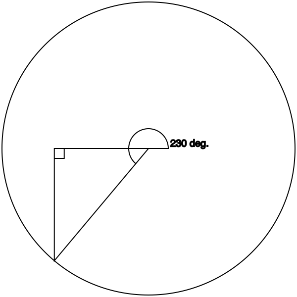
Geometrically, the origin is 0,0. As long as we’re in the 0–90° range, no problem, because both the x (cosine) and y (sine) values in that quadrant are positive. But now we’re in negative territory.

With the hypotenuse in this quadrant, the adjacent and opposite sides are now negative numbers. cos π = cos τ2 is -1, and sin (τ×34) is likewise -1. For this triangle, they’re similarly negative, though not -1.

(Exercise: What about the other two quadrants? What are the cosine and sine of, say, 110° and 300°?)

Tangent: What if we use an angle greater than 45°?

As we saw above, if we give the tangent function an angle of τ/8, the ratio is 1. What if we go higher?

Well, then the ratio goes higher. Very quickly.

Graph of tan(x) for x = 0 → τ/4

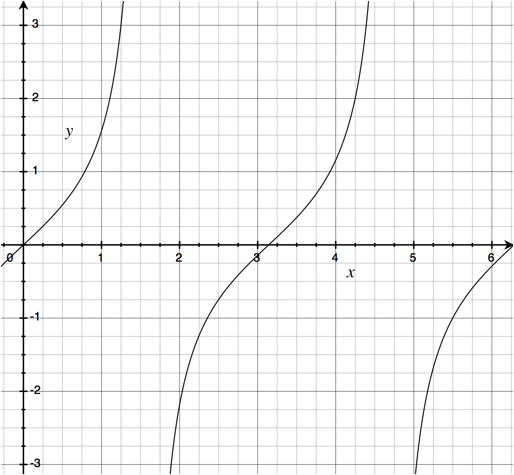
The half-curve at left is the quadrant from 0 to τ/4 (the upper-right quadrant).
The curve in the middle is the two quadrants from τ/4 to τ×34 (the entire left half of the circle).
The half-curve at right is the quadrant from τ×34 to τ (the lower-right quadrant).

In words, the tangent function returns a value from 0 to 1 (inclusive) for any angle that is a multiple of π plus or minus τ4 (45°). 0 counts (it’s 0π), as does π, as does π2 (= τ = 360°), and so on. Likewise 45°, 360-45=315°, 180-45=135°, 180+45=215°, etc.

Segmentation of a circle by what sort of values tan(x) returns

Outside of those left and right quadrants, the tangent function curves very quickly off the chart—it approaches infinity.

(Programmer note: In some environments, there are both positive and negative values of zero, in which case tan 0 returns positive zero and tan π returns negative zero. Mathematically, there is only one zero and it is neither positive nor negative.)

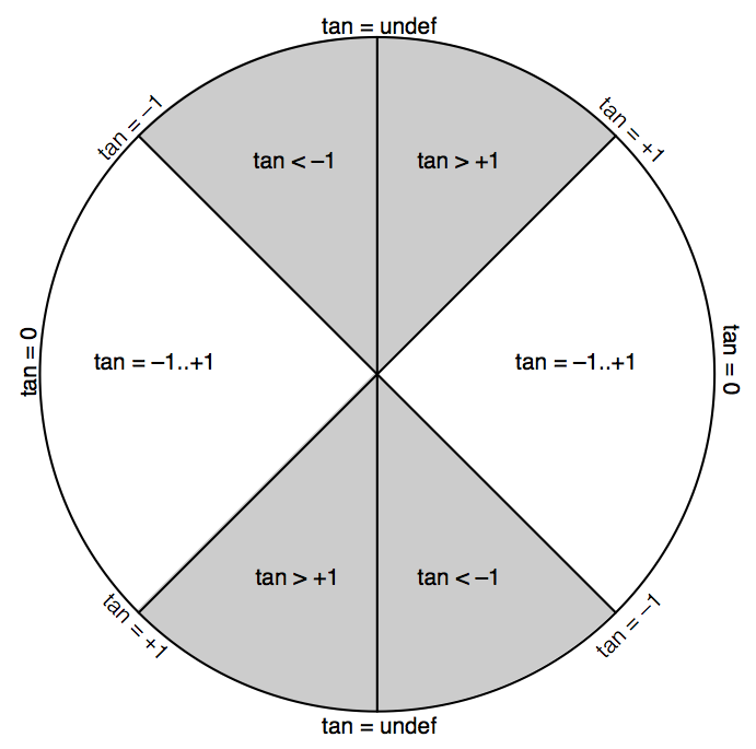
Tangent is the only one of the three that can barf on its input. Namely, a hypotenuse angle of τ/4 (90°) equates to the opposite (vertical) side being 1 and the adjacent (horizontal) side being 0 (as shown above for the sine function), so tan τ4 = 1/0, which is undefined. The same goes for tan τ34, which equates to -10.

The tangent of an angle is its slope, which you can use to reduce an angle down to whether it is more horizontal (-1..+1), more vertical (< -1 or > +1), perfectly horizontal (0), or perfectly vertical (undefined).

As a practical matter, whenever I need to compute a slope ratio, I special-case perfectly vertical angles to result in ∞.

Cosine and sine: Width and height

From the above definitions, the practical use of cosine and sine emerges: They return the width and height of the right triangle whose hypotenuse has that angle.

As described above, these results are typically interpreted in terms of the unit circle (a circle with radius 1), meaning that the hypotenuse of the triangle is 1. Thus, if you’re working with an arc or circle with a different radius, you need to multiply your cosine or sine value by that radius.

A practical problem

For example, let’s say your friend has a 50″ TV, and you’re wondering what its width and height is. Maybe she’s moving, or giving or selling it to you, or both, so one of you is going to need to know whether and where it’ll fit.

The length of the hypotenuse is the radius of the circle; in the unit circle, it’s 1, but we’re dealing with a hypotenuse (diagonal measurement of the screen) whose length is something else. Our radius is 50″.

Next, we need the angle. No need for a protractor; TVs typically have an aspect ratio of either 16:9 (widescreen) or 4:3 (“standard”). The aspect ratio is width / height, which is the inverse of the slope ratio: the ratio that the tangent function gives us (which is opposite / adjacent, or height / width). Dividing 1 by the aspect ratio gives us the slope.

Only problem is now we need to go the opposite direction of tangent: we need to go from the slope ratio to the angle.

No problem! That’s what the atan (arctangent) function is for. (Each of the trigonometric functions has an inverse, with the same name but prefixed with “arc” for reasons I have yet to figure out.)

atan takes a slope ratio and gives us, in radians (fraction of τ), the angle that corresponds to it.

Let’s assume it’s an HDTV. (I don’t want to think about trying to move an old 50″ rear-projection SDTV.) The aspect ratio is 16/9, so the slope is 9/16 (remember, tangent is opposite over adjacent); atan 916 is about 29–30°, or about 0.5 radians.

Diagram of a right triangle of 30° within a circle

I promise that my choice of 30° for the first example and subsequently deciding to measure an HDTV as the example use case was merely a coincidence.

So we have our angle, 0.5 radians, and our radius, which is 50″. From this, we compute the width and height of the television:

  • Take the cosine and sine of the angle. (Roughly 0.867 and 0.577, respectively, but use your calculator.)
  • Multiply each of these by 50 to get the width and height (respectively) in inches. (Roughly 44″ and 29″, respectively, rounding up for interior-decorative pessimism.)
  • Add an inch or two to each number to account for the frame around the viewable area of the display.

So the TV needs about 45 by 30 inches of clear space in order to not block anything.

More good iOS games


2013-05-25 17:48:32 -08:00

Inspired by this post from last year by Mike Lee, here’s a list of the best games from my iOS app library.

Many games are excluded, for any of these reasons:

  • Games on this list must not be violent (e.g., I excluded Carmageddon and even Bastion, Sonic 2, and Sonic 4)
  • Games on this list must not be Zynga-tastic (e.g., I excluded Draw Something)
  • Games on this list must not be on last year’s list (see Mike’s post)

Also, I’ve restricted myself to iOS games. Some of the games below are available on multiple platforms, but all of the links are to the iOS App Store.

The games

(Enigmo violates the “not on Mike’s list” requirement, but I gave it a pass for two reasons: because I linked to both the iPhone and iPad versions, and because I linked to the sequel.)

A language-contrast exercise


2013-03-31 14:59:34 -08:00

Python’s str type has a translate method that, given a second string representing a translation table, returns a new string in which characters in the first string are looked up at their ordinal positions in the translation table and replaced with the characters found at those positions.

The identity translation table, performing no changes, is table[i] = i. For example, table['!']* is '!', so exclamation marks are not changed. If you made a table where table['!'] were '.', exclamation marks would be changed to periods (full stops).

I’d like to see implementations of a program that does that, with the input string encoded in UTF-16 and the translation table encoded in UTF-32 (a 0x11000-element long array of UTF-32 characters), with the table initialized to its identity: table[i] = i.

And yes, you need to handle surrogate pairs correctly.

Some languages that I would particularly like to see this implemented in include:

  • C
  • Haskell
  • LISP
  • A state-machine language (I don’t know of any off-hand; this might be their time to shine)

I know how I would do this in C, and I’m sure I could bash something out in Python, but how would you do this in your favorite language?

As a test case, you could replace “ and ” (U+201C and U+201D) with « and » (U+00AB and U+00BB).

If you want to post code in the comments, <pre>…</pre> should work. Alternatively, you can use Gist.

* I’m using the C sense of '!' here. In Python, this would be table[ord('!')], since characters in Python are just strings of length 1, and you can’t index into a string with another string; ord is a function that returns the ordinal (code-point) value of the character in such a string.

“The Matrix”—the first movie—is one of my favorite movies for a few reasons, of which two stand out:

  • The visuals and sound design are exceptionally well-crafted. For just one example, consider the moment early in the movie where the human police officer unbuttons his handcuffs pocket on his belt. That moment shows the kind of beautiful sound design that you hear several times throughout the movie.
  • In the dialog, nearly everything is significant in at least one, usually more, way.

I’ll demonstrate the latter with the full text of the police interview between Agent Smith and Thomas Anderson, starting 17 minutes and 15 seconds into the film.

SPOILERS BELOW


ANDERSON is already seated at the interview table. Enter Agents SMITH, NUMBER TWO, and NUMBER THREE. TWO and THREE enter first and stand on either side of ANDERSON; SMITH sits across from ANDERSON at the table.

SMITH plops a thick green folder onto the table, whereupon ANDERSON looks at it. He then looks up at SMITH, who looks back at ANDERSON. SMITH then unwinds the cord that holds the folder shut, opens it, and begins to leaf through the pages while ANDERSON watches.

SMITH: As you can see, we’ve had our eye on you for some time now, Mr. Anderson.

This is the scene where they’re about to start monitoring him even more deeply.

SMITH: It seems that you’ve been living two lives.

SMITH: In one life, you’re Thomas A. Anderson, program writer for a respectable software company.

In a world of computers, a “program writer” would be pretty powerful, no?

SMITH: You have a Social Security number, you pay your taxes, and you… help your landlady carry out her garbage.

SMITH: The other life is lived in computers, where you go by the hacker alias “Neo” and are guilty of virtually every computer crime we have a law for.

SMITH: One of these lives has a future… and one of them does not.
[SMITH closes the folder to punctuate his last statement]

At this stage of the movie, and in this context, we’re meant to conclude—as Anderson himself presumably does in his situation—that Smith means that Anderson has a future, and Neo does not—that Anderson’s life of crime, as “Neo”, must come to an end, ideally with Anderson’s cooperation.

Of course, what actually happens later in the movie is the opposite: It is Neo who lives on past the end of the movie, and Anderson, the resident of the Matrix, whose time will soon end.

SMITH: I’m going to be as forthcoming as I can be, Mr. Anderson. You’re here because we need your help.

Again, we’re meant to believe at this point that this is simply a police interrogation, that the Agents are “Agents” in the FBI sense of the word. We are thus meant to believe that “help” means Anderson’s voluntary cooperation.

They need his help, all right, but they do not need his cooperation.

[SMITH takes off his sunglasses]

SMITH: We know that you’ve been contacted by a certain individual, a man who calls himself “Morpheus”. Whatever you think you know about this man is irrelevant. He is considered by many authorities to be the most dangerous man alive.

More words that don’t mean what we think (and Anderson would think) they mean. “Authorities”, again, does not simply refer to law enforcement; it refers to the computer systems in charge of the Matrix. “Dangerous” not in the sense of life-threatening, but dangerous to the Matrix.

[SMITH points briefly to TWO and THREE]
SMITH: My colleagues believe that I am wasting my time with you, but I believe you wish to do the right thing. We’re willing to wipe the slate clean [SMITH pushes the folder aside], give you a fresh start.

Anderson isn’t the first person they’ve made such an offer for. This is foreshadowed, ever so subtly, in the first minutes of the movie, and explicitly confirmed later on in the restaurant scene.

SMITH: All that we’re asking in return is your cooperation in bringing a known terrorist to justice.

Unlike Smith, all of Anderson’s lines have exactly one subtext, which is this: Anderson is still a resident of the Matrix, nominally aware that there is a thing called “The Matrix” but unaware of any of the particulars or its significance in his life.

As such, Anderson’s lines have no subtext, and this is, itself, their subtext.

ANDERSON: Yeah. Wow, that sounds like a really good deal. But I think I got a better one: How about, I give you the finger,
ANDERSON: ..|.
SMITH: Hm.
ANDERSON: and you give me my phone call.

[SMITH sighs]
SMITH: Oh, Mr. Anderson.
[SMITH puts his sunglasses back on]

You’ll notice that Smith takes one of his headgear items off when he’s about to behave a bit more human-like. He takes off his sunglasses to do a fairly standard interrogation on Anderson. He takes off his earpiece later on for another, different kind of questioning. In both cases, he puts them back on to return to his normal role as part of a computer system.

SMITH: You disappoint me.
ANDERSON: You can’t scare me with this Gestapo crap. I know my rights. I want my phone call.
SMITH: Tell me, Mr. Anderson… What good is a phone call if you’re unable to speak?
[ANDERSON’s mouth begins to seal; ANDERSON stands up from his chair as he panics]
[TWO and THREE walk over and seize ANDERSON, open ANDERSON’s shirt, and throw ANDERSON onto the table as SMITH steps away from it]

SMITH: You’re going to help us, Mr. Anderson…
[SMITH takes out a case full of tracers, and takes one out of the case]
SMITH: whether you want to or not.

One of the aforementioned implications is resolved here: As I mentioned above, they need only Anderson’s help, not his cooperation.


The richness of subtext in “The Matrix” isn’t limited to that one scene by any means. Most of Morpheus’s lines are similar, and the Oracle does it every bit as much as you’d expect. (“You look like you’re waiting for something. … Your next life, maybe. Who knows?”)

This is just an example, and it’s just one of the reasons why I love this movie.

I was at Staples today and saw a Microsoft Surface (the tablet, not the big-ass table) demo unit, so I spent about ten minutes with it.

Illustration of a laptop, with the thicker, heavier portion resting on the desk, and the Surface, with its keyboard cover on the desk and the thicker, heavier portion sticking up.
Yup, that’s accurate. (No idea who made it, but here’s where I grabbed it from.)

  • Their demo unit was in the Desktop (classical Windows minus Start menu) view when I found it. Looks about the same as it does on a Windows 8 laptop. The desktop proper only had the Recycle Bin on it.

  • As I’d figured out previously on a Windows 8 laptop, the Windows key on the keyboard switches in and out of the Start screen, which replaces the Start menu in previous versions of PC Windows with something a lot more like the Mac’s Dashboard.

  • I tried two of the widgets, or whatever they’d call the things on the Start screen. The first was Games, which resembles the Xbox 360 dashboard (and even says “xbox games” at the top), set in the typographic theme of Windows 8.

  • Of the half-dozen or so games listed there, most had the “Play” button disabled. The one that didn’t was “Angry Birds Space”, which gave me a barely-meaningful error message (something along the lines of “link not recognized; would you like to show this app in the Windows Store?”).

  • When I launched Word and chose the Blank Document template, it displayed the document as ready to type into briefly, then showed some kind of tutorial dialog or something (I closed it without caring enough about what it said to read it, as I do with all such dialogs). Thanks for the interruption, Microsoft.

  • Tapping on the screen instead of using a mouse feels more natural than I’d expected, although it helps having had a year and a half of training from the iPad. There’s no mouse cursor to be revealed by such actions, unlike past touch-screen versions of Windows.

  • Word on the Surface feels like a simplified version, as Pages is on the iPad. But maybe there’s some progressive disclosure that I didn’t drill down into.

  • Imagine typing on a Smart Cover. That’s about what typing on the Surface’s keyboard cover is like. You can feel some give underneath your fingers, but there’s no tactile feedback by which to know that the keypress has registered. For this reason alone, I can’t see myself adopting this as my daily driver for Real Writing as some have with the iPad + a Bluetooth keyboard.

  • Once I got a little bit used to the keyboard cover’s key-feel, my accuracy was somewhere close to what I get on my iPad’s on-screen keyboard. Unfortunately, the Surface (or at least Word, at least however it was configured there at that moment) doesn’t have auto-correct like the iPad has, so my actual output accuracy was significantly lower.

  • The biggest problem was insufficient keypresses causing missing characters. The iPad doesn’t have this problem, since a keypress is only insufficient if you miss the key outright.

  • I didn’t attempt to detach the Surface from its keyboard cover, which might have been prevented for anti-theft reasons even if it is possible with sold units. Consequently, I don’t know whether there’s an on-screen keyboard for typing without the keyboard cover.

There are no official ebooks of SICP, but there are a few unofficial ebook conversions from the free web version. Here are the two best versions I’ve found:

An insight on the construction of meals


2012-12-22 02:25:37 -08:00

Last year, I started cooking for myself rather than depending on microwaved meals and fast food.

Earlier this year, a realization dawned on me, pertaining to the basic food groups that were drilled into every kid’s head via TV when I was growing up.

Those old PSAs talked about healthy eating, and how it was Very Important to eat something from the “four basic food groups” with every meal. As a kid who greatly preferred cookies to celery, this was no sale to me—I didn’t give a rat’s ass how healthy it was or wasn’t, I wanted food that tasted good. All the droning about “healthy eating” did nothing to make me think about it when deciding what I wanted.

Fast forward 20 or so years, and it hits me: Those “four basic food groups” (the number has varied over the years, as the aforelinked article outlines) are the framework of constructing a meal.

Nearly every single meal in the American diet is some combination of those four groups.

(This is particularly true of dinner. Numerous meals for other times of day leave out some of the groups.)

Here are the groups as I was taught them:

  • Meat (nowadays more generally classified as Protein)
  • Grains, especially bread
  • Fruit and veg
  • Dairy, such as cheese

Butter seems to often get filed under “fat” and excluded, which is technically true, but whenever it makes it to the plate, I think it makes more sense to file it under dairy. (Another reason to shun margarine, the False Butter.)

Let’s look at some example meals and how they satisfy the categories.

Note: I’m not claiming that these are all healthy meals—those healthy-eating PSAs are simply where I got the “four basic food groups” from. I’m reappropriating the groups as a framework for constructing meals. Anything that checks all four boxes is automatically a complete meal.

Also, this is mostly observation, not prescription. My epiphany is that most meals, particularly nearly all dinners, already fit this framework.

Cheeseburger
  • Bread/grains: Bun
  • Meat: Beef patty
  • Fruit/veg: Any of lettuce, tomatoes, pickles, onions
  • Dairy: Cheese
Spaghetti and meatballs
  • Bread/grains: Pasta
  • Meat: Beef meatballs
  • Fruit/veg: Marinara sauce
  • Dairy: Cheese
Pizza
  • Bread/grains: Crust
  • Meat: Toppings; often pepperoni, ham, sausage, or a combination thereof
  • Fruit/veg: Sauce, plus some toppings, such as pineapple
  • Dairy: Cheese
Sandwich
  • Bread/grains: Sliced bread, such as white, wheat, rye, or sourdough
  • Meat: Sliced turkey, roast beef, or other
  • Fruit/veg: Lettuce and/or tomato
  • Dairy: Cheese
Dinner plate
  • Bread/grains: Often potato-based, such as baked or mashed potatoes; alternatively, rice
  • Meat: Steak, chicken, sliced turkey, etc.
  • Fruit/veg: Varies
  • Dairy: Cheese and/or butter

A meal doesn’t necessarily have to hit all four categories, though. Here are some that don’t:

Hot dog
  • Bread/grains: Bun
  • Meat: Meat frank, usually either beef, turkey, pork, or a mix of turkey, chicken, and pork
  • Fruit/veg: Relish (diced pickles) and/or diced onions (often both omitted)
  • Dairy: Omitted
Chili dog
  • Bread/grains: Bun
  • Meat: See hot dog
  • Fruit/veg: Usually omitted, AFAIK
  • Dairy: Cheese (optional)
Grilled cheese sandwich
  • Bread/grains: As above for sandwich
  • Meat: N/a
  • Fruit/veg: N/a
  • Dairy: Cheese

(On the other hand, panini are basically grilled cheese sandwiches that may include meat and/or fruit/veg.)

Bowl of cereal
  • Bread/grains: Cereal
  • Meat: N/a
  • Fruit/veg: Some folks put chopped strawberries or bananas on theirs, at least in the commercials
  • Dairy: Usually milk, but I eat mine dry
Pancakes/waffles
  • Bread/grains: Pancakes/waffles
  • Meat: N/a
  • Fruit/veg: As above for cereal, but can also include blueberries or similar berries (which may be either whole as a topping or chopped and mixed into the batter)
  • Dairy: Butter (optional)
Hamburger
  • Bread/grains: Bun
  • Meat: Beef patty
  • Fruit/veg: As above for cheeseburger
  • Dairy: N/a

A few points I want to acknowledge:

  • Vegetarians will, of course, exclude the meat category. (I consider veggie meats, such as tofu burger patties, to be cheating—you don’t get to check the meat box by having fake meat.) Some vegetarians will also exclude dairy.
  • Various dietary conditions, such as celiac disease, greatly restrict what sufferers can eat. I can barely imagine the problems that the tendency of American meals to fit this framework causes to sufferers of dietary restrictions that break it. (Those with celiac disease, for example, must not eat nearly all bread items—anything with gluten.)
  • I know very little of cuisine outside of the US. I wonder how much cuisine outside the US fits this same template, and how much is radically different.

This insight leads me to two conclusions:

  1. I can “invent” other meals that I might like simply by swapping items in the four boxes.
  2. It could be a worthwhile adventure to try to break out of this framework. What would a complete meal look like that doesn’t fit into all four categories? Vegetarians will have some idea in one direction; what other possibilities are there?

How to create a new class in Xcode 4


2012-10-16 12:36:04 -08:00

  1. Choose which group you want to put the class into. You must do this first, before anything else, or you will have even more work to do later.
  2. Right-click on the group or on any file reference inside it. You must create the class this way, or you will have even more work to do later.
  3. Choose “New File”. You use this same command to create classes, nibs, storyboards, plists, and files of several other types. There is no “New Class” command, and the command is called “New File” even though it often creates multiple files.
  4. Choose which platform you want to create this class for. You must choose exactly one, even if your project is cross-platform, and even if this class will be cross-platform (e.g., NSManagedObject subclass). Even if your project is single-platform, the platform for which the file(s) should be created will not be inferred from the project’s platform.
  5. (Optional) Choose which group of file templates to look in.
  6. If you performed step 5, and guessed wrong, correct yourself. (For example, OS X nibs are not among the “Resource” templates, even though they go in the Resources subfolder. You want “User Interface”.)
  7. Choose which template to use.
  8. Set the class name.
  9. Set the superclass name.
  10. Turn on “With XIB for user interface” if you’re creating a window controller or view controller.
  11. Choose where to save the file(s).
  12. Nibs created along with a WC or VC are created unlocalized (outside of a .lproj folder), so if you did step 10, select the nib and click “Make localized”.

It seems to me that there is room here for optimization.

How to ride a bike


2012-10-02 12:05:17 -08:00

For the past year (2011–2012), I’ve been teaching myself to ride a bicycle. My goal is transportation; I’d like to be able to ride at least a mile or two without burning gasoline.

I would not have been able to do this by myself without YouTube. You can learn about any bicycle-related topic you’re interested in; all you have to do is find the right video (or videos).

Background

I’m 28 as I write this; I was 26 or 27 when I started (I don’t remember which month it was). How didn’t I know how to ride a bike already?

I had a bike as a kid, with training wheels. My parents wanted to take the training wheels off. I objected on the quite reasonable grounds that the bike stayed upright just fine with the training wheels, so why did they want to make it capable of falling over?

So they gave me an ultimatum: Either we take the training wheels off, or we put the bike away and you don’t ride it again until you change your mind. Guess which one I chose.

(More recently, I found out that there’s a right and a wrong way to use training wheels. What you’re supposed to do is raise them up, a little bit at a time, so that eventually they’re nowhere near the ground, by which point the child doesn’t need them anymore and might not even notice if you take them off. That’s not what my parents did, so I never learned to ride without training wheels.)

Step 1: How to not fall over

Read the rest of this entry »

Characters in NSString


2012-06-03 18:43:45 -08:00

Working with Unicode in any encoding but UTF-32 (which we don’t use because, for nearly all text, it wastes tons of memory) has some pitfalls:

As UTF-8’s name implies, its code units (roughly speaking, character values) are 8 bits long. ASCII characters are all one code unit long (in UTF-8, this means that 1 ASCII character == 1 byte), but any character outside of that range must be encoded as multiple code units (multiple bytes). Thus, any single character above U+007F will end up as more than one byte in UTF-8 data.

This first observation is not limited to Emoji; it’s true of most characters in Unicode. Most characters take up more bytes in UTF-8 data than “characters” in an NSString.

As we’ll see a couple of tweets later, though, even NSString’s length can be problematic.

UTF-16 data may begin with a single specific character that is used as a byte-order mark.

(I should point out, just in case it isn’t obvious, that code units in UTF-16 are two bytes, as opposed to UTF-8’s one-byte code units. This still isn’t enough to encode any Unicode character in a single code unit, though, which will become important shortly.)

The BOM’s code point is U+FEFF. If you encode this in big-endian UTF-16 (UTF-16BE), it comes out as 0xFEFF, exactly as you’d expect. If you encode it in UTF-16LE, it comes out as 0xFFFE, which is not a character.

Thus, a BOM indicates which byte-order all of the subsequent code units should be in. If the first two bytes are 0xFFFE, you can guess that it’s 0xFEFF byte-swapped, and if that’s true, then the rest of the code units (if indeed they are UTF-16) are little-endian. The BOM isn’t considered part of the text; it’s removed in decoding.

The BOM is also used simply to promise and detect that the data is UTF-16: If you see one, whichever way it is, then the rest of the data is probably UTF-16 in one form or the other.

So it’s useful to include the BOM for data that may be saved somewhere and later retrieved by something that may need to determine its encoding.

-[NSString dataUsingEncoding:] includes the BOM, so that you can just take the data and write it out (if it is the whole data—more on that in a moment). Since the data it returns has the BOM character in it, the data’s length includes the two bytes that encode that character. -[NSString lengthOfBytesUsingEncoding:], on the other hand, counts only the bytes for the characters in the string; it does not add 2 bytes for a BOM.

A corollary to this is that if you send dataUsingEncoding: to an empty string, the data it returns will not be empty. So, are you testing whether the string you’ve just encoded is empty by testing whether the data’s length is zero? If so, your test is always succeeding/always failing.

One problem with the BOM is that it should only appear at the start of the data, which means you can’t just encode a bunch of strings using dataUsingEncoding: and then, say, write them all to a file or socket one after another, because the output will end up with BOMs (or, worse, invalid characters, namely U+FFFE) sprinkled throughout.

The naïve solution to that is to staple strings together, then encode and write out the entire agglomeration. If performance (particularly memory consumption) is an issue and you’re writing the output out piecemeal anyway, a more efficient solution would be to use getCharacters:range: or getBytes::::::: to extract raw UTF-16 code units into your own buffer.

Unicode, the character set, can hold up to 0x20000 characters. Foundation’s unichar type is 16-bit, which means it can only hold values within the range of 0x0000 to 0xFFFF.

This is a problem for all of the characters above 0xFFFF, including the Emoji characters, which are in the range from U+1F300 to U+1064F.

UTF-16 addresses this problem by means of a system called surrogates. It’s similar to what UTF-8 does for the same problem, except that the values that UTF-16 uses are within two defined ranges of actual characters.

Surrogates come in pairs. The first one is called the high surrogate, and the second is called the low surrogate. The ranges of usable characters are named accordingly.

The bomb character, 💣, encodes to UTF-16 as 0xD83D 0xDCA3.

NSString and CFString use the word “character” all over the place, but what they really mean is “UTF-16 code unit”. So the aforementioned single-character string actually contains two “characters”:

2012-06-03 13:15:45.498 test[14761:707] 0: 0xD83D
2012-06-03 13:15:45.501 test[14761:707] 1: 0xDCA3

Beware of such things when enforcing length limits. Be sure of whether you’re counting ideal characters or code units in some encoding. Also make sure you’re clear on whether a destination with a length limit (e.g., Twitter) counts up to that limit in ideal characters or in code-units in some encoding.

Also, as @schwa mentions in the same tweet, this all applies to characterAtIndex: as well (indeed, everything in NS/CFString that talks about “characters”). So, for example, [bombString characterAtIndex:0UL] will really retrieve only half of the character.

As noted above, each of these Emoji characters is encoded in UTF-16 as two code units in a surrogate pair. A surrogate pair has a high surrogate and a low surrogate.

The high surrogate identifies a range of 210 characters; the low surrogate identifies a specific character within that range. Since the poop character and the bomb character are within the same range, they have the same high surrogate—i.e., the same first “character” in their NSString/UTF-16 representations.

As the example demonstrates, just because a string contains only one ideal character doesn’t mean that characterAtIndex:0 will return 1.0 character. It may return 0.5 characters.

Greg Titus answered this one for me:

No worries about surrogate pairs or lengths greater than 1 for characters that exist in ASCII (≤ U+007f).

Recap

  • “Characters” in NS/CFString are really UTF-16 code units.
  • Some characters in Unicode—including, but by no means limited to, Emoji—are outside the range of what a single UTF-16 code unit—a single NSString “character”—can hold.
  • Therefore, do not assume that a single character is a single “character”.
  • Neither should you assume that a single character will be a single byte in UTF-8. That sounds obvious, but…
  • Both of the preceding rules can trip you up when checking against length limits (or sending text to something else that will do such a check). Make sure you know whether the limit is in ideal characters (U+whatever) or code units in some encoding, and make sure you count the appropriate unit and do so correctly.
  • Those rules also have a way of tripping you up whenever you extract a single “character” at a time from a string. You should probably only do this when looking for known ASCII characters (e.g., for parsing purposes), and even then, please consider using NSScanner or NSRegularExpression instead.

On the API design of CGBitmapContextCreate


2012-06-01 03:24:38 -08:00

Let’s review the prototype of the CGBitmapContextCreate function:

CGContextRef CGBitmapContextCreate (
 void *data,
 size_t width,
 size_t height,
 size_t bitsPerComponent,
 size_t bytesPerRow,
 CGColorSpaceRef colorspace,
 CGBitmapInfo bitmapInfo
);

The arguments:

  • data may be a pointer to pixels. If you pass NULL, the context will create its own buffer and free that buffer itself later. If you pass your own buffer, the context will not free it; it remains your buffer that you must free after you release the context, hopefully for the last time.
  • width and height are what their names say they are, in pixels.
  • bitsPerComponent is the size of each color component and the alpha component (if there is an alpha component), in bits. For 32-bit RGBA or ARGB, this would be 8 (32÷4).
  • bytesPerRow is as its name says. This is sometimes called the “stride”.
  • colorspace is a CGColorSpace object that specifies what color space the pixels are in. Most importantly, it dictates how many color components there are per pixel: An RGB color space has three, CMYK has four, white or black has one. This doesn’t include alpha, which is specified separately, in the next argument.
  • bitmapInfo is a bit mask that specifies, among other things, whether components should be floating-point (default is unsigned integer), whether there is alpha, and whether color components should be premultiplied by alpha.

The most immediate problem with this function is that there are so damn many arguments. This is especially bad in a C function, because it’s easy to lose track of what each value specifies, especially when so many of them are numbers. Suppose you want to make an 8-by-8-pixel grayscale context:

CGContextRef myContext = CGBitmapContextCreate(NULL, 8, 8, 8, 8, myGrayColorSpace, kCGImageAlphaNone);

Now, without looking at the prototype or the list, which argument is bitsPerComponent, which is bytesPerRow, and which are width and height?

Objective-C’s names-and-values message syntax can help with this, as we can see in the similar API (for a different purpose) in NSBitmapImageRep:

NSBitmapImageRep *bir = [[NSBitmapImageRep alloc]
    initWithBitmapDataPlanes:NULL
                  pixelsWide:8
                  pixelsHigh:8
               bitsPerSample:8
             samplesPerPixel:4
                    hasAlpha:YES
                    isPlanar:NO
              colorSpaceName:NSCalibratedRGBColorSpace
                 bytesPerRow:8
                bitsPerPixel:8*4];

But this has other problems, notably the redundant specification of bitsPerPixel and samplesPerPixel. With that and the isPlanar argument, this method takes even more arguments than CGBitmapContextCreate. More importantly, it doesn’t solve the greater problems that I’m writing this post to talk about.

EDIT: Uli Kusterer points out that bitsPerPixel is not redundant if you want to have more bits not in a component than just enough to pad out to a byte. That’s a valid (if probably unusual) use case for NSBitmapImageRep, so I withdraw calling that argument redundant.

I’m going to use the example of both of these APIs, but mainly CGBitmapContextCreate, to talk about a few principles of API design.

The first is that it should not be possible for an object to exist in an unusable state. From the moment a freshly-created object is returned to you, you should be able to use it without it blowing up in your face.

From this principle follows a corollary: Everything an object needs in order to function, it should require when you instantiate it. Otherwise, the object would exist without the needed information—and thereby be unable to function—until you provide it.

It might seem that these APIs are as long as they are in order to uphold that principle. After all, a bitmap context needs to have someplace to put its pixels, right? (In fact, CGBitmapContextCreate‘s buffer argument was required until Snow Leopard and iOS 4.) It needs to know what format the pixels should be in, right?

Now for the second principle: Any information that an object does not need in order to function should be omitted from initialization and provided afterward. In Objective-C, the most common means of this post hoc specification are readwrite properties and delegate messages. Generally, for anything that could be specified in the initializer, the post hoc way to specify it would be via a property.

We’d like to invoke the second principle and move things out of the initializer, but that would seem to conflict with the first principle: What can we move that the context does not require?

The resolution is in a third principle—one that is not specific to APIs, but applies to all interfaces, including user interfaces: An interface should have reasonable defaults for as many parameters as it can—it should only require the user to provide values for parameters for which no default can be reasonably chosen in advance.

With that in mind, let’s look at some of CGBitmapContextCreate‘s arguments and see how we might apply the reasonable-defaults principle to simplify it:

  • bitsPerComponent, bitmapInfo, and colorspace: Most commonly, the caller will want 8-bit RGBA or ARGB, often with the goal of making sure it can be used on the graphics card (either by way of a CG- or CALayer or by passing the pixels directly to OpenGL). That’s a reasonable default, so these three can be eliminated.

    We could make them properties, but there’s an alternative: We could dynamite bitmapInfo and merge some of its values with bitsPerComponent in the form of several pixel-format constants. You’ve seen this approach before in QuickTime and a few other APIs. CGBitmapContext only supports a specified few pixel formats anyway, so this simply makes it impossible to construct impossible requests—another good interface principle.

  • bytesPerRow: Redundant. The number of bytes per row follows from the pixel format and the width in pixels; indeed, CGBitmapContextCreate computes this internally anyway and throws a fit if you guessed a number it wasn’t thinking of. Better to cut it and let CGBitmapContextCreate infer it.

    Making you compute a value for bytesPerRow does provide an important safety check, which I’ll address shortly.

    EDIT: Alastair Houghton points out another case for keeping bytesPerRow. This doesn’t apply to CGBitmapContextCreate, which rejects any value that doesn’t follow from the pixel format and width in pixels, but could be valid for NSBitmapImageRep and CGImage.

  • data (the buffer): Since Snow Leopard and iOS 4, the context will create its own buffer if you don’t provide one. That makes it explicitly optional, which means it is not required.

The only arguments that are truly required are the width and height, which tell the context how many pixels it should allocate its initial buffer for in the given (or default) pixel format.

In fact, if we take the above idea of replacing three of the arguments with a single set of pixel-format constants, then we don’t actually need to make any of the properties readwrite—there isn’t any reason why the owner of the context should be changing the pixel format on the fly. You might want to change the width or height, but CGBitmapContext doesn’t support that and we’re trying to simplify, not add features.

So, what problems do the current APIs solve, what problems do they raise, and how would we address all of both problems?

  • Specifying the pixel format (bitsPerComponent, colorspace, bitmapInfo) up front saves the context having to reallocate the buffer to accommodate any pixel-size changes.

    If we simply removed the pixel format arguments from the initializer and made them readwrite properties (or a property), then the context would have to reallocate the buffer when we change the pixel format from the default (ARGB or something similar) to something else (e.g., grayscale).

    The immediate solution to that would be for the context to allocate its buffer lazily the first time you draw into it, but that would mean every attempt to draw into the context would hit that “have we created our buffer yet” check.

    A better solution would be to follow the above idea of condensing the specification of the pixel format down to a single constant; then, we could have a designated initializer that would take a pixel-format value, and a shorter initializer for the default case that calls the DI with the default pixel-format value.

  • Specifying the buffer as a plain pointer (or pointer to one or more other pointers) requires the dimensions of the buffer to be specified separately.

    It’s a mystery to me why CGBitmapContextCreate doesn’t take a CFMutableData and NSBitmapImageRep’s initializers don’t take an NSMutableData. With these, the length in bytes would be associated with the buffer, enabling the context/rep to check that the length makes sense with the desired (or default) pixel format. This would be better than the current check in two ways: First, the current check only checks bytesPerRow, ignoring the desired height; second and more importantly, the current check only checks the value you gave for bytesPerRow—it can’t check the actual length of the buffer you provided.

    (From that, you can derive a bit of guidance for using the current API: If you pass your own buffer, you should use the value you computed for bytesPerRow in computing the length of your buffer. Otherwise, you risk using one stride value in allocating the buffer and telling a different one to CGBitmapContextCreate.)

  • Requiring (or even enabling) the buffer to be provided by the caller is redundant when the API has all the information it needs to allocate it itself.

    This was especially bad when the buffer was required. Now that CGBitmapContext can create the buffer itself, even having that optional input is unnecessary. We can cut this out entirely and have the context always create (and eventually destroy) its own buffer.

  • The caller must currently choose values for parameters that are not important to the caller.

    The current API makes you precisely describe everything about the context’s pixels.

    WHY? One of the central design aspects of Quartz is that you never work with pixels! It handles file input for you! It handles rendering to the screen for you! It handles file output for you! Core Image handles filtering for you! You never touch pixels directly if you can help it!

    99% of the time, there is no reason why you should care what format the pixels are in. The exact pixel format should be left to the implementation—which knows exactly what format would be best for, say, transfer to the graphics card—except in the tiny percentage of cases where you might actually want to handle pixels yourself.

With all of this in mind, here’s my ideal API for creating a bitmap context:

typedef enum
#if __has_feature(objc_fixed_enum)
: NSUInteger
#endif
{
    //Formats that specify only a color space, leaving pixel format to the implementation.
    PRHBitmapContextPixelFormatDefaultRGBWithAlpha,
    PRHBitmapContextPixelFormatDefaultRGBNoAlpha,
    PRHBitmapContextPixelFormatDefaultWhiteWithAlpha,
    PRHBitmapContextPixelFormatDefaultWhiteNoAlpha,
    PRHBitmapContextPixelFormatDefaultCMYK,
    PRHBitmapContextPixelFormatDefaultMask,

    PRHBitmapContextPixelFormatARGB8888 = 0x100,
    PRHBitmapContextPixelFormatRGBA8888,
    PRHBitmapContextPixelFormatARGBFFFF, //128 bits per pixel, floating-point
    PRHBitmapContextPixelFormatRGBAFFFF,
    PRHBitmapContextPixelFormatWhite8, //8 bpc, gray color space, alpha-none
    PRHBitmapContextPixelFormatWhiteF, //Floating-point, gray color space, alpha-none
    PRHBitmapContextPixelFormatMask8, //8 bpc, null color space, alpha-only
    PRHBitmapContextPixelFormatCMYK8888, //8 bpc, CMYK color space, alpha-none
    PRHBitmapContextPixelFormatCMYKFFFF, //Floating-point, CMYK color space, alpha-none

    //Imagine here any other CGBitmapContext-supported pixel formats that you might need.
} PRHBitmapContextPixelFormat;

@interface PRHBitmapContext: NSObject

- (id) initWithWidth:(NSUInteger)width
    height:(NSUInteger)height;
- (id) initWithWidth:(NSUInteger)width
    height:(NSUInteger)height
    pixelFormat:(PRHBitmapContextPixelFormat)format;

//There may be an initializer more like CGBitmapContextCreate/NSBitmapImageRep's (taking individual pixel-format values such as color space and bits-per-component), but only privately, to be used by the public DI.

//Mutable so that an asynchronous loader can append to it. Probably more useful in an NSBitmapImageRep analogue than a CGBitmapContext analogue.
@property(readonly) NSMutableData *pixelData;

@property(readonly) NSColorSpace *colorSpace;
@property(readonly) bool hasAlpha;
@property(readonly, getter=isFloatingPoint) bool floatingPoint;
@property(readonly) NSUInteger bitsPerComponent;

- (CGImageRef) quartzImage;
//scaleFactor by default matches that of the main-menu (Mac)/built-in (iOS) screen; if it's not 1, the size (in points) of the image will be the pixel size of the quartzImage divided by the scaleFactor.
#if TARGET_OS_MAC
- (NSImage *) image;
- (NSImage *) imageWithScaleFactor:(CGFloat)scale;
#elif TARGET_OS_IPHONE
- (UIImage *) image;
- (UIImage *) imageWithScaleFactor:(CGFloat)scale;
#endif

@end

With the current interface, creating a context generally looks like this:

size_t bitsPerComponent = 8;
size_t bytesPerComponent = bitsPerComponent / 8;
bool hasAlpha = true;
size_t bytesPerRow = (CGColorSpaceGetNumberOfComponents(myColorSpace) + hasAlpha) * bytesPerComponent * width;
CGContextRef context = CGBitmapContextCreate(NULL, width, height, bitsPerComponent, bytesPerRow, myColorSpace, myBitmapInfo);

With an interface such as I’ve described, creating a context would look like this:

PRHBitmapContext *context = [[PRHBitmapContext alloc] initWithWidth:width height:height];

Or this:

PRHBitmapContext *grayscaleContext = [[PRHBitmapContext alloc] initWithWidth:width height:height pixelFormat:PRHBitmapContextPixelFormatWhite8];