First: Masks are good in their own right
Masks are stylish. Cloth masks in particular. Some of us have a variety of cloth masks that we cycle through whenever we go out, much like some people have a wardrobe of T-shirts or full outfits. The “cloth face covering” is one more way for people to aesthetically express themselves.
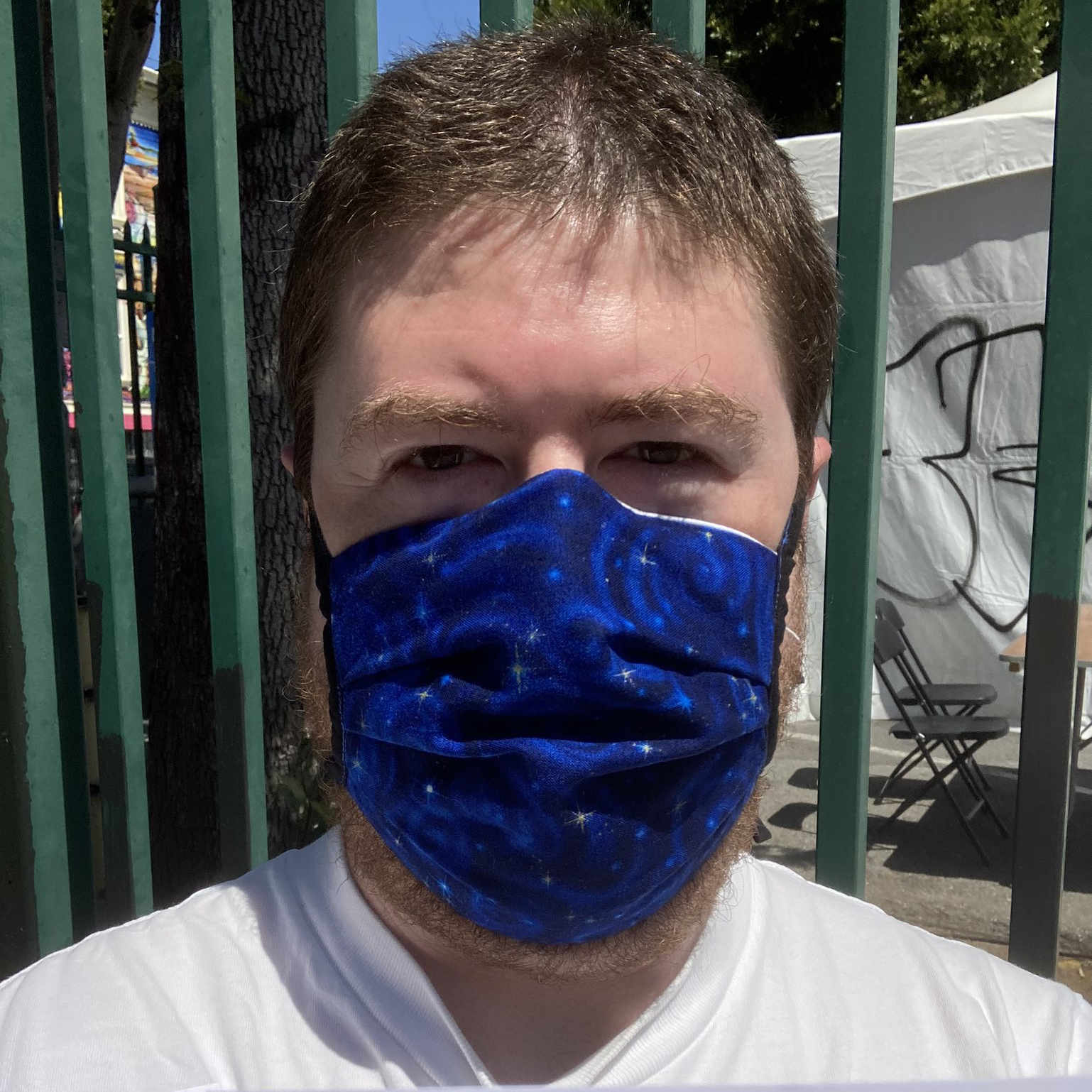
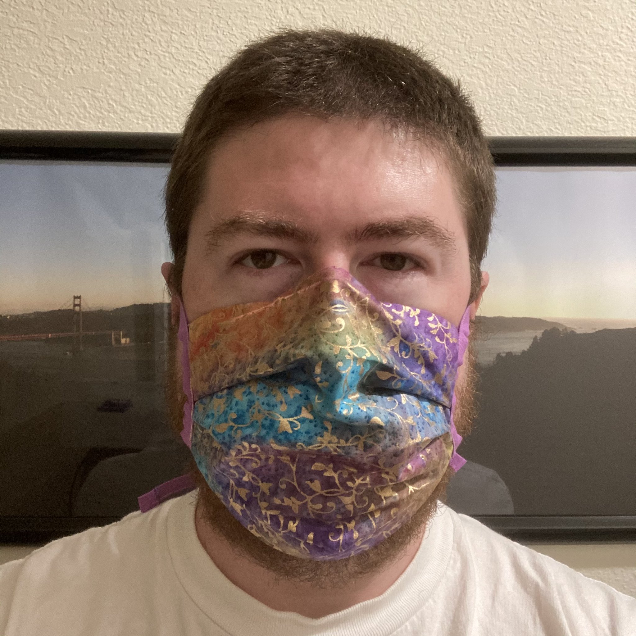
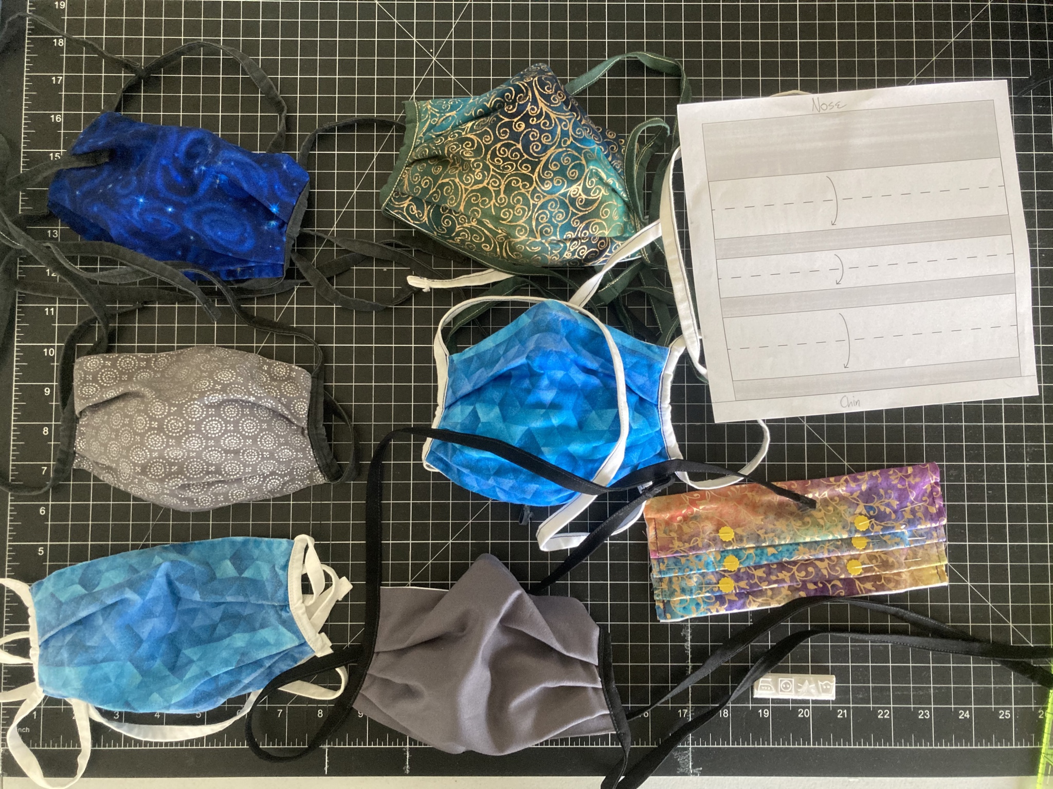
Here are some masks I’ve made (including one that was in progress at the time, seen completed in one of the photos above).
Masks prevent the spread of disease. Especially when we wear them as a community—and each and every one of us can and should contribute to that by wearing our masks.

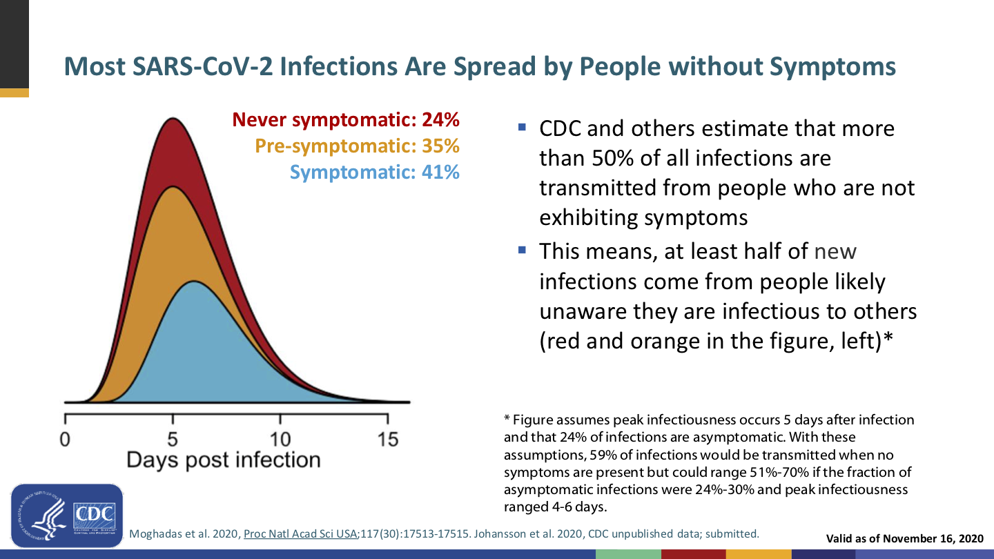
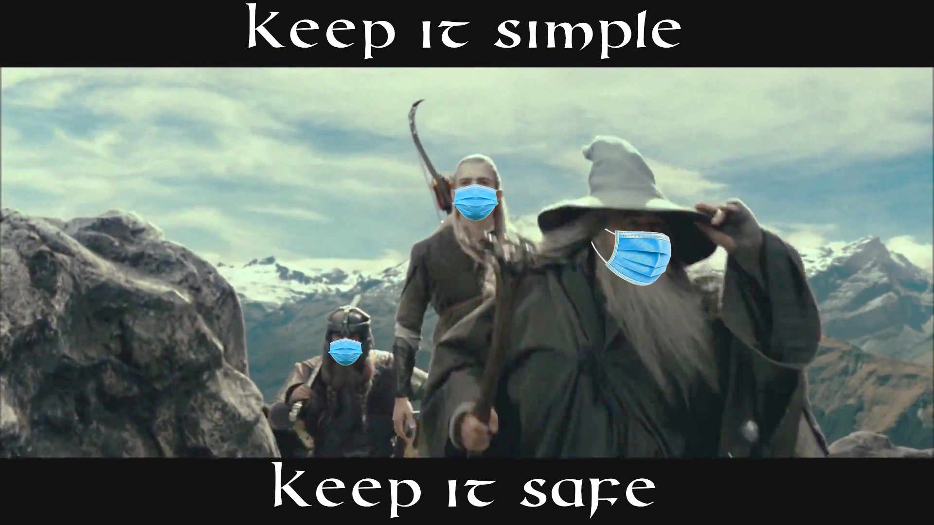
Slide from a November 2020 CDC presentation on mask necessity and effectiveness.
Remember, if you’re infected, you can spread the virus to others—who may be not-yet-vaccinated or vulnerable for other reasons—without having developed symptoms. And while the vaccines provide a staggering reduction in the chance of infection, it’s not 100%. Breakthrough infections are rare but do happen—and if you’re one of the unlucky, you can then be a vector unless you’re wearing a mask.
Slide from the same November 2020 CDC presentation on mask necessity and effectiveness.
Getting vaccinated protects you (and very, very well!), but wearing a mask also protects everyone around you.
We’ve known for over a hundred years that masks work; they were a key part of the response to the 1918 flu pandemic. And that was before modern mask technologies like non-woven polypropylene; today’s masks are even better, as Asian countries proved in 2003 during the SARS outbreak.
Oh, and speaking of flu… Have you seen our flu numbers? We fucking rekt the flu this season! That’s not all due to masks—it includes staying home and social distancing—but I’d love to see what we could do with the masks but without the restrictions.
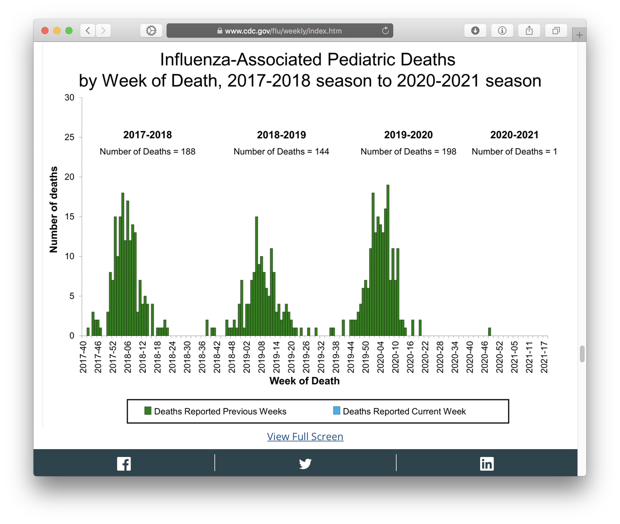
Screenshot taken 2021-05-16 of one of the graphs on CDC’s weekly US flu surveillance report.
Do we want to go back to killing 150–200 children a year?
Masks prevent the spread of disease. They reduce the chance of the wearer catching something, and they’re even better at reducing the chance of the wearer spreading something. And they’re more effective the more of us keep masking up.
Defense in depth. Positioning masks’ effectiveness as something to be left behind in favor of vaccines’ effectiveness poses a false dichotomy: that we must choose one or the other, and the vaccines are better. We should instead recognize that, well…

Defense in depth means layering multiple defenses to create a better defense than any single layer could achieve on its own, because even when one layer fails, other layer(s) can still stop the failure and keep you safe.
The right answer isn’t a false choice between masks or vaccines; the right answer is masks and vaccines.
Masks are a signal that “I am (still) taking this seriously and you should too”. We are still in a pandemic, and it’s not yet certain whether covid will ever be Behind Us Once And For All, or will instead become a permanent fixture of life that everyone gets sooner or later and has some percentage chance of mortality, not unlike flu, or permanent disability.
Masks communicate to everyone around you that you know covid and other airborne illnesses are dangerous and to be taken seriously, and that you are taking this simple, positive measure to protect them as well as yourself.
I have a much longer rant on the notion of “virtue signaling”, but what it boils down to is that whinging about “virtue signaling” was always disingenuous pap, and that modeling good behaviors is actually a good thing. Setting a positive example is a good thing. Leading by doing is a good thing. Fuck the haters; be a positive example and proud of it.
This is the social component of public health. It’s not enough for CDC and your state and county health departments to yell from the mountaintops “you should do X!”. The way to get everyone to do X is for everyone around them to do X. You can help by being one of those examples.
Masks protect numerous groups of people against harassment, violence, or other unpleasantness. Julia Carrie Wong wrote the definitive piece on this. You have:
It’s easy to be OK with losing masks if you don’t feel like you’re losing anything. For some folks, masks were a big net gain in ways that have nothing to do with disease transmission.
Second: Abandoning masks is premature and ill-advised
The pandemic isn’t over. As I write this, the CDC’s data tracker shows approximately 35,000 new cases of covid in the United States each day. This is not the time to start scaling back the non-pharmaceutical interventions that keep that daily number from being higher.
Lots of people still aren’t vaccinated yet. 12–15-year-olds only just became eligible for the Pfizer vaccine. That vaccine comes with a three-week period between jabs, plus the two-week period afterward for immunity to build up. It would be five weeks from now when we could consider people in the 12–15 age range protected, if we could vaccinate all of them at the same time, which we can’t.
12–15-year-olds won’t be fully vaccinated for another two months at minimum. So keep your shirt on.
On top of that, there are plenty of adults and 16- and 17-year-olds who either haven’t started or haven’t completed their vaccination series yet. Yes, some will be unreachable anti-vaxxers, but we should try to get as many as possible started, and wait until they are fully vaxxed.
And it’s not just about age—access is also a tremendous factor. Many people can’t afford to take time off work, especially up to three days for jab #2 (one day to get the jab, then up to two days of potential side effects). Some disabled people can’t get vaxxed unless people administering vaccines come to them.
Just because everyone you know is vaxxed doesn’t mean we’ve finished the roll-out.
We don’t yet know whether certain groups of people are protected by the vaccines. Particularly immunocompromised and immunosuppressed people. They can still get a vaccine, but the jury’s still out on whether it’ll actually protect them. It’s plausible (but yet to be proven) that it won’t, because the purpose of the vaccine is to train the immune system to respond to the virus’s spike proteins. If the immune system is suppressed or compromised, what can we expect from that? We don’t know yet.
For the sake of their safety, we kind of have to assume that them getting vaccinated will not be enough to protect them.
Both of these last two facts combine to mean we cannot jump to the conclusion that we have vaccinated enough people by this point for us to leave masks behind. It’s simply too early.
We don’t know yet how long immunity built by vaccination lasts. Antibodies from natural covid infection last at least 8 months, possibly longer. Covid reinfections do occur, though they are rare. With the vaccines being only a few months old, we haven’t had enough time yet to know how long vaccine-induced immunity will last.
Even if we all get vaxxed, if we all drop our masks and then the immunity fades after a year or so, covid could come roaring back.
And if that happens, it’ll be a couple of weeks of growing community transmission—likely in numerous locations all over the country and the world in parallel—before we know it. Remember, most covid transmission happens without symptoms, and each new case takes a median of 5 days to develop symptoms (if they do at all). By the time we realize that there’s a resurgent outbreak, it’ll already be a big problem.
Strong community masking can help prevent and impede such outbreaks.
CDC does not consider the social aspects of public health. This has become abundantly clear over the past year-and-a-half.
CDC does a lot of good work gathering evidence (especially that—if you want a relevant study, the CDC probably has it on their website) and maintaining updated recommendations, but sometimes, their guidance is overly skewed to what you can do to protect yourself, without consideration to social aspects like what these actions imply to other people or building interest in protecting your community.
Take the CDC’s disastrous new guidance: “Fully vaccinated people can stop wearing masks.” As a statement of actual necessity, this is true: if you’re vaccinated, your risk of disease is low and your risk of transmission is infinitesimal. It ignores the concept of defense in depth (vaccine plus mask is better than vaccine without mask), but it’s fair enough to say that a mask on a vaccinated person is no longer strictly necessary.
But consider the social aspect: We now have the implication that mask-wearers are the unvaccinated. The implied intention seems to be to incentivize vaccination—“you can leave your mask behind!”, ignoring that masks are good, actually—but I think this could send exactly the opposite message, that all these mask-wearers you still see suggest that maybe the vaccine is not such hot shit.
Further, suppose mask-wearing gets rarer down the line. Then, the implication that mask-wearers are unvaccinated could lead to some unpleasant (not to mention invasive) “why haven’t you gotten vaxxed?” questions. This is why the false dichotomy is harmful; we need people to know that both is an option.
We should be sending the message that getting vaccinated is popular, because the vaccines are good and fantastically effective, as well as free to literally anyone and by this point extremely plentiful. And that masking is also good, and you should do that, too.
Mask-abandonment as incentive to get vaccinated also supports anti-mask rhetoric. Fuck those people and their bad-faith whinging. They’ve already had more influence on public health than they deserve to have had; leave them behind and focus on promoting all of the things that actually help.
“Need to” is the wrong question. CDC and other public health authorities, at least in part motivated by trying to satisfy the bad-faith whinging of anti-maskers, have been trying to draw a precise shape dividing when you do need to wear a mask and when you don’t need to, based on vaccination status, mixing of households, distancing, indoors vs. outdoors, and on and on and fucking on.
This is the wrong question. The right question is whether you should wear a mask, and the right answer is yes.
There are exactly two exceptions:
The latter is why we shouldn’t go around policing people’s mask-wearing—they might have an actual reason that is none of your business—and why the anti-maskers are assholes for abusing that as an excuse to spread disease.
Notice how simple this is. Unless you are younger than 2 or otherwise medically contraindicated, wear a mask whenever you are outside of your home or car. Simple. Easy.
Trying to precisely circumscribe when people “need to” wear a mask and when they don’t is doomed to failure. Nobody can remember that shit. The more you complicate it, the more you ensure people will get it wrong in one direction or another, or will give up on understanding it and consequently ignore it.
If you want everyone to do the right thing, you have to keep the right thing simple:
Wear a mask whenever you are outside your home or car.
Some acknowledgements
Universal masking has been rough on d/Deaf and hard-of-hearing people. Lip-readers, particularly.
I don’t have a simple answer for this. The National Association of the Deaf recommends clear masks, but those are few and far between and my understanding is they kinda suck. They have other recommendations, too, including whiteboards and phone apps and, as a last resort and only upon request, standing two meters away and pulling down your mask to talk.
I know some lip-readers wear buttons that say “Please face me—I read lips”. We may start seeing buttons that say “Please lower your mask—I read lips”, though asking disabled people to take on an expense to accommodate people without that disability is always problematic.
Certainly the vaccines—once enough people are fully vaccinated—will make it much safer to drop a non-clear mask to talk to people. I hope we do get to a point where it will be safe enough to reserve masks for when one is exhibiting symptoms of illness, and trust our vaccinations to prevent outbreaks.
We are traumatized. The pandemic has been a year-and-a-half of hell, more for some of us than others, but even folks like me who are privileged and generally introverted have still had a rough time of it.
I do think this has gone both ways: There are people who are hesitant to give up the safety of masks, as well as people who just want to “go back to normal”—including no more masks—right the hell now. I think these are different expressions of the same year+ of trauma.
Give people time and space to come out of this in their own way, at their own pace. Don’t rush people “back to normal”—all that does is compound the harm and prolong the pandemic.
At the same time, be compassionate with those who want the pandemic to be over (not to be confused with covid deniers)—we all want the pandemic to be over, and in order to make that happen, it’s important that we not rush to abandon our protective measures prematurely. Short cuts make long delays.
In conclusion
Do otherwise-healthy, fully-vaccinated people need to wear masks? I won’t try to argue against the evidence: Generally not most of the time.
Can we wear masks? Yes, especially when many of us do it and normalize it.
Should we wear masks? Yes. Cloth masks can look cool as hell and wearing masks helps protect everyone. You especially should wear a mask when you are sick.
Will we wear masks? That’s up to us. The new guidance doesn’t have to stop us.
Will I continue wearing my masks? Abso-fucking-lutely.


![Wicked Cushions Upgraded Gaming Earpads installation instructions. 1: Gently pull the [old] ear pad out. 2: Notice the gap, this is where you will need to insert the cushion lip [on the new pad]. 3: Gently insert the ear pad lip to the top of the ear cup. 4: Move around the ear cup and insert the lip. 5: Tip: Insert your finger inside the cushion to have a better grip of pulling the lip, it is very flexible and it will not rip.](https://boredzo.org/blog/wp-content/uploads/2021/06/Wicked-Cushions-Upgraded-Gaming-Earpads-installation-instructions-cropped.jpg)