Archive for the 'Reviews' Category

Dash mini rice-cooker review

Saturday, September 24th, 2022

I originally wrote this review on the product listing on Target’s website, but unfortunately Target’s website isn’t really designed for reviews longer than a paragraph. So here’s the Director’s Cut.

Ratings

  • Overall: 3 out of 5
  • Design: 3 out of 5
  • Quality: 4 out of 5
  • Ease of use: 2 out of 5
  • Easy to clean: 5 out of 5
  • Value: 4 out of 5

Pros:

  • Yup, it’s smol.
  • The lid and pot are dishwasher safe.
  • The pot is non-stick and indeed the rice did not stick.
  • Comes with a rice-measuring cup (160 ml) and rice paddle.

And it does make pretty good rice, assuming you get the ratio correct. If you like yours a little crispy on the bottom, this’ll do you well. If not… well, me either, but we’ll live.

Cons:

  • First thing out of the box, I had to repair the lid, which was assembled incorrectly. (The lid screw was drilled into the knob off-center. I unscrewed it and screwed it into the hole it was supposed to be in.)
  • The rice-making instructions are almost useless. Like most rice cookers, they tell you to measure the rice using the provided 160-ml cup. But then they give you the rice:water ratios in terms of US 240-ml cups! Treat them as ratios; for white rice, 160 ml of dry rice needs 200 ml of water. (You could use a regular measuring cup, or use the rice cup to measure 160 ml of water and then 40 more.)
  • The marks on the inside of the bowl are completely useless. They’re labeled as “0.5 cup” and “1 cup”. They’re actually 1.5 and 2 US cups! Pour in water up those lines and then pour it out into a 2-cup measuring cup and you’ll see. The “1 cup” line marks how much rice you’ll get from 1 rice-cup of dry rice—which is exactly no help when trying to measure the rice or the water in the first place. If you dump in water up to that line, it’ll be way too much. (Remember, the right amount of water for that much white rice is 200 ml. 2 US cups is 480 ml!) I knocked a star off of “Ease of use” for this.
  • The LEDs are surprisingly dim. In a bright kitchen, it’s hard to tell whether it’s on Cook or Warm.
  • There’s no on/off switch, so plugging it in immediately turns on Warm mode. Fairly typical of low-end rice cookers like this one. You may want to get a switch tap if you’d like to leave it plugged in.

Conclusion

Soooo there’s a bit of homework. But once that’s all sorted, it works fine. Made decent rice.

Bonus tip that I didn’t mention in the Target review: Add one-quarter teaspoon of garlic salt to the rice+water for tasty garlic rice.

Wordle

Monday, January 3rd, 2022

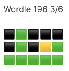
Some of you have probably seen some mysterious tweets on Twitter consisting of several rows of yellow, green, and white or black emoji squares (much to the consternation of screen-reader users), sometimes also containing the name “Wordle” and what appears to be a score.

Screenshot of a Wordle tweet, bearing the name “Wordle”, the number 196, the score of 3 out of 6, and three rows of five emoji squares: the first having four black and one green, the second having two green and one yellow, and the third and final being all green.

Wordle is a word puzzle game by Josh Wardle. The game is this:

  • Every day, there is a new five-letter word to guess. The word changes every day at midnight.
  • You have six tries to figure out what the word is.
  • In each of your guesses, the game highlights which letters were right but in the wrong place (in yellow) and which were right and in the right place (in green). (There’s also a color-blind mode that changes the color assignments to blue and orange, respectively.)

If you guess the word, the victory screen includes (at least on some browsers; it doesn’t show up on my iPad) a Share button that gives you the spoiler-free emoji representation of how you did.

There have already been two reimplementations that remove the one-word-per-day limit and simply give you a new random word every time you play:

The former also has a slider for word length, so you can try for longer words if you want. The number of guesses doesn’t increase, though.

Tips

If you’re happy with your Wordle game as it is, feel free to skip this section.

Solving word games (including Boggle and similar games) generally starts with the approximate high end of the frequency distribution of letters in English text, “ETAOIN SHRDLU” (or, more freshly but less pronounceably, “ETAOIN SRHLDCU”).

Based on that, my opening gambit in Wordle consists of the following two words:

  1. EARNT
  2. SOLID

The other two implementations don’t recognize EARNT, so my alternate opener is:

  1. LEARN
  2. STOIC

Either of these openers will usually give you at least a couple of letters that are somewhere in the puzzle, and get you started on eliminating the remaining letters of the alphabet. You still have a few other common consonants and a couple of vowels (U and Y) to try before moving on to the less-common letters.

My other tip—really more of a heads-up—is that the game does sometimes use words that contain multiples of a letter, so don’t assume that the fifth letter you’re looking for is one you haven’t already picked—it may be a double letter (e.g., SPOOL) or a letter that appears twice (STAYS).

Aftermarket headphone earpads

Saturday, June 19th, 2021

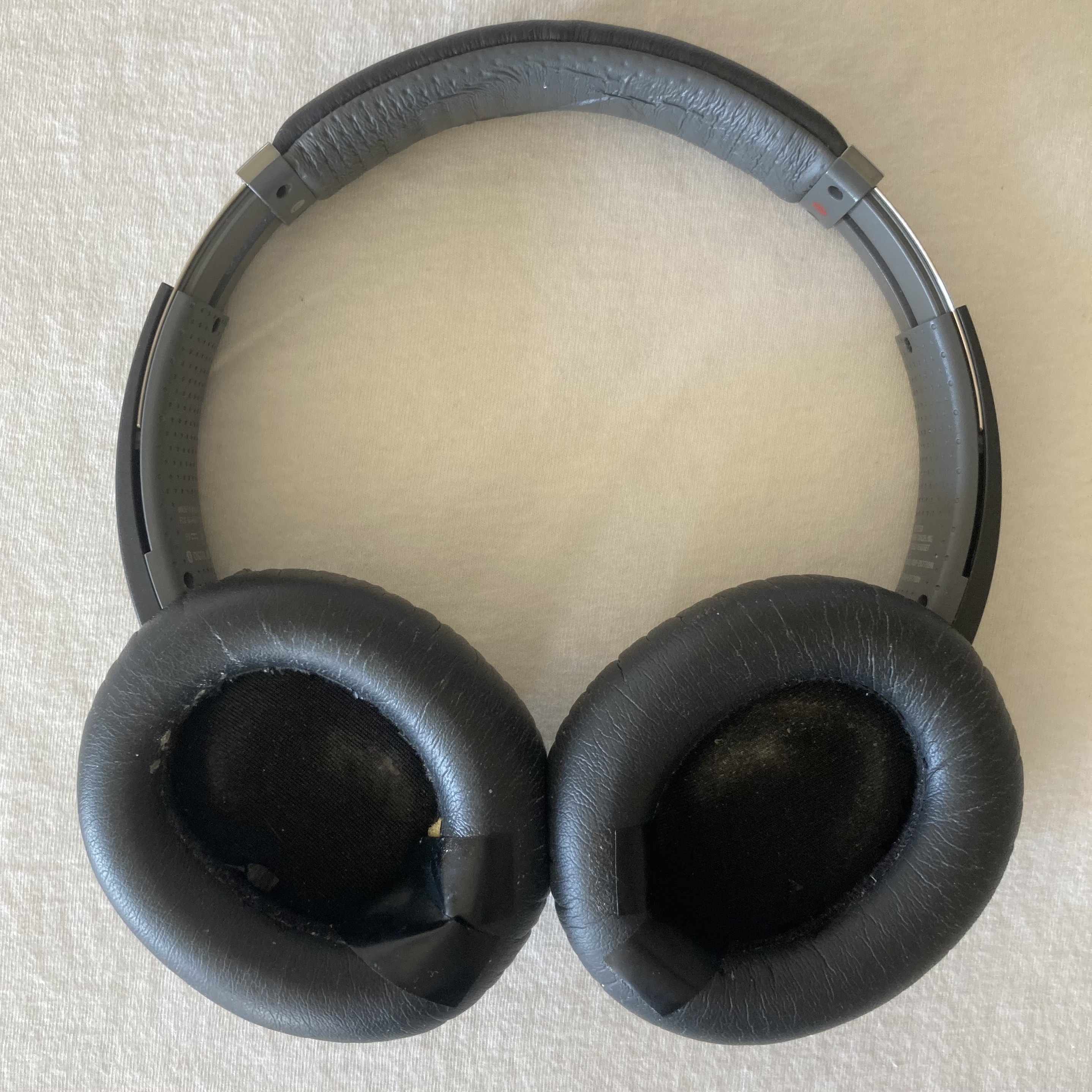
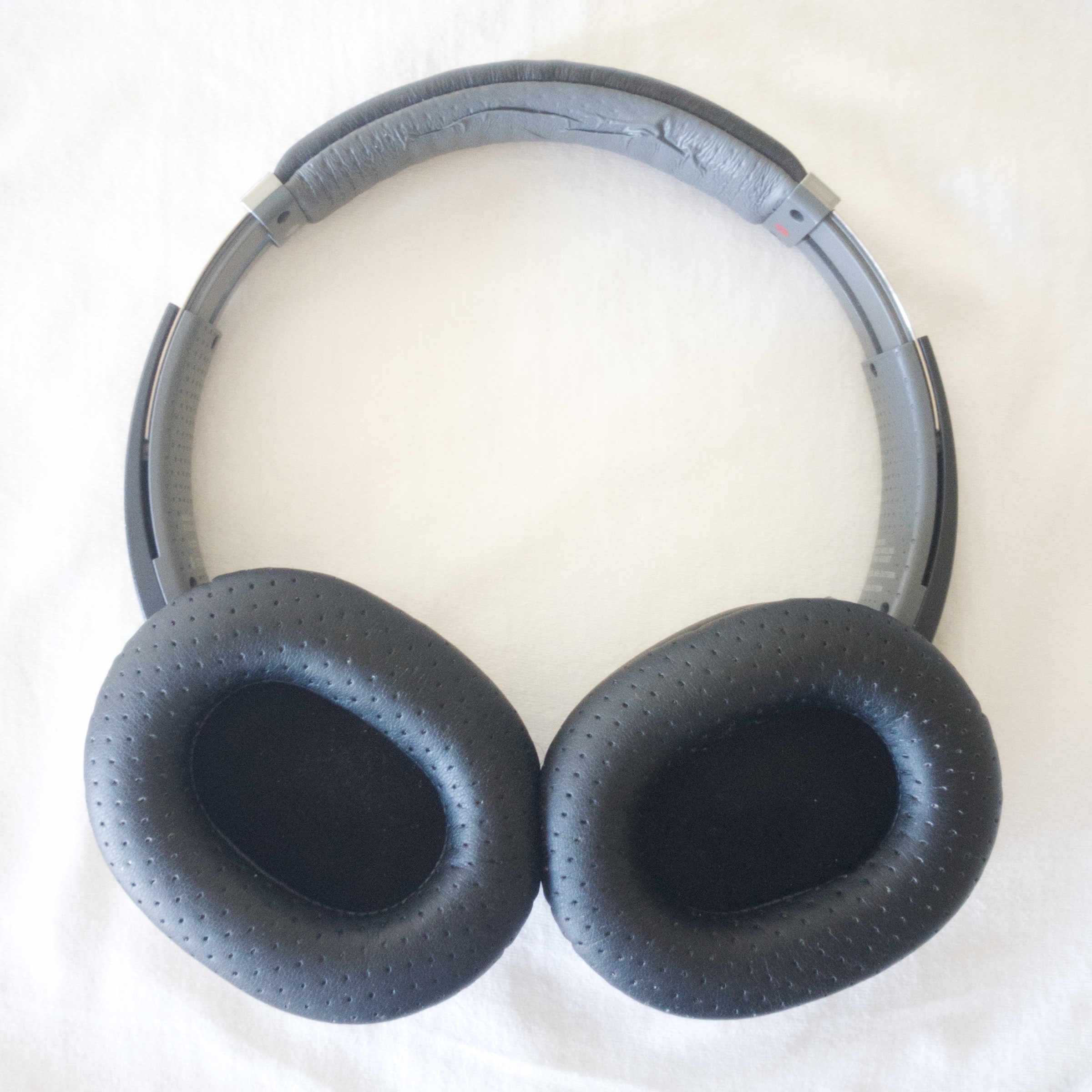
I have a pair of Sony MDR-ZX770BN headphones that I’ve had for the better part of five years. They’re discontinued, replaced by another model, which I already bought one of to succeed this pair when its service life ends.

I had thought that day was nigh, as the earpads on these headphones had started to fall apart:

The stock earpads have each developed a hole along the bottom curve, exposing the foam inside. Each hole is vainly patched over with poorly-sticking electrical tape.

As shown in the picture, I tried patching the holes with electrical tape. This basically didn’t work; the tape simply doesn’t stick to the pads’ exterior material.

So I went researching alternative methods of patching the holes—and in so doing, discovered that you can buy new earpads for some headphones, and replace the old earpads with the new ones. This is fantastic; it means that instead of replacing perfectly-working $150 headphones, I get to replace the one deteriorating part with a $20 replacement.

There are two vendors for these that I’ve found: Brainwavz Audio, which makes a wide variety of products including earpads, and Wicked Cushions, which is specifically focused on earpads (and has some repair/DIY info on their website as well, which is cool).

Neither one has products specifically for my headphones—but it turns out that the Sony MDR-7506 uses the same size/shape earpads, so Brainwavz lists my headphones as a compatible model on their 7506 earpads. Wicked Cushions also has earpads for the MDR-7506, as well as “upgraded gaming earpads” for my HyperX Cloud Mix headphones.

(Why do I have two pairs of headphones? Partly because I’ve had the Sony ones longer, but also, I bought the HyperX Cloud Mix this year for videoconferencing, which its boom mic makes it much better at. I still use the Sony headphones for music listening.)

It turns out the “upgraded gaming earpads” also fit my Sony headphones, even though they’re not listed as compatible with them.

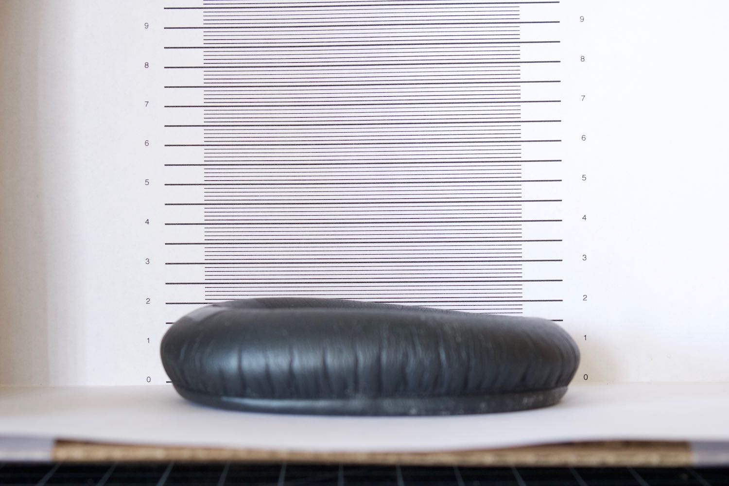
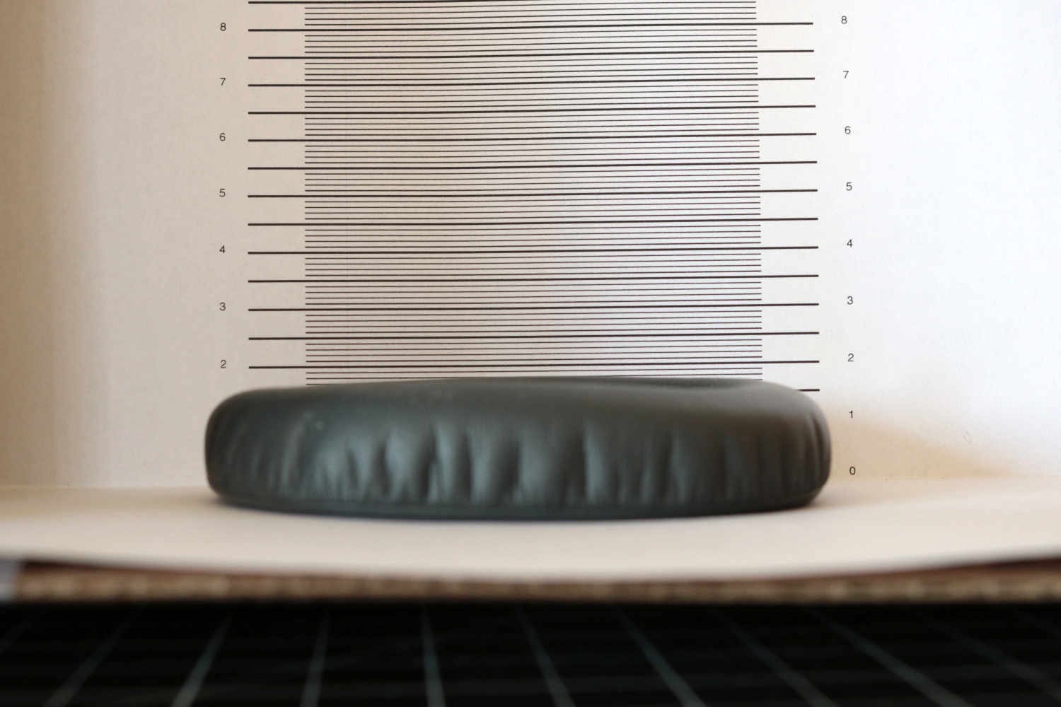
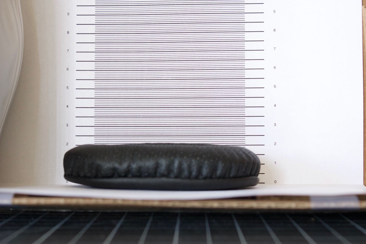
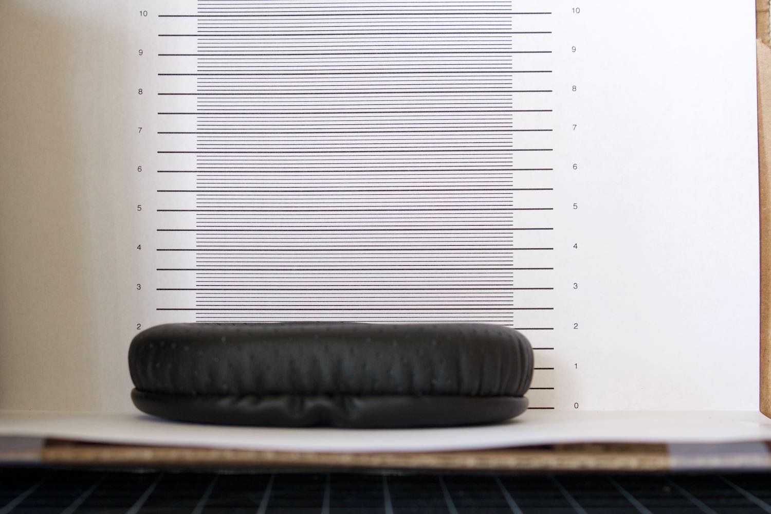
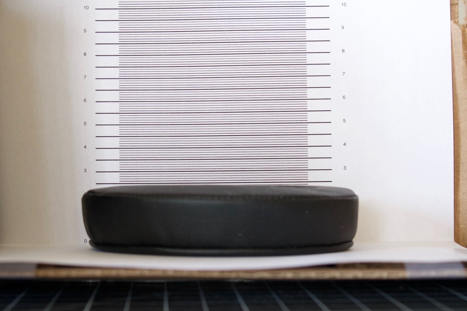
Here are the earpads’ thicknesses:

  • Sony MDR-770BN stock: Approximately 16–18 mm (this is tricky to measure because both earpads had ruptured near the bottom curve, which allows the foam to expand in that area and makes the unopposed thickness uneven; the unopposed thickness around the rupture is 21 mm)
  • Sony WH-CH700N stock: 17 mm (these are the successor model to the MDR-770BN, and I’ve confirmed that the earpads are interchangeable between them)
  • Brainwavz MDR-7506: 20–21 mm
  • Wicked Cushions MDR-7506: 21 mm
  • Wicked Cushions “upgraded gaming earpads”: 24 mm

Photo of one stock earpad from the Sony MDR-770BN headphones in front of a height scale in mm.Photo of one stock earpad from Sony WH-CH700N headphones in front of the height scale.Photo of one Brainwavz MDR-7506 earpad in front of the height scale.Photo of one Wicked Cushions MDR-7506 earpad in front of the height scale.Photo of one Wicked Cushions “upgraded gaming earpad” in front of the height scale.

L–R: MDR-770BN stock, WH-CH700N stock, Brainwavz 7506, Wicked 7506, Wicked “upgraded”. Click each to embiggen.

The difference between the Brainwavz and Wicked Cushions replacements may seem slight, but I actually find the Wicked ones more comfortable for extended wearing. They’re firmer as well as ever-so-slightly thicker.

The “upgraded gaming earpads”, however, between their greater thickness and their rectangular rather than round cross-section, are more comfortable than any of the rest. I’m quite sure I could comfortably wear these all day. Any compatible replacement would extend the life of my headphones, but the “upgraded gaming earpads” truly are an upgrade.

Installation, on my headphones, is easy; the old earpads can be simply slipped off the rim they sit on (if you’ve ever changed a bike tire, it’s kinda similar), and the new earpads pulled on. I found it easiest to put the earpads on at a right angle to their normal orientation, with the top or bottom edge of the headphone rim going into a broad side of the earpads, and rotate the earpads into the correct position as I pull them onto the rim.

Wicked’s website notes that some headphones have the earpads glued or otherwise anchored on. Luckily, my Sony headphones are not in that category.

Wicked also included a little instruction sheet in their package, which was a nice plus.

Wicked Cushions Upgraded Gaming Earpads installation instructions. 1: Gently pull the [old] ear pad out. 2: Notice the gap, this is where you will need to insert the cushion lip [on the new pad]. 3: Gently insert the ear pad lip to the top of the ear cup. 4: Move around the ear cup and insert the lip. 5: Tip: Insert your finger inside the cushion to have a better grip of pulling the lip, it is very flexible and it will not rip.
Click to embiggen.

Based on these findings, I can recommend Wicked Cushions’s replacements, both the straight-across replacement and (if compatible with your headphones) the “upgraded gaming earpads”.

Since originally writing this post, I did switch back to the Wicked MDR-7506 earpads. They’re still plenty comfortable, and I might as well use ’em since I bought ’em.

“After” photo of my MDR-770BN headphones with the Wicked Cushions MDR-7506 replacement earpads installed.

What got this post out of my drafts and onto the web is that Wicked Cushions is having a sale this weekend, June 18–20, for 30% off of their products with the coupon code “WCPrime”. So if you want to order some replacement earpads for your headphones, now is an excellent time to do that.

Review: Raspberry Pi 3 Model A+

Thursday, January 2nd, 2020

TL;DR: It’s $25 (not including case); it’s good; you should get one and set up Pi-Hole on it.


Quick history recap:

When the first Raspberry Pi was introduced, it came in models A and B. Initially, the only differences were Ethernet (the B had it; the A didn’t), USB (the B had two USB ports; the A had only one), and RAM (the A had half as much).

Later, they introduced the B+, with more GPIO (general-purpose input/output) pins.

Then they introduced the A+, with all the guts of the Model A, and the larger GPIO pinout—but on a smaller board, over 20 mm shorter on the board’s longer dimension. (The A+ is still not quite square, but it’s a lot closer.)

Both of the original A models, however, suffered a big drawback over the B and B+: No networking.

On a B or B+ board, you could plug in hard Ethernet, or use your other USB port to plug in a Wi-Fi dongle. No contention with your USB keyboard and mouse (or Bluetooth dongle). On an A or A+ board, with no Ethernet and only one USB port, you had to choose between your input devices and a network connection—or else add an external USB hub, at which point you might as well just get a B+ in the first place.

The second generation skipped having any sort of Model A entirely. There was only the Model B.

The third generation was the first to have built-in Wi-Fi and Bluetooth. Like the second generation, it debuted as only a Model B, which supported only 2 GHz Wi-Fi (no 5 GHz). Two years later, that was succeeded by the third-generation B+, now supporting 5 GHz Wi-Fi.

The B+ was followed a few months later by the return of the Model A+.

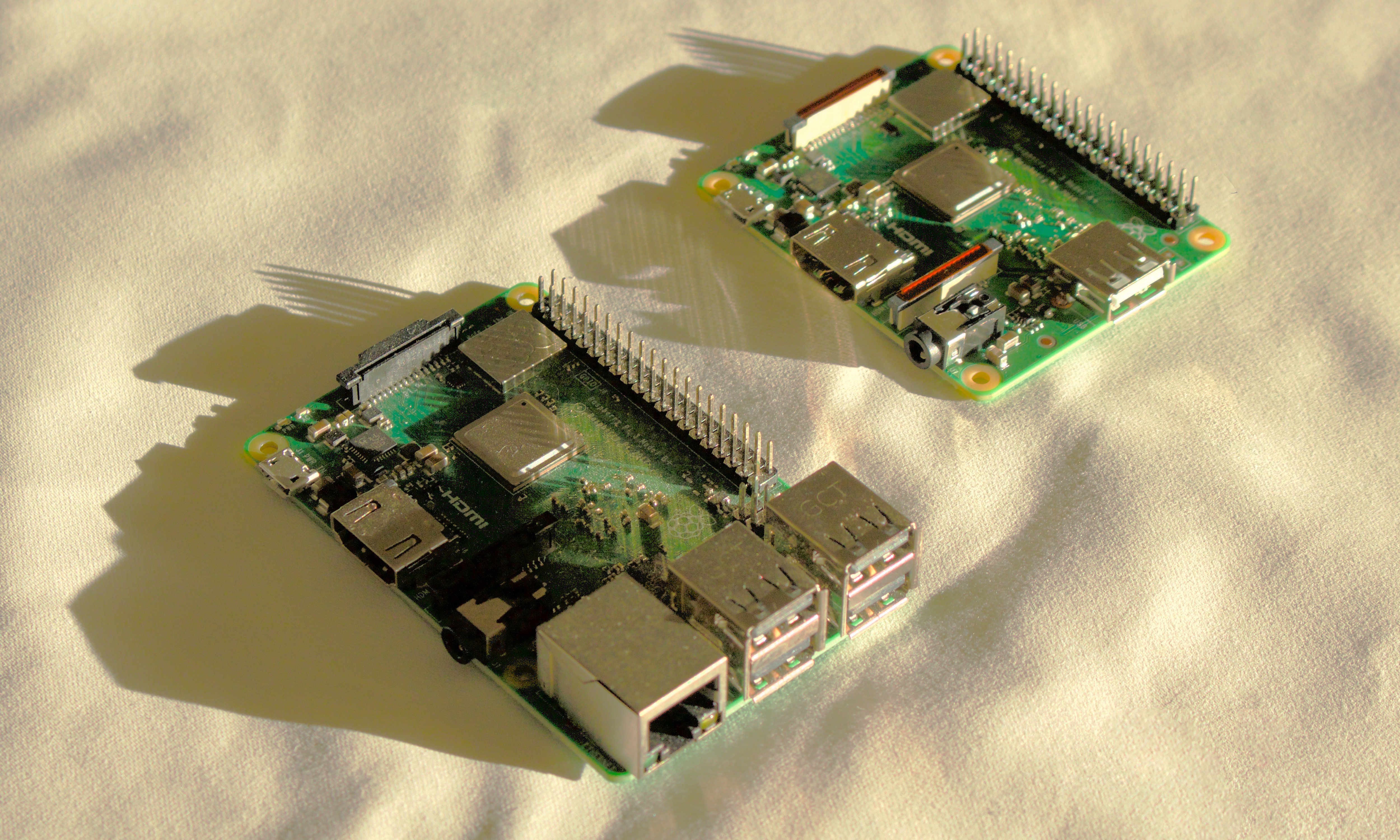
Side-by-side comparison of Models A+ and B+ (of the third generation).

The Pi 3 Model A+, like the original A+, has half the RAM of its bigger sibling, only one USB port, and no hard Ethernet. But, it has the Bluetooth and dual-band Wi-Fi support of the third-gen B+.

Previously, you basically needed a B+ to do anything networked, including software updates, without having to add an external USB hub. Now, an A+ alone is perfectly sufficient for most Raspberry Pi applications, especially those that treat the Pi as a server.

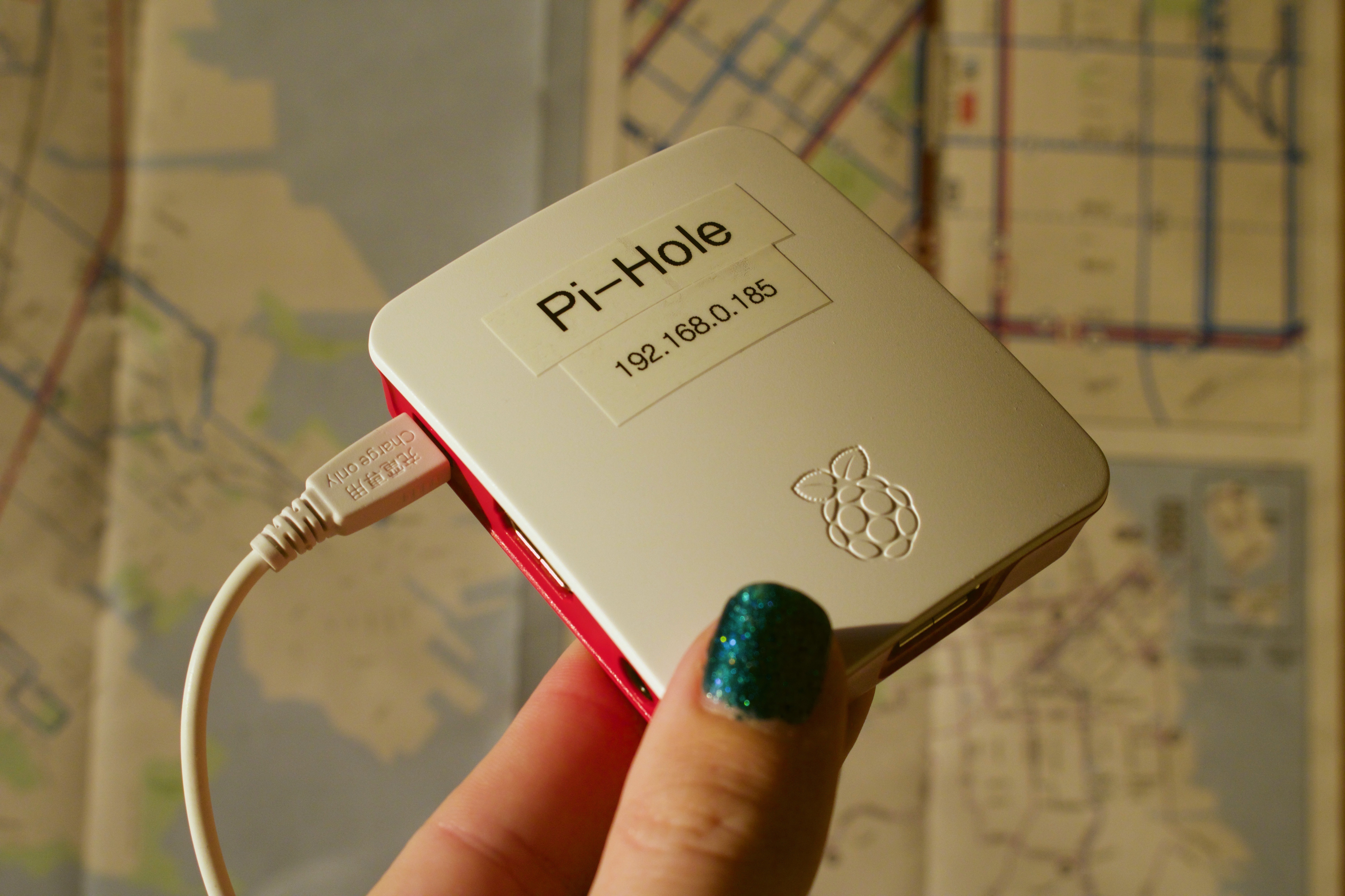
My Model A+ is my Pi-Hole.

A Raspberry Pi 3 Model A+, in the official case and plugged in on power, but with nothing else plugged into it, being held up for display. A couple of labels affixed to the top panel of the case read “Pi-Hole” and an IP address (192.168.0.185).
Bonus question: Why did I choose 185?

Pi-Hole is a DNS-based content blocker. You set it as your router’s DNS server, and point the Pi-Hole at your real (ISP) DNS server, and the Pi-Hole will filter all DNS requests from clients on your network, screening out requests to advertising and tracking servers.

It’s similar to a variety of hosts files (I’ve used the WinHelp2002 hosts file for years) that route the known names of such servers to the null address, but unlike setting up a hosts file (which has to be done per machine), the Pi-Hole benefits every device on your network, including mobile phones and tablets.

Pi-Hole is open-source software. You install it on your Raspbian card by running a shell script on the Pi. The setup process is relatively painless and can be done in textmode (I used the Lite version of Raspbian, which omits the GUI; it’s textmode-only).

You do need a sufficiently advanced router to be able to set the router’s DNS IP addresses (if your router came from your ISP, it may be locked down to not provide this option), as well as to assign a fixed IP address to a particular MAC address (that of your Pi).

The default configuration of Pi-Hole maintains a local log and database of requests, both for your own perusal and for the software’s own cache. You can turn this off, and I did, but (as Bill Bumgarner suggested) you should also get a high-endurance microSD card, so that it’ll take longer for any logging—including the system’s—to wear out the card. You can get the smallest capacity available; Pi-Hole doesn’t take up much space.

The Raspberry Pi 3 Model A+ is the perfect Pi-Hole machine, and also likely to be a good option for many other Raspberry Pi applications. It’s $25, which is $10 cheaper than the B+. You should probably also get a case, such as the official one, to keep the dust off your board.

Shopping list

Here’s what you’ll need to run a Raspberry Pi 3 Model A+:

  • Raspberry Pi 3 Model A+ (also available at Micro Center, though not online)
  • Raspberry Pi 3 Model A+ case (also available at Micro Center)
  • A USB micro-B cable (like this one, though I use one from Daiso) and a USB charger dishing up 5W or more (like this one)
  • A microSD card, preferably a high-endurance variety (like this one)
  • Raspbian; the Lite (no GUI) version will do
  • A USB keyboard (like this one)
    • You’ll also need a mouse, trackball, or trackpad if you use a GUI version of Raspbian. The keyboard I linked to is a combination keyboard and trackpad, so it covers both needs.
  • A monitor, TV, or projector that can receive HDMI input, and an HDMI cable (full-size HDMI, not mini or micro)

Pi-Hole specific notes

If you’re setting up your Pi as a Pi-Hole, you’ll only need the keyboard and monitor for setup. You shouldn’t need to interact with the Pi again once it’s set up and working.

You should also dig up (or download if possible) your Wi-Fi router’s manual, and the IP address and admin credentials you’ll need to use to administer it. If your router doesn’t let you change DNS servers, you may need a newer/fancier one, like this one.

I assign my Pi its static IP address on the router (by setting the router to always assign that IP address to my Pi’s MAC address). My router has this under its DHCP settings as “Address Reservation”. Your router may call this something different, or it may not have this feature; the Pi can also be configured to request a static IP address, though I have not tried these steps.


UPDATE 2020-01-03: Added the shopping list and Pi-Hole set-up notes.

How to read what I’ve been writing

Sunday, August 11th, 2013

You might have noticed that this blog of mine has gotten mighty quiet on the sort of programming-related (especially Cocoa-related) topics I historically have written about here.

There have been, and will continue to be, occasional exceptions, but, for the most part, this will remain the case for the foreseeable future.

So, where do I write about programming nowadays?

MacTech magazine.

Cover of the August 2011 issue of MacTech magazine.
The first issue with an article of mine in it.

Here’s some of what I’ve written about:

  • C and Objective-C basics
  • Introduction to NSOperationQueue
  • Uses of GCD besides dispatch_async (this one was split over two issues)
  • How Cocoa and Cocoa Touch use blocks
  • A sampling of available developer tools, both Apple and third-party (co-written with Boisy Pitre)
  • Reviews of developer documentation viewers
  • Using Quick Look
  • Practical applications of Core Image

If you want to read my previous articles, they sell old print issues for $10 each, and they sell old issues from January 2012 onward in their iPad app for $5 each.

If you want to read future articles, it’s cheaper to subscribe: iPad subscriptions are $11 (in-app) for three months, and print subscriptions are $47 for a year (or cheaper with certain coupons).

I’ve got some good stuff coming up. The immediate next thing is a two-parter on essential tools and best practices for developers. Part 1 should be in the August issue.

More good iOS games

Saturday, May 25th, 2013

Inspired by this post from last year by Mike Lee, here’s a list of the best games from my iOS app library.

Many games are excluded, for any of these reasons:

  • Games on this list must not be violent (e.g., I excluded Carmageddon and even Bastion, Sonic 2, and Sonic 4)
  • Games on this list must not be Zynga-tastic (e.g., I excluded Draw Something)
  • Games on this list must not be on last year’s list (see Mike’s post)

Also, I’ve restricted myself to iOS games. Some of the games below are available on multiple platforms, but all of the links are to the iOS App Store.

The games

(Enigmo violates the “not on Mike’s list” requirement, but I gave it a pass for two reasons: because I linked to both the iPhone and iPad versions, and because I linked to the sequel.)

The interview scene from “The Matrix”, annotated [SPOILERS]

Wednesday, February 6th, 2013

“The Matrix”—the first movie—is one of my favorite movies for a few reasons, of which two stand out:

  • The visuals and sound design are exceptionally well-crafted. For just one example, consider the moment early in the movie where the human police officer unbuttons his handcuffs pocket on his belt. That moment shows the kind of beautiful sound design that you hear several times throughout the movie.
  • In the dialog, nearly everything is significant in at least one, usually more, way.

I’ll demonstrate the latter with the full text of the police interview between Agent Smith and Thomas Anderson, starting 17 minutes and 15 seconds into the film.

SPOILERS BELOW


ANDERSON is already seated at the interview table. Enter Agents SMITH, NUMBER TWO, and NUMBER THREE. TWO and THREE enter first and stand on either side of ANDERSON; SMITH sits across from ANDERSON at the table.

SMITH plops a thick green folder onto the table, whereupon ANDERSON looks at it. He then looks up at SMITH, who looks back at ANDERSON. SMITH then unwinds the cord that holds the folder shut, opens it, and begins to leaf through the pages while ANDERSON watches.

SMITH: As you can see, we’ve had our eye on you for some time now, Mr. Anderson.

This is the scene where they’re about to start monitoring him even more deeply.

SMITH: It seems that you’ve been living two lives.

SMITH: In one life, you’re Thomas A. Anderson, program writer for a respectable software company.

In a world of computers, a “program writer” would be pretty powerful, no?

SMITH: You have a Social Security number, you pay your taxes, and you… help your landlady carry out her garbage.

SMITH: The other life is lived in computers, where you go by the hacker alias “Neo” and are guilty of virtually every computer crime we have a law for.

SMITH: One of these lives has a future… and one of them does not.
[SMITH closes the folder to punctuate his last statement]

At this stage of the movie, and in this context, we’re meant to conclude—as Anderson himself presumably does in his situation—that Smith means that Anderson has a future, and Neo does not—that Anderson’s life of crime, as “Neo”, must come to an end, ideally with Anderson’s cooperation.

Of course, what actually happens later in the movie is the opposite: It is Neo who lives on past the end of the movie, and Anderson, the resident of the Matrix, whose time will soon end.

SMITH: I’m going to be as forthcoming as I can be, Mr. Anderson. You’re here because we need your help.

Again, we’re meant to believe at this point that this is simply a police interrogation, that the Agents are “Agents” in the FBI sense of the word. We are thus meant to believe that “help” means Anderson’s voluntary cooperation.

They need his help, all right, but they do not need his cooperation.

[SMITH takes off his sunglasses]

SMITH: We know that you’ve been contacted by a certain individual, a man who calls himself “Morpheus”. Whatever you think you know about this man is irrelevant. He is considered by many authorities to be the most dangerous man alive.

More words that don’t mean what we think (and Anderson would think) they mean. “Authorities”, again, does not simply refer to law enforcement; it refers to the computer systems in charge of the Matrix. “Dangerous” not in the sense of life-threatening, but dangerous to the Matrix.

[SMITH points briefly to TWO and THREE]
SMITH: My colleagues believe that I am wasting my time with you, but I believe you wish to do the right thing. We’re willing to wipe the slate clean [SMITH pushes the folder aside], give you a fresh start.

Anderson isn’t the first person they’ve made such an offer for. This is foreshadowed, ever so subtly, in the first minutes of the movie, and explicitly confirmed later on in the restaurant scene.

SMITH: All that we’re asking in return is your cooperation in bringing a known terrorist to justice.

Unlike Smith, all of Anderson’s lines have exactly one subtext, which is this: Anderson is still a resident of the Matrix, nominally aware that there is a thing called “The Matrix” but unaware of any of the particulars or its significance in his life.

As such, Anderson’s lines have no subtext, and this is, itself, their subtext.

ANDERSON: Yeah. Wow, that sounds like a really good deal. But I think I got a better one: How about, I give you the finger,
ANDERSON: ..|.
SMITH: Hm.
ANDERSON: and you give me my phone call.

[SMITH sighs]
SMITH: Oh, Mr. Anderson.
[SMITH puts his sunglasses back on]

You’ll notice that Smith takes one of his headgear items off when he’s about to behave a bit more human-like. He takes off his sunglasses to do a fairly standard interrogation on Anderson. He takes off his earpiece later on for another, different kind of questioning. In both cases, he puts them back on to return to his normal role as part of a computer system.

SMITH: You disappoint me.
ANDERSON: You can’t scare me with this Gestapo crap. I know my rights. I want my phone call.
SMITH: Tell me, Mr. Anderson… What good is a phone call if you’re unable to speak?
[ANDERSON’s mouth begins to seal; ANDERSON stands up from his chair as he panics]
[TWO and THREE walk over and seize ANDERSON, open ANDERSON’s shirt, and throw ANDERSON onto the table as SMITH steps away from it]

SMITH: You’re going to help us, Mr. Anderson…
[SMITH takes out a case full of tracers, and takes one out of the case]
SMITH: whether you want to or not.

One of the aforementioned implications is resolved here: As I mentioned above, they need only Anderson’s help, not his cooperation.


The richness of subtext in “The Matrix” isn’t limited to that one scene by any means. Most of Morpheus’s lines are similar, and the Oracle does it every bit as much as you’d expect. (“You look like you’re waiting for something. … Your next life, maybe. Who knows?”)

This is just an example, and it’s just one of the reasons why I love this movie.
An extremely superficial review of Microsoft Surface

Saturday, January 19th, 2013

I was at Staples today and saw a Microsoft Surface (the tablet, not the big-ass table) demo unit, so I spent about ten minutes with it.

Illustration of a laptop, with the thicker, heavier portion resting on the desk, and the Surface, with its keyboard cover on the desk and the thicker, heavier portion sticking up.
Yup, that’s accurate. (No idea who made it, but here’s where I grabbed it from.)

  • Their demo unit was in the Desktop (classical Windows minus Start menu) view when I found it. Looks about the same as it does on a Windows 8 laptop. The desktop proper only had the Recycle Bin on it.

  • As I’d figured out previously on a Windows 8 laptop, the Windows key on the keyboard switches in and out of the Start screen, which replaces the Start menu in previous versions of PC Windows with something a lot more like the Mac’s Dashboard.

  • I tried two of the widgets, or whatever they’d call the things on the Start screen. The first was Games, which resembles the Xbox 360 dashboard (and even says “xbox games” at the top), set in the typographic theme of Windows 8.

  • Of the half-dozen or so games listed there, most had the “Play” button disabled. The one that didn’t was “Angry Birds Space”, which gave me a barely-meaningful error message (something along the lines of “link not recognized; would you like to show this app in the Windows Store?”).

  • When I launched Word and chose the Blank Document template, it displayed the document as ready to type into briefly, then showed some kind of tutorial dialog or something (I closed it without caring enough about what it said to read it, as I do with all such dialogs). Thanks for the interruption, Microsoft.

  • Tapping on the screen instead of using a mouse feels more natural than I’d expected, although it helps having had a year and a half of training from the iPad. There’s no mouse cursor to be revealed by such actions, unlike past touch-screen versions of Windows.

  • Word on the Surface feels like a simplified version, as Pages is on the iPad. But maybe there’s some progressive disclosure that I didn’t drill down into.

  • Imagine typing on a Smart Cover. That’s about what typing on the Surface’s keyboard cover is like. You can feel some give underneath your fingers, but there’s no tactile feedback by which to know that the keypress has registered. For this reason alone, I can’t see myself adopting this as my daily driver for Real Writing as some have with the iPad + a Bluetooth keyboard.

  • Once I got a little bit used to the keyboard cover’s key-feel, my accuracy was somewhere close to what I get on my iPad’s on-screen keyboard. Unfortunately, the Surface (or at least Word, at least however it was configured there at that moment) doesn’t have auto-correct like the iPad has, so my actual output accuracy was significantly lower.

  • The biggest problem was insufficient keypresses causing missing characters. The iPad doesn’t have this problem, since a keypress is only insufficient if you miss the key outright.

  • I didn’t attempt to detach the Surface from its keyboard cover, which might have been prevented for anti-theft reasons even if it is possible with sold units. Consequently, I don’t know whether there’s an on-screen keyboard for typing without the keyboard cover.

Analysis of Matias Tactile One Keyboard

Thursday, March 22nd, 2012

I can’t really call this a “review”, because I don’t have one (it costs two hundred freaking dollars), but I did notice some things about the Matias Tactile One Keyboard (which I saw an ad for in MacTech magazine) that I wanted to write down.

  • Weird fn key placement: They put it where the AEK2 and Tactile Pro have the right ctrl key. (Indeed, it looks like the lower-right caps are the same sizes as their mirror counterparts in the lower-left.)
  • Weird eject (⏏) key placement: It’s fn-return. Huh?
  • Weird ⌦ key placement: It’s where the AEK2 and Tactile Pro have the right option key. That’s because…
  • No six-block. The AEK2 and Tactile Pro have a block of six keys—four navigation-related, plus “help” and ⌦—above the arrow keys, between the letter-board and number pad. The One, for some reason, omits this. The full photo shows an iPhone resting there, but I see a missed opportunity in its place: For two hundred freaking dollars, they could have put in an iPhone/iPod dock in the gap between the function keys, and kept the six-block.
    • As on Apple’s laptops and Wireless Keyboard, they moved the navigation keys onto the arrow keys as their fn variants.
  • PC-style number pad (with double-height plus key and no equals key), even on the so-called Mac version. This made sense for the Unicomp SpaceSaver M and Das Keyboard Model S for Mac, since they’re PC keyboard manufacturers and probably reused the same PCB (also, both of those keyboards’ fn key placement follows from the Windows layout’s extra “menu” key in the same area), but I can’t figure why Matias did this.
  • An extra tab key where the clear key used to be. I like this idea.

The headlining feature of the “One Keyboard” series (and the reason why they call it that) is the fact that you can switch it between talking to your Mac over USB and talking to some other device (nominally an iPhone, iPod touch, or iPad) over Bluetooth. If they brought that and the number-pad tab key to the Tactile Pro, that might be worth $150 to me. (As for $200? No. Never have I wanted to use the same keyboard on both my Mac and iPad.)

Portal 2

Sunday, April 24th, 2011

The best works of fiction all have in common a certain feeling.

It comes at the end. You’ve finished it. There is no more; you know this, and it hurts you, because you want more, you want the enjoyment you’ve just had to continue forever, and yet you know that if there were always more, if it ran forever, eventually it would get boring, so it is good that is over, and yet it hurts.

Portal 2—which is great, all the way through—leaves you with that feeling. The ending is great, the best ending I’ve ever seen in a video game, and it hurts.

You should play it.

Play the first one first, and then play the second. And then you should probably play them both again—I know there’s some stuff I’ll view differently when I play Portal 2 the second time.

The only thing it left me wanting was a soundtrack album. I only bought the one song (you know the one) from the Orange Box soundtrack, but I would happily buy the whole soundtrack to this game. The music is as wonderful as the game it accompanies. I hope, someday, preferably someday soon, I can go to the iTunes Store or Amazon MP3 and buy it.

Valve and everybody else involved in making this game (and the original): You rock.

EDIT 2011-06-12: Just found this phenomenon on TVTropes. (To be clear, they had it first.)

Block eraser comparison: Pentel ZEH-05 vs. Staedtler Mars vs. Target store-brand

Sunday, July 25th, 2010

Being a reader of Dave’s Mechanical Pencils has gotten me interested in block erasers as companions to the pencils themselves. My first mechanical pencil was a Pentel Twist-Erase III (QE515), which I chose for its wide and long built-in eraser, but, thanks to Dave, I have since switched over to a Uni Kuru Toga * for writing and a block eraser for erasing.

But which eraser?

Here in the United States, the most available eraser is the Pentel Hi-Polymer ZEH-10, usually in three- or four-packs. As a fan of the Twist-Erase eraser, I knew Pentel could make a good eraser (even though Dave disagreed about the Twist-Erase), so I wondered how good Pentel’s block erasers were. At the same time, once I started reading Dave’s Mechanical Pencils, I wondered how the Pentel block erasers might compare to Dave’s favorite, the Staedtler Mars.

For years, all I’d ever seen were Paper-Mate erasers, store-brand erasers, and the ZEH-10, which is the larger of Pentel’s two ZEH models. Indeed, that was the only Pentel eraser I knew about until I saw Dave’s review of the ZES-08 (the “Hi-Polymer Soft”, which sounds like it’s a different eraser compound). Then, not long ago, I spotted a three-pack of ZEH-05 (the smaller one) erasers at Stater Bros. for $2, and snapped it up.

Then all that remained was to pick up a Staedtler Mars eraser and compare them. Art Supply Warehouse to the rescue: They sell them individually for 99¢ each. Other stores sell them in four-packs for $3. (If nothing else, Pentel’s ZEH erasers are cheaper: A four-pack of ZEH-10s is currently $2.64 at Target, while ASW sells the ZEH-05 individually for 72¢.)

Prior to my buying either of those, I’d bought a three-pack of store-brand pencil leads at Target for $2. That package included a block eraser. So, since I have it, I might as well include it in the comparison.

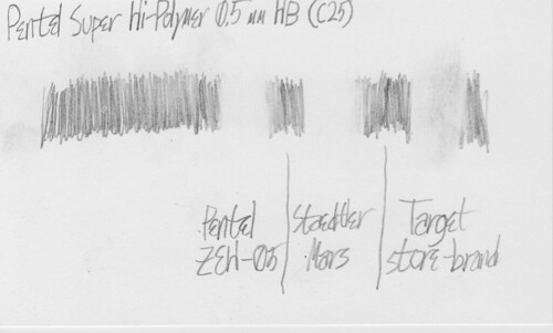
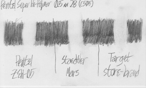
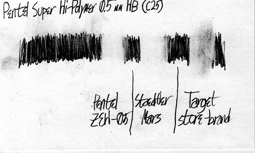
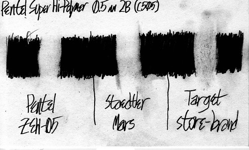
For that comparison, I used Pentel Super Hi-Polymer (a.k.a. “Ain”) lead in the HB and 2B grades on a blank store-brand (“Corner Office”) 3″×5″ index card from Walgreens.

Let us begin.

Comparison with HB lead. ZEH-05: Flawless victory. Staedtler Mars: Just a little bit less effective. Target store-brand: Pitiful.

Comparison with 2B lead. ZEH-05: Pretty close to perfect. Staedtler Mars: Well-erased, but with much smearing at the edges. Target store-brand: Not so well-erased; smearing in the middle, perhaps because it's a thinner eraser.

And both comparisons with level adjustments to better show the differences:

Comparison with HB lead. Here, too, Staedtler Mars' inferiority is just barely apparent—it's pretty much a dead heat. Target store-brand, of course, still loses by a wide margin.

Comparison with 2B lead. No real change between the ZEH-05 and Staedtler Mars; Target store-brand's loss is much more apparent now.

For erasing, Pentel’s ZEH-05 wins. It’s evenly matched with Staedtler Mars on the HB test, but erases a bit better with less smearing on the 2B test. And it’s cheaper to boot!

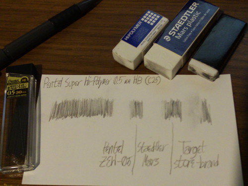
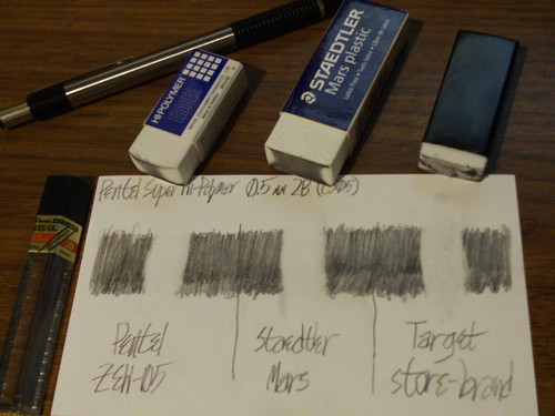
Now let’s look at shots of the erasers after each job and see how dirty they got:

Comparison with HB lead. The ZEH-05 barely got dirty at all; the Staedtler Mars got a bit dirty; the Target store-brand eraser is filthy.

I cleaned the Target eraser (by “erasing” a blank piece of rough cardboard) between tests.

Comparison with 2B lead. The ZEH-05 is dirty in the middle; the Staedtler Mars is about equally dirty over a larger surface; the Target store-brand eraser is about as dirty as before.

As far as dirtiness, it’s pretty much a dead heat between the Pentel and the Staedtler Mars. The ZEH-05 appears dirty over less area because I’d used it more before I began testing, so it has a slightly rounder surface. Over the two erasers’ dirtied areas, the 2B test got them about equally dirty.

The Target store-brand eraser lost badly on all tests. It didn’t do as good a job of erasing, and (perhaps relatedly) the dirtied eraser compound didn’t come off the eraser body. It stuck to it. Reminds me a bit of the Pentel Tri-Eraser, which has the same problem.

In case you’re wondering, I brought the Tri-Eraser into competition after taking the above scans and photos, and found that it is almost but not quite as good as the Staedtler Mars. It doesn’t erase quite as well as the Pentel and Staedtler block erasers, because of that dirty-eraser-compound-sticks-to-the-eraser-core problem. The one advantage it has over the Staedtler Mars is the same as Dave found: Not as much smearing as the Staedtler Mars did.

So, there you have it: The Staedtler Mars does a good job, but the Pentel ZEH erasers (assuming the ZEH-10 and -05 are made of the same stuff) are both slightly better and a bit cheaper.

Dickey’s Barbecue Pit

Saturday, March 20th, 2010

I ate at the Dickey’s in Huntington Beach for the first time tonight, and decided to write up my observations.

(ADDED 2010-07-04: The Dickey’s in Huntington Beach has closed.)

The place is very obviously a chain. The first thing you notice upon walking in is that the decor is not the burned-wood-and-horseshoes type you usually see in barbecue restaurants. It looks more like a fast-food restaurant, and, in fact, that’s what it is (slogan: “Slow cooked, served fast”).

If I were to describe it pithily, I’d call it the KFC of barbecue. Like KFC, it serves a type of food that most fast-food chains don’t touch; the main difference is which type: fried chicken vs. barbecued meat. One particular similarity is their acknowledgements of their founders in messages on the walls: for KFC, it’s the famous Colonel Sanders; for Dickey’s, it’s Travis Dickey.

Here’s their drinks menu:

  • Big Yellow Cup (32 oz.), $1.99

That’s it. That’s the only size, not counting the smaller size included with the kid’s meal.

Both sizes are a hard-plastic yellow cup, similar to what you used to be (maybe still are) able to get at AM/PM and some other convenience stores. The cup calls itself a “souvenir cup”, but otherwise looks like it’s intended to be refillable. I don’t think you get a discount for that, but you can at least feel good about not throwing away cup after cup.

One nice touch: At every table is a roll of paper towels.

You can buy meat by the plate or by the pound; the former option, which is what I went for, comes with two sides and a roll.

Curiously, the baked potato counts as two sides. It’s a large potato, and comes with a full suite of toppings: Two individually-wrapped four-triangular-sided thingies (what do they call those?) of sour cream, a cup of chives, a cup of bacon bits, three tubs of “whipped spread” (essentially margarine), and I think one or two other things. All of that occupied an entire second plate, next to the one that had my brisket on it.

They offer six types of meat: Beef brisket, Polish sausage, pork (two kinds), chicken breast, and turkey breast. I had beef brisket. It was good. It cut easily, sometimes a little too easily (falling apart under my fork). I eventually settled on scooping it onto my fork with my knife.

The sauce is not too spicy, but you will want to alternate between the meat and either the roll or cole slaw, or else the heat will accumulate. It’s not unbearable, but it drowns out the rest of the flavor. They also have a “hot ‘n’ spicy” sauce.

I will go again sometime.

Amadeus Pro’s noise-removal filter

Thursday, February 11th, 2010

Many of you may remember an audio editor named Amadeus II. It turns out that there is a successor to it now, named Amadeus Pro.

One of Amadeus Pro’s features is the ability to remove noise, quickly and simply. Find, within the audio, a patch of nothing but noise, and choose “Sample Noise”. This trains the filter for that audio. Then, select the whole thing (or nothing), and choose “Suppress Noise”.

That’s it. Sample Noise, then Suppress Noise.

Here’s the result, as demonstrated by a 12-second clip from a recording, ripped from cassette, of Haydn’s Symphony #49, “La Passione”:

(This is actually from a quiet section; I amplified it before filtering it so that you can hear the hiss at the start.)

That’s not to say that it only works on music. I’m also using it on the audio for forthcoming CocoaHeads Lake Forest videos.

This feature alone is worth the $40 for this application.

Before anybody mentions Audacity: Yes, Audacity has a Noise Removal tool, but it lacks the It Just Works factor of Amadeus’s noise-remover. Audacity gives you three settings to think about, with names only an audio engineer could love. (“Frequency smoothing”?!) In Amadeus, all you need to tell it is “here’s what noise sounds like. Go kill it.” This (plus a native Mac OS X interface) is worth the money to me.

The iPod Radio Remote and Griffin Navigate

Saturday, January 9th, 2010

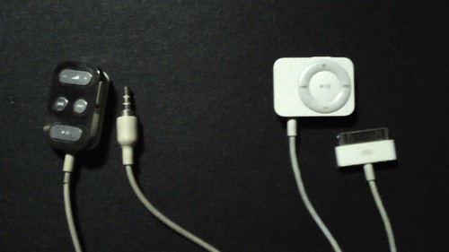
Some of you know that I use a second-generation iPod nano (the best iPod ever) with an iPod Radio Remote. There are two generations of iPod Remote; here they are side by side:

iPod Remote and iPod Radio Remote

The original is on the left. It was for the 2G iPod (that’s what I had, anyway) and possibly some other models. That remote didn’t have a radio tuner in it. The one on the right, the one that has a Dock connector and looks like a 2G iPod shuffle, is the iPod Radio Remote.

The iPod Radio Remote never did work with the iPhone and iPod touch. Every introduction of a new iPhone or iPod touch model (including the originals) made clearer that they’d either make a third generation or kill it. Sometime around the time when they introduced the new Apple Remote, they chose the latter.

At some point, Griffin Technology introduced their Navigate. I spotted one today at Walmart for $20 on clearance and snapped it up. Walmart normally sells it for $50, and MSRP is $60.

Not only does the Navigate work with my 1G iPod touch, it adds a display showing the current track. The iPod Radio Remote never had this! The picture on Griffin’s website doesn’t do it justice; it actually looks much better, as shown in this video:

(If you want to really see how good it looks, click through to the YouTube page and watch it there.)

Like the Radio Remote, the Navigate has a clip. Unlike the Radio Remote, it’s not a moving part; it’s just a fixed, flexible (but not too flexible, but not too stiff, either) bit of plastic. Time will tell how easy it is to break.

True to its name, you can even use it to navigate your music: It will let you pick a playlist, artist, or album to listen to, and change the shuffle setting. However, it does not let you go straight to a specific song, which makes that feature useless for me. I understand why that limitation exists, though: It would be much more difficult to scroll to it with the Navigate’s buttons than with the iPod’s own click wheel or touch screen.

Navigating the FM band isn’t exactly easy. When moving along the frequency band itself, next and previous move one frequency-stop at a time. You can set presets, but only four of them. It’s not at all obvious how to set and use them; I’ll leave it to the manual to explain it. Ameliorating this problem is that it remembers the last station you had tuned, so it’s not like you’re going to have to deal with the preset menu every time you turn on the radio.

I do have a couple of significant problems with it.

The first is that it doesn’t remember your volume setting. (The Navigate has its own volume setting, separate from the iPod’s; the iPod’s volume setting has no effect on audio through the Navigate. This is another difference from the Radio Remote, which had no volume of its own.) The Navigate doesn’t have a battery; it relies on the iPod for power, so it goes dead when you unplug it. Then, when you plug it back in or plug it into a different iPod, it’s back to the default volume, which is quite loud for me. This will probably grate on me a bit.

The other problem is that it doesn’t fit in my iPod touch’s Dock connector with its SeeThru hard case on it. My iPod nano doesn’t have a case on it, so I don’t have that problem with that iPod. If you don’t have a case on your iPhone or iPod touch (or other iPod), or you use a different case that won’t conflict with Griffin’s Dock connector, then this won’t be a problem for you.

I hope a future version of the Navigate will remember the volume setting and have a slightly thinner Dock connector so that it isn’t blocked by my iPod touch’s case. Even now, though, I consider the Navigate a worthy successor to the iPod Radio Remote, primarily because of the display, secondarily because of the iPod touch (and iPhone) compatibility.

Energizer’s 15-minute NiMH charger

Thursday, December 10th, 2009

Some of you remember that a few years ago, Rayovac introduced their “IC³” NiMH batteries and chargers. The IC³ chargers could charge the IC³ batteries in 15 minutes, but only the IC³ batteries—they could charge regular NiMH batteries, but in the usual 6–8 hours. Naturally, the magic batteries were expensive: $20 for a four-pack of AA.

At some point (I bought mine earlier this year, if I remember correctly), Energizer introduced their own 15-minute NiMH charger. Unlike Rayovac’s, this one doesn’t require special batteries; it’ll charge any NiMH AA or AAA batteries. It can do up to four batteries at once, with the restriction that if you load both slots 1 and 2 or both 3 and 4, they must form a matched pair (no mixing ages or mAh ratings within a pair).

Besides requiring Rayovac’s special batteries, the IC³ charger had other problems: Copious RFI output, and a very loud fan to keep the batteries from overheating. Energizer’s charger has no RFI that I’ve been able to notice, and while it does also have a fan, its noise level is much more reasonable.

The Energizer charger has a car cigarette-lighter plug, so that you can charge batteries in your car. The IC³ charger plugged straight into the wall. I don’t use that, but maybe you could.

There is one catch to the Energizer charger’s “15-minute” claim: 15 minutes is its time for 2200 mAh batteries like the ones it comes with; higher-capacity batteries will take a few more minutes. That’s actually good, compared to the IC³ charger, which charged in either exactly 15 minutes (Rayovac’s own special batteries) or 6–8 hours (anything else). Energizer’s charger doesn’t have any special requirements, so it’ll finish in 15–20 minutes no matter what NiMH batteries you put in it; the charging time scales with the batteries’ capacity.

It’s hard to find online. Amazon.com has it twice, but doesn’t sell it themselves; the two listings are from independent sellers. Target.com doesn’t have it, even thought I bought mine at Target (physical store).

The prices on Amazon are a little over $30; a bit expensive compared to other chargers, but it’s helped me be much better about keeping my camera’s batteries charged, so I deem it worth it.

In order that this review should not end without a link, here’s the chargers section of Energizer’s website. Unfortunately, they don’t have a way to link to a specific charger; you’ll have to find it in the list and click on it. That will give you a photo so you can find it at a store. Alternatively, here’s Google Products.

The successor to iShowU

Thursday, September 10th, 2009

As you may be aware, I’ve used iShowU in the past to record screencasts. Yesterday, after iTunes 9 came out, I went to record a screencast of one of its features, but was stymied because iShowU, even as of 1.74 (its current version), stopped working in Snow Leopard.

So, on Twitter, I solicited recommendations for a new screen-recording tool.

iShowU doesn’t work under Snow Leopard. What’s a good replacement?

(Not ScreenFlow, not QTX)

After some of the nominations came in, I wrote a list of features I require:

My requirements:

  1. A rectangle, not necessarily whole screen
  2. Animation codec
  3. Size presets
  4. Good UI

QuickTime X fails at the first three points: It can only record the whole screen, and only in H.264. Its UI is “good” through extreme simplicity, which it achieves through (presumably deliberate) lack of features.

ScreenFlow‘s exclusion is special. I’ve always been put off by a passage from its marketing copy:

ScreenFlow has advanced algorithms that only encode areas of change on your screen.

OK, so either they’re unnecessarily sucking up my CPU with “advanced algorithms”, or they’re using a Quartz screen-refresh callback (like they should be doing) and calling it “advanced algorithms”. Neither possibility impresses me.

Here are the other contenders, in order by nomination.

Snapz Pro X, nominated by Steve Streza, fails point four, as I harshly told him in reply. (Sorry!) As I said in my reply, it’s designed for taking static pictures; every time I’ve used it, I’ve found that that UI doesn’t work well for creating movies. I don’t remember whether it satisfies points two and three or not.

Camtasia, nominated by Chris McQueen, has been around on Windows for a long time, but recently joined the Mac market as well. It looks nice, but it’s way too pro-caliber for me. On the other hand, if I didn’t already have Final Cut Express, I’d probably take a harder look at it for its editing tools.

(Say, I wonder if my old version of Final Cut Express (3.5) works in Snow Leopard. Hrm.)

This is the point in the timeline where I published my list of requirements.

I dismissed Screen Mimic, nominated by Rob Rix, for three reasons: First, I’d already found my winner, which strangely received no nominations. Second:

Flash-based screen recording for OS X

It’s not as bad as that makes it sound (well, not as far as I can tell without downloading the demo, anyway). What they mean by “Flash-based” appears to be that it can export the recording as Flash video as well as QuickTime. It’s probably a nice enough app, but the idea that it’s designed around Flash put me off.

The third reason was that there are no screenshots. I know these are screen-recording apps and it’s good to eat your own dog food, but static pictures are good, too. I can load and look at a full-res static picture much more quickly than I can load up even a half-res video. The faster I get to like your app, the more likely you are to make a sale; conversely, throw delays in front of me, and I’m likely to give up.

The final nomination, from Uli Kusterer, was Screenflick. It looks nice enough, but fails point 3 (presets).

The winner, which I found independently, is Screenium. It’s simple, it satisfies all of my requirements, it works in Snow Leopard, the trial limitation is pretty good (full quality, but no more than 30 seconds per recording), and the price is only $29. It even has a button to set the target rectangle to that of a specific window, which was perfect for the video I had in mind at the time. Plus, it has QuickTime export built-in, so I no longer have to use QTAmateur for that.

Here’s the video, which I recorded using Screenium’s trial mode. (If you don’t want Vimeo’s scaled-down version, hit the download link in the lower-right for the full-res QuickTime movie I uploaded. That’ll be up for about a week.)

Thanks again to everyone who replied for all of their nominations.

Targus Chill Mat follow-up

Sunday, May 24th, 2009

I wrote previously about the Targus Chill Mat. Two Chill Mat generations later, it’s time for an update.

When I wrote the previous post, I had only the first-generation Chill Mat, and Targus had just introduced the second generation. I finally bought one a few months ago.

It does seem more effective at cooling than the first-gen, but the price I paid for that is that it’s loud—so loud that I would intentionally put it aside and go back to the first-gen for my monthly trips to CocoaHeads Lake Forest.

Last week, visiting Walmart for the first time in a long time (they remodeled it! it sucks less now!), I noticed that there is now a third generation. I picked it up for $20, partly out of curiosity regarding just where they stashed the cable, since I couldn’t see it from outside the package.

For those of you not familiar with the Chill Mats, they’re powered by USB. One end looks like the end of a DC power cable (as from a wall-wart), and the other end is a USB A connector.

The first and second generations had a problem where bouncing around inside your laptop bag with the DC connector plugged in would cause the connector to become loose, and eventually stop making reliable contact. The first-generation also had an inline power switch, which was even easier to break; they knocked that off with the second-gen, so let us not speak of it again.

The third-generation adds a nifty feature: Set into the underside of the mat is a hollow cleat, with a clip on each side of it. You wrap the cable around the cleat and hold it in place by snapping it into the clips, and you put the USB connector inside one end of the cleat and the DC connector inside the other end.

This cleat feature should help relieve the fragility issues that plagued the DC connector on previous Chill Mats, because now I have a better place to store the cable than plugged into the jack.

The third-generation is also much better about noise (to the point that I’ll feel comfortable bringing it to CocoaHeads), but the trade-off is that it cools much less effectively than the second-gen. Even so, I think it’s good enough. (In case you’re wondering, it is a little louder than the first-gen.)

All told, this is the best Chill Mat yet, and it will be my Chill Mat for all uses from now on.

UPDATE 2009-05-24: When I went to add links to this post, I noticed the Chill Mat for Mac on their website. I haven’t seen this in any store. If you find or order one, I’m curious to hear how well it works (you can set iStat Menus to show your MBP’s external temperature) and how loud it is.

finetune vs. Pandora

Tuesday, January 13th, 2009

The most popular mix-and-match-music app, according to the completely objective score of how often I hear its name, is Pandora.

Pandora's application icon.

Most of this popularity came with their release of an iPhone app back in July 2008. The iPhone app makes the site portable: previously, you could only listen to Pandora while chained to a browser (or a SSB), but now you can listen to it anywhere that’s in cell range.

Pandora now has competition.

finetune's application icon.

It first appeared in AppShopper’s free iPhone apps feed on 2008-11-08, but I didn’t see it then (I probably scrolled past it). I did see it when they released their 1.1.3 update back on 2008-11-31.

Its name is Finetune. Like Pandora, it’s free.

The differences:

  • Unlike Pandora, Finetune doesn’t require an account.
  • Pandora has an option to jump over to the iTunes Store to buy a song; Finetune has no such feature.
  • Finetune only creates stations based on artists; Pandora lets you name an artist, song, album, or composer.

I think Finetune does a slightly better job of selecting songs that are similar to the work of the requested artist. (Sometimes this is hard, as in the case of the Beatles, who produced very diverse work.)

One major drawback to Finetune is that, since it only lets you select based on artist (performer), not composer, it really sucks for classical music. (The service has it, but it’s little better than shuffle-play.) If you want a customized classical station, Pandora is currently your only option.

(Note: I wrote this before Pandora 2.0 came out, but it’s still accurate. If anything, Pandora 2.0 is even better for classical now, since you can now make stations by genre.)

Review: BurnBall

Tuesday, January 13th, 2009

On 2008-12-12, Tim Haines, the developer of BurnBall, contacted me on Twitter to offer me a free promo code. I accepted, and played the game on my first-generation iPod touch.

The game is basically Qix with a Sonic-the-Hedgehog-esque theme. Based on that, I give you this pull-quote:

If you like Qix, you’ll like BurnBall.

As it happens, I don’t like Qix. The main thing about Qix that frustrates me is that enemies can kill you just by touching your trail while you’re cutting off another piece of the level. This makes some sense for the Tron-based theme of some of the other Qix work-alike games, but it has the effect on gameplay that you can’t make any but incremental progress, especially after the first few levels, as the number of enemies goes above 2. Your only hope is that your enemies will see some shiny thing and leave you alone long enough to let you complete your wall; otherwise, you can only complete the level a little bit at a time.

One way in which somebody could improve Qix would be to let enemies go right through your wall, and compensate by making them more aggressively pursue you. Then, you’d stand a reasonable chance of completing the wall, if you can just dodge the enemies. Another way would be to have enemies bounce off the wall, which would provide you with a way to restrain them while you draw more wall—but that may make the game too easy.

BurnBall is graphically different enough from Qix that it could pull off either change, although it probably should be an alternate game mode.

So, basically, the only reason I dislike BurnBall is because I dislike Qix games in general.

That said, BurnBall is a very good Qix game, being both well-drawn and responsive to your control. (Since I originally drafted this post, there’s been an update that tweaked the tilt response; I haven’t tested it.)

BurnBall has an advantage over Qix work-alikes on other platforms, in that you can move in any direction—you’re not limited to up, down, left, and right. You move by tilting the iPhone.

Another advantage of BurnBall over other Qix work-alikes is that Haines holds high-score competitions with monetary prizes on the app’s Facebook page. He also posts a free promo code every time that page gets another 100 subscribers, so you may not even have to buy the game.

If you’d rather not wait for the next promo code, the app is 99¢ on iTunes.

iPhone sudoku follow-up: ACTSudoku

Tuesday, July 29th, 2008

A couple of weeks ago, I posted a list of requirements for an iPhone sudoku app. At the time, no app satisfied all of the requirements, but one did come close.

Pierre Bernard of Houdah Software posted a comment that his sudoku app, ACTSudoku, satisfied all but one of the requirements I listed. The only one remaining was rotational symmetry, which he asked about.

In response to our dialog on that post, he added rotational symmetry in ACTSudoku 1.1, which Apple has now approved. You can download it now for $2.99 USD (or free if you bought one of the earlier versions).

UPDATE 2008-08-01: As of yesterday, there’s now a free version of ACTSudoku, which only generates easy puzzles. This is good if you’d like to try it for yourself, but you don’t want to spend $3 just yet.

The interface is simple enough:

ACTSudoku's interface is a sudoku grid on a wooden background, with the difficulty below it on the left and the timer below it on the right. At the bottom is a toolbar with three items: A + button, an Info button, and an X button.

Notice that there’s no row of numbers for input. The obvious thing to try is tap on a cell, and it works:

Tapping on a cell brings up a square pop-up containing nine numerals, possibly colored by pencil-marks.

In other words, the interface is obviously postfix. The key word there is “obviously”: One of my requirements was that it must be obvious how to input numbers.

The input method is not perfectly obvious, however. One thing that stumps a lot of people (going by Bernard’s response to some iTunes reviews) is the fact that simply tapping on a number in the pop-up enters a pencil-mark, rather than locking in the number. You must hold down briefly to set a number in the cell. In the comments on the previous post, I suggested swapping these behaviors; I maintain that suggestion. (UPDATE 2008-10-29: ACTSudoku 1.5 added a preference to do this. It does, indeed, make a tremendous difference in the app’s usability.)

You may be wondering what all the green dots are. Those are pencil-marks, filled in automatically by the game. This is optional; you can turn it off in the settings, if you want to be completely free to make mistakes.

ACTSudoku's settings are in the Settings app; the only control there, as of 1.1, is a light-switch controlling the automatic pencil-marks.

With the automatic pencil-marks turned on, the game will not let you enter a wrong number. With them turned off, the game will let you enter a wrong number. Either way, you can clear the cell by tapping again on the cell and holding down on the giant number.

If you tap on a cell with a number filled in, the pop-up has only that number, and it fills the entire size of the pop-up. Holding down on it clears the cell (and, if automatic pencil-marks are turned on, restores the marks). In this screenshot, the cell has a 4 filled in.
Hold down on that giant 4 to clear it from the cell.

Of course, ACTSudoku is not perfect. It has some minor problems:

  • The interface confusion that I noted above. A long tap sets the number, whereas a short tap sets a pencil-mark. This arrangement makes no sense with automatic pencil-marks turned on—and they’re on by default. It would make much more sense to have the tap lengths the other way around.
  • The northern, eastern, southern, and western blocks are have dimmed-looking gray backgrounds, for no apparent reason. This is slightly distracting (but not enough to qualify as “garish”). I would prefer if all the blocks were uniform white.
  • I’d like to be able to turn off the timer. Again, I find this distracting.

However, it satisfies all of my requirements, so I declare ACTSudoku the winner of the iPhone sudoku race. Congratulations to Houdah Software!