Requirements for a true Mac keyboard
Friday, September 6th, 2013With the Mac undergoing a resurgence in popularity, keyboard manufacturers have started to release Mac versions of their hitherto Windows-only products.
Of course, USB helps; it’s been possible for 15 years to use Windows keyboards on a Mac. But I don’t think any Mac user wants the reminder of looking down and seeing that logo staring back up at you.
Moreover, just as certain things—including that key—make a Windows keyboard a Windows keyboard, there are certain things that make a Mac keyboard a Mac keyboard.
Unfortunately, the Windows keyboard manufacturers tend to forget most of them and screw up others.
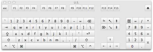
My bias: The keyboard I hold up as the standard
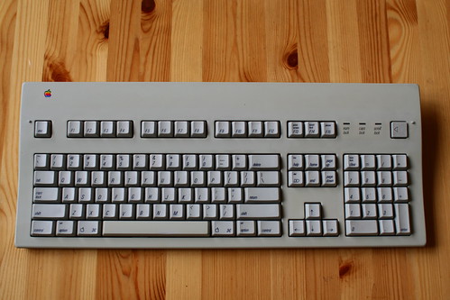
The Apple Extended Keyboard II.
(This is John Gruber’s; his photo was better than any of mine.)
When I evaluate how much of a Mac keyboard a keyboard is, I compare it to this.
The most obvious sign of a Windows keyboard
… is, of course, the plus key on the numeric keypad.
Here’s the Das Keyboard Model S for Mac:
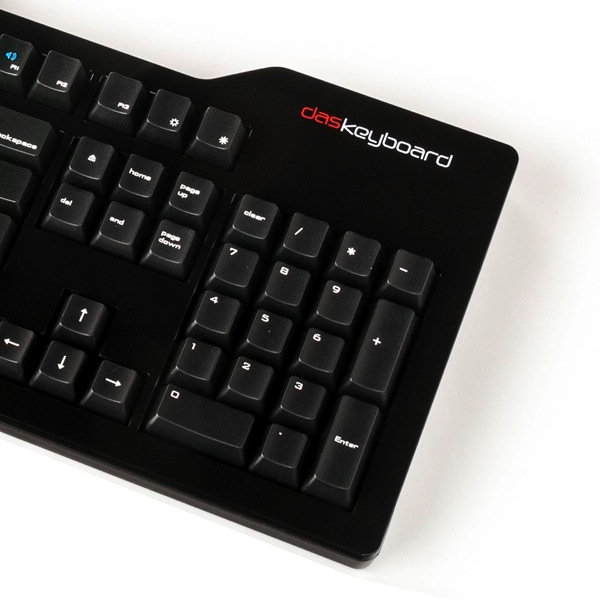
Doubleplus ungood
Compare to the keypad from the Apple Extended Keyboard II above.
To enumerate the differences:
- Where a Windows keypad has NumLock, a Mac keypad has Clear. (Das Keyboard’s Mac model gets this much right.) Extended keyboards often have the Clear key bear both labels (as on the AEK2), since it may be used as NumLock in a PC emulator or virtualizer.
- The Mac keypad inserts an equals key immediately to the right of the Clear key. The operator keys remain in the same order (/ * – +), but are shifted over to the right and down.
- To make room for the equals key, the Mac keypad’s plus key takes up only a single row.
Oh yeah, and the modifiers
PC keyboard manufacturers tend to only do this halfway.
The modifier keys in the bottom-left corner are:
- On a Mac keyboard: ctrl, option, ⌘
- On a Windows keyboard: ctrl, Windows, alt
Plug either one into the wrong kind of computer, and the Option key is Alt (or vice versa) and the ⌘ key is the Windows key (or vice versa). Thus, Option/Alt and ⌘/Windows will be backwards.
There are two differences that PC keyboard manufacturers almost always miss:
- On a Mac keyboard, the option key is slightly smaller than its two neighbors. The ctrl key should be the same size as ⌘.
- A Windows keyboard may have four keys in the lower-right corner: between alt and ctrl, a key to right-click the mouse. (Apparently there are Windows users with one-button mice?!) A Mac keyboard has exactly three modifier keys on the bottom row in each corner.
All too many Mac versions of Windows keyboards have all three modifiers the same size, as the original Windows models do, and some even still have four keys in the lower-right corner (with the fn key in the place of the right-click key).
It’s also unfortunately common for the ⌘ key to be labeled “Command” rather than with the ⌘ symbol. (Both the Das Keyboard and Unicomp’s SpaceSaver M are guilty of this.) If you can put a Windows logo on your Windows key, you can put a ⌘ symbol on your ⌘ key.
The fn key and media keys
I’m of two minds about this.
On the one hand, you saw my standard up there. Ain’t no fn key on that. I’ll be happy to never see one on a desktop keyboard.
On the other hand, we do live in the Mac OS X era, with NeXT-inherited (and other) media keys on our keyboards, generally placed on the function keys. A keyboard so equipped needs a fn key to distinguish between media-key presses and function-key presses.
I’ve seen several variations of fn key placement:
- Apple, as we all know, puts it in the lower-left corner on their laptops and wireless keyboards. Most Bluetooth keyboards that advertise Mac compatibility (as opposed to Windows or iOS) do likewise. Since this is where Apple puts theirs, if you’re making a Mac keyboard with an fn key, this is where you should put yours.
- NeXT’s keyboards didn’t have function keys, but they did have four of the media keys: volume up and down, and brightness up and down. They had a power key, too, in between the pairs of volume and brightness keys. All five were in place of the navigation block (home, page up/down, etc.). The end key was gone entirely. (We won’t get into NeXT keypad layouts.)
- The Das Keyboard replaces the right-click key with this. Having it in between two modifier keys is supremely weird—even just putting it in the lower-right corner would have been better.
- Unicomp’s Spacesaver M does the same as the Das Keyboard.
- Older versions of Matias’s Tactile Pro (which is billed as a successor to the AEK2) do not have an fn key. They put the volume keys and Eject key at the top-right, and have no other dedicated Dashboard, Spaces, Exposé, etc. keys.
- Apple’s current wired keyboard and Matias’s Tactile Pro 4 (the current version as I write this) replace the Help key with an fn key.
- The Mini Tactile Pro puts it immediately above the right arrow key/to the right of the up arrow key. Downside: Very easy to enter dictation mode when up- or right-arrowing repeatedly.
(Incidentally, I think the Mini Tactile Pro makes some very clever choices overall. I still won’t give up my keypad, though.)
Make sure you implement your fn key correctly, lest your users suffer the consequences. (The keyboard that Nicholas Riley was referring to in that tweet was the Logitech K760.)
The return key
Should always be labeled “return” (or “⏎”), never “enter”. Enter is on the keypad; Return is in the main keyboard.
If you have a fn key, fn-return should be Enter, exactly as on Apple’s laptops. I don’t care about this for extended keyboards, but for a compact keyboard, it’s a requirement, and if you have an fn key anyway, better to support it than not. If nothing else, it’s an affordance to heavy laptop users, who’ll be used to fn-return as a habit.
The power key
My standard keyboard, of course, has a power key, so, on a learned-behavior level, I still expect it from a true Mac keyboard.
On the other hand, it doesn’t actually power the machine on anymore (USB ports are dead on a turned-off Mac), and the Eject key can sub for it in all the old n-finger salutes, so it really is disposable.
Perhaps the power key’s remaining value is sentimental. It’s a testament. It says “this is a Mac keyboard, dammit—we didn’t just reskin our Windows board; we made one for you”.
Or: Perhaps the Eject key should replace the power key, exactly where it is. It does all of the power key’s surviving functions, and is likewise characteristic of (modern) Mac keyboards; therefore, it should be in the same place. (The Tactile Pro 4 does this, not surprisingly.)
The help key
Kill it with fire. I’ve never seen a real application make any use of it; all it does is enter a mode of unhelpfulness.
Possible alternatives:
- Make it unconditionally an Insert key (assuming this is possible at the hardware/HID level).
- Replace it with Eject. (Potentially problematic, considering what unmodified Eject does.)
- Replace it with fn.
- Replace it with the world’s smallest ashtray.
The baselines
Most character-generating keys—the letter, punctuation, and number keys—have two baselines. Punctuation keys use both of them, and, on most keyboards, keys marked with only a single character use only one of them.
On older Mac keyboards, single-character keys use the lower baseline. This includes the letter keys, the operator and number keys on the keypad, and the return and enter keys. Indeed, virtually all keys on a previous-generation Mac keyboard are labeled on the lower baseline, except for the punctuation keys. Also, on all Mac keyboards, all keys are the same color.
On a PC keyboard, things are a little more complex.
Unicomp’s visual design is consistent with that of the classic IBM keyboards, which is much of Unicomp’s appeal (particularly among PC users). There is clearly a system there:
- Keys are divided into white keys and gray keys. White keys all generate characters. Most gray keys do not; most of them are modifiers (like shift), and the others include backspace, enter, and the right-click (fn on the SpaceSaver M) key. Curiously, the keypad operator keys (which all insert characters) are also gray keys.
- Single-character white keys use the higher baseline, not the lower, whereas gray keys are vertically centered.
Apple’s newer keyboards are in the middle. All keys are still the same color, but there’s a typographical division between “white keys” and “gray keys”. Most of the keys that generate most of the characters are biaxially centered, whereas “gray keys” are aligned to a bottom corner. Keys labeled with only a symbol have it in the center, whereas most of the word-labeled keys are labeled in a corner, except for esc and the navigation keys.
So, if I had my way, keyboards would have lowercase letters on the lower baseline. The numbers on the keypad should be the same (as they are on older Mac keyboards).
As it is, any keyboard that has letters (and keypad numbers) on the upper baseline sticks out as a PC keyboard in Mac keyboard’s clothing.
And then we come to the SpaceSaver M’s keypad:
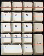
Most of the gray keys are consistent with gray keys everywhere else on this board (and on PC keyboards in general). But what happened with the minus and plus keys? The minus sign is on the upper baseline, consistent with the white keys to the left of it, and the plus sign is on the lower baseline!
(The minus sign is doubly weird when you consider that their PC keyboards have a single-height minus sign that is consistent with the other gray keys. Again, what happened?)
I suppose I should not be surprised that the odd keys out are the ones that replace the double-height plus key on a PC keypad. Although, in Unicomp’s defense: At least they bothered to have a Mac-layout keypad at all, unlike most PC keyboards for the Mac.
The visual design
Most keyboards look about as decent as any other, but the SpaceSaver M and Das Keyboard both stumble here.
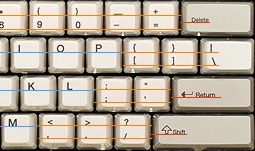
Das Keyboard’s failing is just the ugly, low-legibility font used for the keys. Check out the apostrophe/quote key:
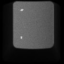
This is cropped from a 3000-pixel-wide photo.
Yes, that really is the quote mark up top—this is not the accent/tilde key.
Then there’s Unicomp’s SpaceSaver M. Check out its media keys:
![]()
The brightness symbols are decent enough, I guess. Nothing wrong with the playback keys, except that that pause symbol needs to eat a sandwich.
But look at “Expose´” and “Dashbrd”. Those two keys in particular strike me as lazy—like, you couldn’t plot some rectangles? If nothing else, you couldn’t type a proper é? And why “Dashbrd” and not, if you’re going to abbreviate, simply “Dash”?
And those speakers! Those are not speakers. Those are funnels. Sideways funnels with dots and waves rising out of the intake for some reason.
Also:
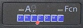
“Fcn”?
Visual design is a low priority in keyboards in general, but needs to be a high priority in a high-end keyboard. The keyboard may not be a part of my system that I regularly look at, but if your keyboard is a high-end product, then it ought to look high-end. It ought to look badass and/or pretty. I ought to be able to brag about it and show pictures and have people be suitably impressed.
And remember: The first test of your keyboard is when I look at it on the web. I can’t type on it yet, so the only test I can apply is whether it looks good. Don’t fail that early.
(Incidentally, this blog post from last month shows a SpaceSaver M that looks quite different from the picture on Unicomp’s website: The left option and right “Function” keys are way smaller (too small, I say); “Expose” loses its fakey accent mark, “Dashboard” is fully spelled out, and both of them are set in a condensed font; etc.)
So what does a modern Mac keyboard look like?
If you make keyboards, this is the keyboard I want to buy from you.
- Mechanical key switches or GTFO. Ideally, somehow license Unicomp’s buckling-spring switches (or be Unicomp). Second-ideally, perfectly mimic the AEK2 keyswitches (like the Tactile Pro purportedly does). But, at the very least, your key switches need to have non-linear, tactile response. My keyboard should be loud.
- It must be an extended keyboard. I will do without a keypad when I’m on a laptop, but when I’m sitting at my desk, I make full use of the ten-key.
- Ctrl and ⌘ should be the same size as the tab and backslash keys. Option should be slightly smaller.
- You should have at least a Caps Lock light, and ideally should have all three lights (they can be controlled by software).
- Kill off the Help key. This is the one bad thing about the AEK2. Any of the alternatives mentioned above would be a welcome improvement. I nominate the fn key.
- The Power key’s rightful successor is the Eject key; therefore, it should be in that place, in the top-right corner.
- The media keys get to live. I, for one, do use the volume keys on my laptop, and I’m sure some folks use the Exposé keys (and I have been known to use Exposé-current-app sometimes). Ideally, I’d like to see these be separate keys, above the function keys, like on certain Windows keyboards. (But not mushy rubber buttons. All keys should be real keys.) But I wouldn’t dismiss a keyboard that satisfied all of the other requirements just because it required fn+function keys to access the media keys.
- It must implement the fn key properly (unlike the Logitech keyboard mentioned above). Double-fn for dictation should work, and the setting to switch function keys and media keys should be respected.
- Ideally, the keyboard should look good, too (more Tactile Pro, less SpaceSaver M).
Updated 2013-09-07 to cover a couple of aspects of newer Apple keyboards that I missed. Thanks to Jason Clark and Jens Ayton for pointing out my omissions.