The tips
Work on your slides and rehearse in alternation
Don't wait until you've “finished” your slides before you start rehearsing. Make a rough draft that hits all the points you intend to make, then rehearse it.
As you rehearse, you will think “I should say [some other way of saying it] instead”, or “I can skip that”, “oh yeah, I should talk about this other thing, too”, or “that should go before/after that other thing”. Remember these, or write them down, or make a Voice Memo, and make those changes on your next iteration.
Iterate, iterate, iterate, until you can't think of anything else to change.
And then keep rehearsing, even after it's “finished”, to polish your own delivery of it.
Banish filler words
I'm talking here about “um”, “y'know”, etc.: words that fill your own thinking pauses.
This is one part self-awareness (listen to yourself speak) and one part practice (previous point). The only way to cure yourself of this is to speak (or pretend to speak) frequently, listen to yourself, and drive this habit out from yourself.
You've practiced the presentation enough when you can give it from memory so fluidly that “um”s are not necessary to fill time.
“Weasel words” (“arguably”, “some would say”, etc.) are another topic entirely, but equally worth driving out from your presentation—and your slides, too.
No bullet points. Ever.
Every slide should express one idea.
If you have multiple things to say, make another slide.
Express commonality between slides with a common heading. The heading you would have had on the single slide of bullets should be on all of the slides you explode that list into.
Builds are your friend
Fade things in. Slide things around. Tie some builds together, make some dependent on others, and keep some separate.
Consider making a build instead of another slide, especially if you're just adding (rather, fading in) another object.
Most builds should be no more than one-fifth of a second. Don't make people wait.
Talk during builds, not after builds.
Beware of dependent builds
(In Keynote, this is the “Starts after [some previous build]” feature.)
If one build starts immediately after another, you can think of those as one build, and that's OK, but be wary of inserting a delay of some fixed number of seconds. You should probably make those two separate builds to be triggered separately, one at a time, by the remote. This gives you flexibility in timing.
Transitions are your enemy
Don't do wipes, dissolves, or other transitions between slides. Don't make people wait.
There's nothing to talk about during a transition.
Images are just better
If you can say it with an image, do it.
If your image needs a title or caption, so be it, but most are better without.
Your presentation is not done when there is nothing left to add, but when there is nothing left to take away
Summarize your points; then, use the summary
When you summarize, you cut out everything that is superfluous. If it's superfluous, why were you saying it in the first place?
You can keep some explanation and context, but anything that doesn't support a core point that would belong on a Summary slide is better removed.
Summary slides: Zero or one, not infinity
No more than one “summary” slide. Ever.
If you're summarizing that many points, go cut some points out of your presentation until it all fits.
If you're talking about two different things, make two presentations!
You may not even need a summary slide in the first place. One alternative is some sort of finale (more feasible for some presentations than others); another is a slide with contact information and/or links to more information about the subject.
Lowering your font size is cheating
The correct response to “my text doesn't fit” is “cut out some text”.
Text should be huge
Guy Kawasaki says text on a slide should be no less than 30 point. I say 50.
The smallest text in my last presentation was 42 points, and that was my name. Anything that is actually relevant to the subject should be larger.
Use a remote
Don't chain yourself to the computer.
Wireless mouse = Poor person's remote.
If you use Keynote, Apple sells a Keynote Remote app for iOS (iPhone, iPod touch, etc.)
Use the Presenter Display
Keynote has it. I hope PowerPoint does, too.
Turn everything on. Set the timer to count down your time limit; show the presenter notes; show both the current and next slide; show the animation indicator bar; show the builds-remaining display.
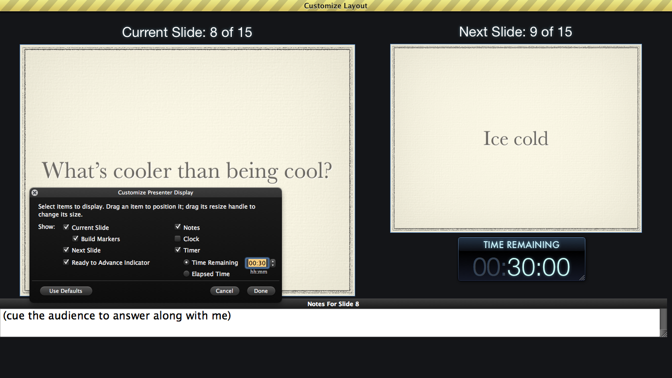
This is what you should be seeing when you present.
(The audience should, of course, only see the current slide.)Look at the audience, unless they should look at the screen
The audience will look where you're looking.
If you look at the audience, they'll look back at you.
If you made your slides right, they're sparse enough that the audience will look at you most of the time.
Engage them by looking out at them while you talk.
If you look at anything or anyone else, they'll look at that.
Corollary: If you stare at one person, on stage or in the audience, everyone (else) in the audience will look at that person. So don't do that unless you have a really good reason (i.e., calling attention to that person as part of your message).
More generally, don't try to look at any one person individually, at least not too much; you should be addressing the entire audience. Sweep your gaze over it from left to right, back and forth.
If you look at the screen, they'll look at the screen.
If you want to call attention to something on the screen, such as a screenshot, look at the screen.
For videos, watch the video—on the big screen—along with them.
Inversely: If you don't look at the screen, they won't look at the screen (as much).
They'll look at it when it changes (build or slide change), then go back to looking at you, whatever you're looking at, or their notes/laptop.
So, at all other times, look at the audience.
(Incidentally, this is one problem with demos: If you're looking at your laptop, they're more likely to look at theirs.)
Pointers are an anti-pattern
This includes laser pointers, projector pointers, and cue sticks. The technology used is not important.
Anything that is actually important for the audience to take note of should dominate the slide. It probably should be the only thing on the slide.
If you really need to include the element among a bunch of others and then emphasize it specifically, use styling (e.g., text color or underline) or an element (e.g., a bright red ellipse or rounded-rectangle), initially hidden with a quick build to unhide it.
If you take more than two minutes on a slide, break it up
Don't rush through the slide to cram it in under my arbitrary time limit. Taking more than two minutes is not the problem, it's a symptom. The problem is that it's too big, so break it up.
When you give your presentation for real, you should neither have nor need a timer on each slide. You should already be going through slides fast enough that you don't need to watch the clock.
You have too many slides
Yes, you do. Trust me on this. Go delete some.
You already did? Good! Go delete some more.
Make the hard decisions of what you really, really need to say.
Assume you won't have enough time
Look at the schedule for where you'll be presenting. Take the amount of time you were allotted and divide it by 2. Plan for that amount of time.
Your presentation will expand to fill it—or, if you don't do this, overfill it—because of setup problems, stage fright, wrath of the Demo Gods, etc.
Any time you have left over can be used either for Q&A or by the organizers to get the schedule back on track.
Charge all relevant equipment the night before
- ☐ Laptop
- ☐ iPad or other tablet
- ☐ iPhone/iPod touch, if relevant
- ☐ Remote (if not your iOS device)
You are not important
Your shortest slide, time-wise, should be the one where you say who you are.
You probably shouldn't even have it. Skip talking about yourself and talk about your subject.
If it is truly important to your subject matter that the audience know who you are and what you've done, pare it down to the absolute bare minimum.
Ten seconds, no more; less is better, zero is best.
Fancy is bad
Backgrounds
Use a simple monochrome gradient.
Plain white or black is tolerable, but harsh. Gradients are softer.
No patterns, images, etc.
Fonts
Pick exactly one.
Myriad and Helvetica are good.
If you feel a need to go serif, Palatino is good.
Bitstream Vera Sans is good, but goes under two or three different names. Make sure you have every version of it ever.
Gill Sans only for chapter transitions (if your presentation is of that sort), and then only in all caps. Don't use it otherwise.
Arial only if you're presenting on Windows and you're not allowed to use Helvetica.
Make sure the font is on the computer you'll present from, especially if it's not yours.
You do not want your slides to show up in fucking Courier.
System-included fonts are an easy way to make sure of this. Helvetica is on both Mac and Windows, Palatino is on Macs, Arial is on Windows, Vera/DejaVu is on Ubuntu.
Code fonts
The usefulness of program code on a slide is highly debatable, but if you go through with it, font choice for code bears special mention.
Bitstream Vera Sans Mono and its descendants are great. Right now, this includes:
- Vera Sans Mono
- DejaVu Sans Mono
- Panic Sans (included with Coda)
- Menlo (included with Mac OS X since Snow Leopard)
Monaco is also good. Other good ones include Consolas (Microsoft), Andale Mono, Lucida Console, and Inconsolata. Most sans-serif fixed-width fonts are decent enough.
No bitmap fonts. I know some programmers like them, but scalability is vital in a presentation, particularly given the huge-text requirement. The scalability freedom of outline fonts is just too important here.
Never proportional (varying-width, i.e., “normal”) fonts. Some programmers actually use proportional fonts, but in a presentation, there is no faster way to say “I am not a programmer”.
Never fucking Courier. American Typewriter is better, but not much.
Use Comic Sans only for code you're going to mock, because if you don't, the audience will.
Contrast
The projector will wash out the contrast, moreso if there's any lighting turned on up front. Pick your colors accordingly.
Use either white text on a black or very-dark-to-black-gradient background, or black text on a white or very-light-to-white-gradient background. Keynote's first three templates (“White”, “Black”, and “Gradient”) are great for this.
For program code, be careful with syntax highlighting. Again, keep the contrast high. Full brightness, low saturation; change only the hue between syntax element types.
Slides must not be redundant
If your slide deck is perfectly understandable without you presenting on stage, make a document out of it and stay home.
Some conferences ask for your slide deck to give to attendees. This should be worthless.
If your slides don't need you, you don't need them.
Slides should be helpful, not necessary
Something worth practicing: After you've rehearsed a few times, start rehearsing without slides. This includes on your way to the conference (I did this in the car the morning of my session).
(But also keep practicing normally, with slides, remote, etc.)
Shit happens. Your laptop may get stolen (or you forgot to charge it), their laptop may flake out, the projector's bulb may burn out, etc. Expect Murphy to fuck your session up and be ready for anything.
Moreover, being able to give the presentation without any visual or technical support is evidence that you have it down.
Conversely, being unable to give the presentation without having the slides to read from is evidence that you don't have it down and/or your slides are too packed.
Use the presenter notes feature
Keynote, at least, lets you set “presenter notes” for a slide, which are displayed along the bottom of the presenter display. Use this on some of your slides for a terse outline of what you need to talk about on that slide.
Don't use it on every slide.
Don't write a full script (of any length) in the presenter notes. You should not read the notes off verbatim; keep it to an outline.
Watered-down Gatorade is the life-giving nectar of the gods
You are going to be talking non-stop. This will make you thirsty.
Plain water is not good enough. Too much of it rinses away your saliva and just makes you differently thirsty.
Turn your phone off
No, not to vibrate. Off, entirely.
It's bad enough when your phone rings while you're in the audience. There is no faster way to lose the audience than to have your phone go off on stage.
Vibrate mode is not an option. For one thing, the vibration would be distracting. (It's supposed to be!) You don't need or want distractions; you have enough on your mind already.
For another, any transmissions from your phone back to the tower, even if you aren't calling or answering, will often get picked up by the audio equipment. This is the “chirping” noise you sometimes hear on podcasts and in presentations. You don't even need to make or receive a phone call, especially if it's a smartphone that may transmit data over the cell network.
So just turn it off.
Regular-strength Gatorade is too strong; it will also make you thirsty. You need to water it down. I don't know exactly how much; I know it by taste. It may vary from person to person anyway, so experiment for your own ideal balance.
If you make it from powder, use a little more than a liter of water per level scoop (the instructions say a quart; a liter is more than a quart and I say use a little more than that).
I don't know whether/how well this works with Powerade, Mio, etc.
Flavor matters, too. Find your favorite and don't use anything but.
Don't expect the venue to provide it, especially given the watered-down requirement. Make it yourself in advance and bring it with you.