New app: Apple Extended Keyboard II Overlay Generator
Last week, John Gruber and Dan Benjamin released episode 20 of their podcast, The Talk Show. It was devoted to the Apple Extended Keyboard (the Saratoga) and Apple Extended Keyboard II (the Nimitz). This renewed my interest in bringing my own Nimitz back into service using a Griffin iMate.
The Nimitz is the greatest keyboard ever made for the Macintosh. It has the best keys, the best height adjustment, the best Caps Lock key (it physically locks down!)—everything.
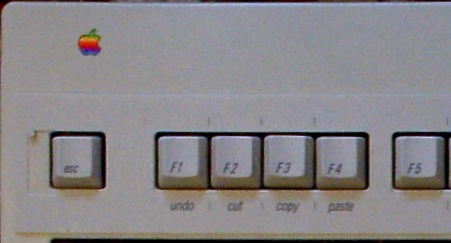
One of its distinctive features is a couple of pegs near the top of the keyboard—one near the Escape key, and another near the Power key.
The Saratoga had, printed under the F1 through F4 keys, the words “undo”, “cut”, “copy”, and “paste”. Because these definitions were useless (not to say confusing) to most Mac users, the Nimitz moved these labels to a plastic overlay that came with the keyboard. Those who actually needed it could put it on, which they did by hanging it on those two pegs, and everyone else could simply leave it in the box.
That overlay is even more useless today. But I think the idea of an overlay defining the function keys is a good one, especially as Mac OS X has made the function keys actually useful.
So I decided to make a new overlay.
Apple Extended Keyboard II Overlay Generator.
I’ve included with the application two ready-made overlays: a replica of the classic Apple overlay; and my Mac OS X overlay. You also have the option of editing them or creating your own from scratch.
Assembly instructions (among other information) and the download are on the webpage.
May 7th, 2008 at 01:44:54
Fantastic idea. I don’t have a ruler in the office, but what’s the chance of fitting the printout (diagonally?) on a sheet of A3? Would reduce the possibility of ‘Fail’.
May 7th, 2008 at 01:55:24
BTW, what kind of printer are you using? I think some HP models have Univers built-in. (At least some TeX Readmes back from 1994 mention that they now provide metrics for the Univers in LaserJet 4 printers…)
May 7th, 2008 at 04:25:02
I just tried it in Lineform. It fits diagonally, but just barely. You’ll need a printer capable of borderless printing, as well as a vector editor (such as Lineform or VectorDesigner) in which to stitch two copies of the PDF output together and rotate the result. As an example, here’s the A3 PDF of the Mac OS X overlay that I made in Lineform.
It’s a Samsung. It doesn’t matter, though: it even works if I simply save the EPS or PDF file and open it in Preview, without ever sending it to the printer.
That’s how I took the two screenshots of the word “eject” that you can see on the webpage: I made an EPS file of it, then used pstopdf to convert it to PDF, then used image to scale by 400% and convert to PNG. Here’s the EPS file in case you want to try it for yourself.
May 7th, 2008 at 11:48:27
“NewApplication Help”.
May 7th, 2008 at 18:51:11
Jesper: Thanks. Fixed in 1.0.1, which is now up.
May 8th, 2008 at 03:02:17
I’m not sure our printer can print without margins. Perhaps I’ll investigate printing it anyway and just cutting along the shape of the original plastic thingy…
Are you sure you don’t have a copy of Univers sitting _somewhere_ (X.5 is rather good at finding fonts in remote locations and using them). I can’t reproduce the behaviour here.
May 8th, 2008 at 04:06:43
I’m on Tiger, and I’m quite sure. Like I said, locate doesn’t find it, and locate searches everywhere (including /System, /Library, and $HOME).
The command line I tried: locate Univers | grep -vF Universal.
May 8th, 2008 at 04:12:13
Also, I can’t use the font in applications, such as TextEdit (or the Generator—the form for the labels is in Arial Narrow, even when the output is in Univers). I can only use it in a PostScript program.
May 18th, 2008 at 23:30:01
Two points (previously destroyed by your clever spam protection, I guess…):
1. With old PostScript font names, you may be looking for slightly crippled file names – ‘UnivCondIta’ or whatnot.
2. Taking another look at the graphic you posted suggests that the font is _not_ Univers – which has an angled top of the t as well as a slightly less round look. Instead I’d guess that font replacement just uses a (fake) narrow Helvetica there. And, indeed feeding your app with easily recognisable Helvetica chars (G, R) confirms that guess.
May 19th, 2008 at 00:11:45
ssp: You’re right. I just tried the Linotype website and, sure enough, Univers does have the same slanted t as Arial. Wow.
When I’m back on my main machine in a week, I’ll correct the webpage. Thanks.